
Project Gallery
The gallery showcases some of my favourite custom projects. I am truly, madly, gladly grateful to the clients who have entrusted their cherished materials to Bari Zaki Studio—from art collections and special books to ephemera and other treasures. I’ve included specifics about structures, materials, and my collaboration with the client. In many cases, my work will protect and present artifacts that are valuable monetarily as well as sentimentally. So, I am always balancing beauty with functionality and durability.
Sailor’s Mail: Letters From My Heart
[ December 2022 ]
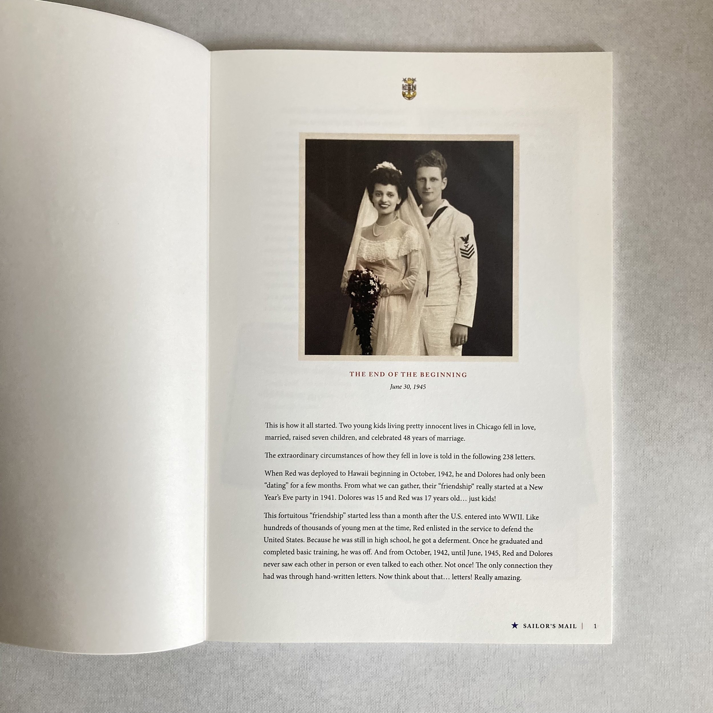
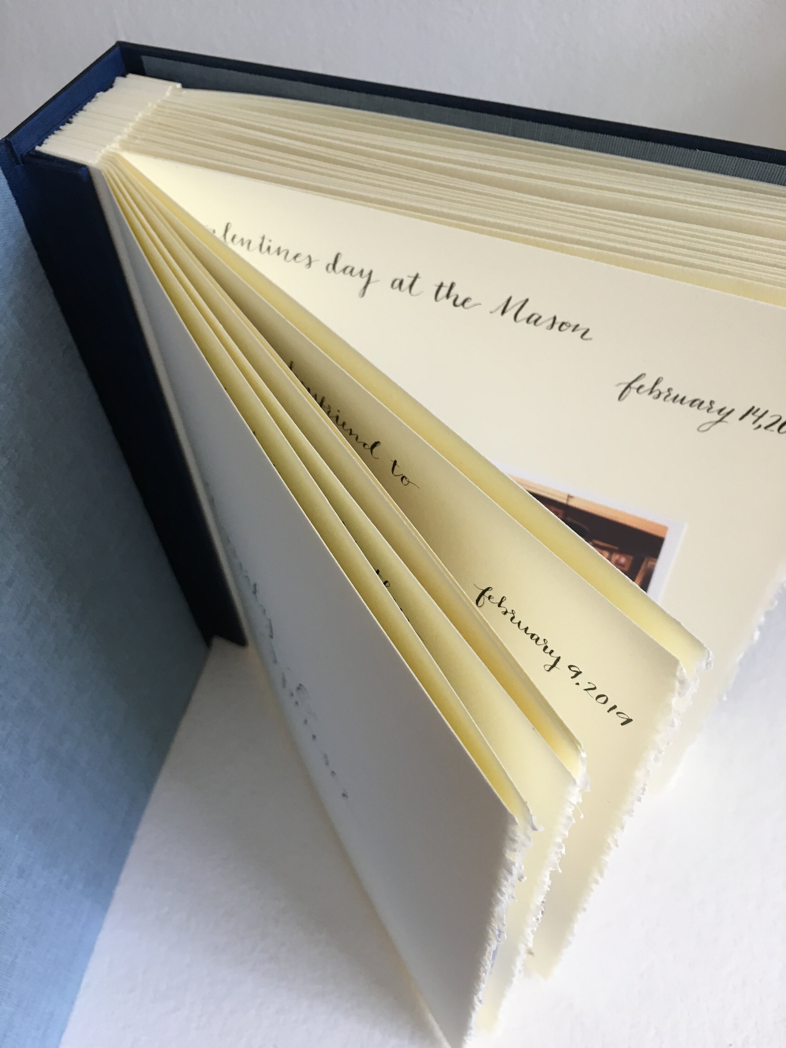
Kevin and his siblings wanted to share their parents’ epistolary romance: 238 letters written between Dolores and Ellis (a.k.a. Red) from October 1942 to June 1945, while Ellis was stationed in Hawaii and Guam. Kevin had become the keeper of the correspondence, in the same suitcase his mother had stored the letters in for 70 years. After Dolores’s death, her children began to think about sharing their parents’ correspondence with the next generations. A book seemed the logical format, but Kevin wanted it to be very special, and he would need nine of them.
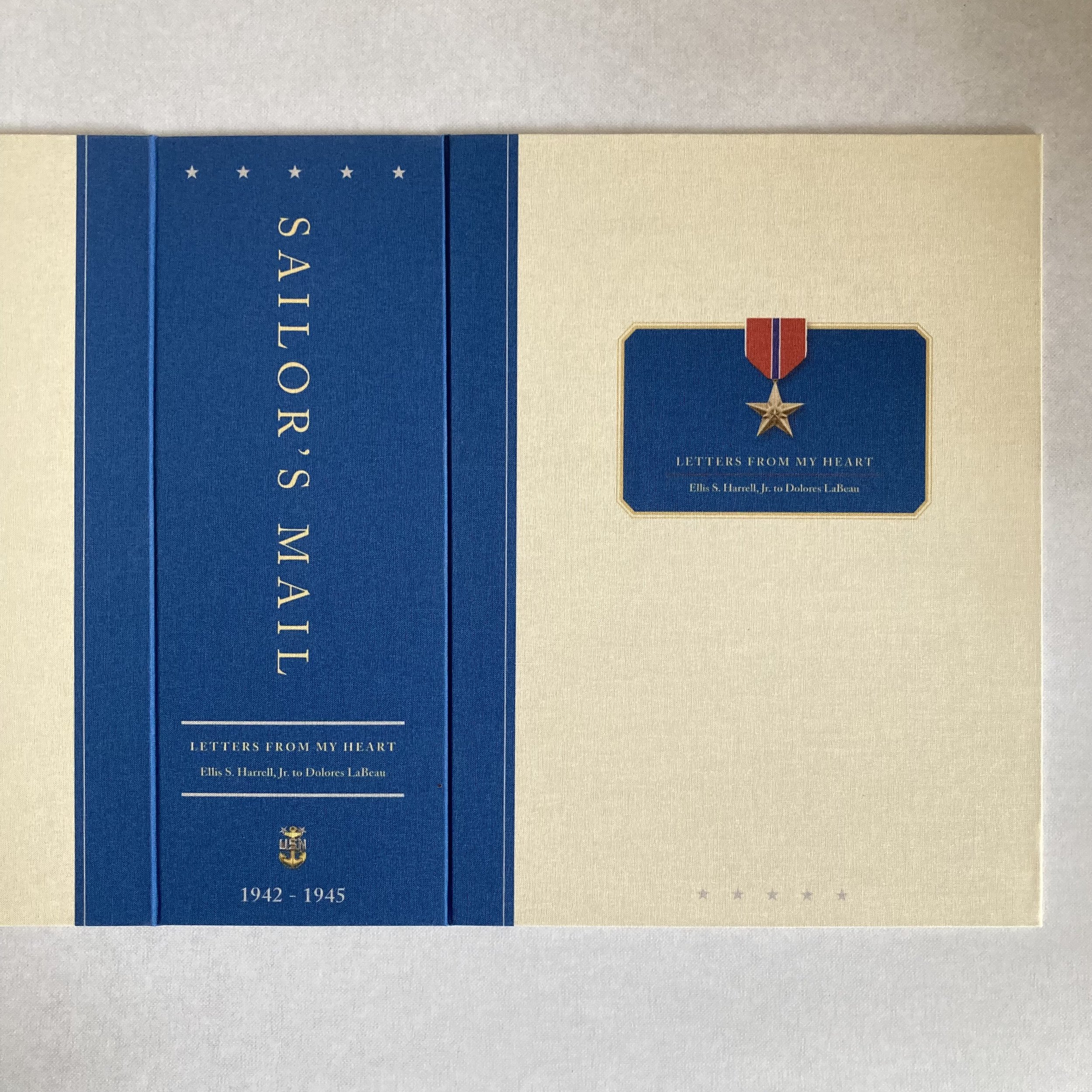
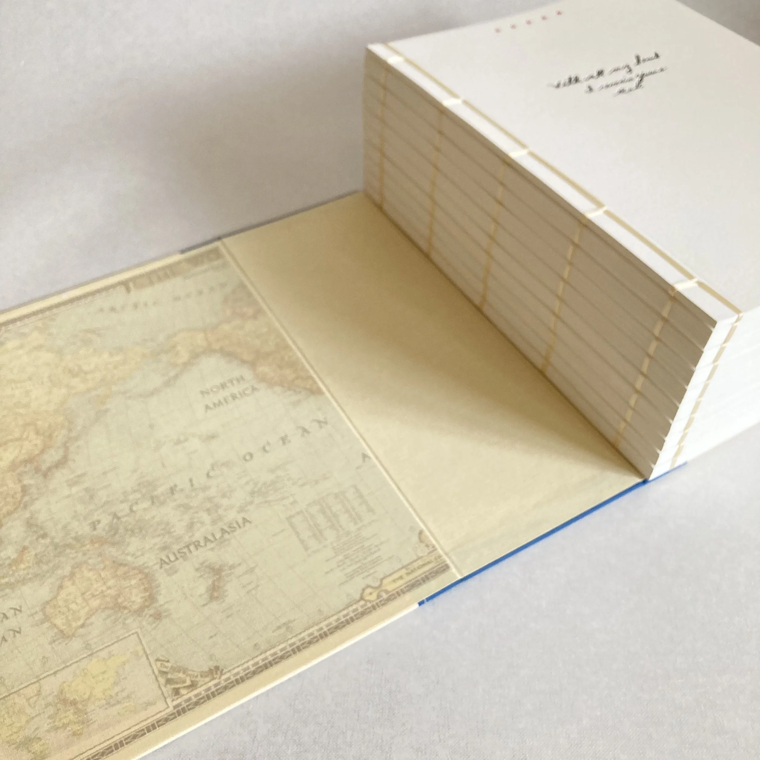
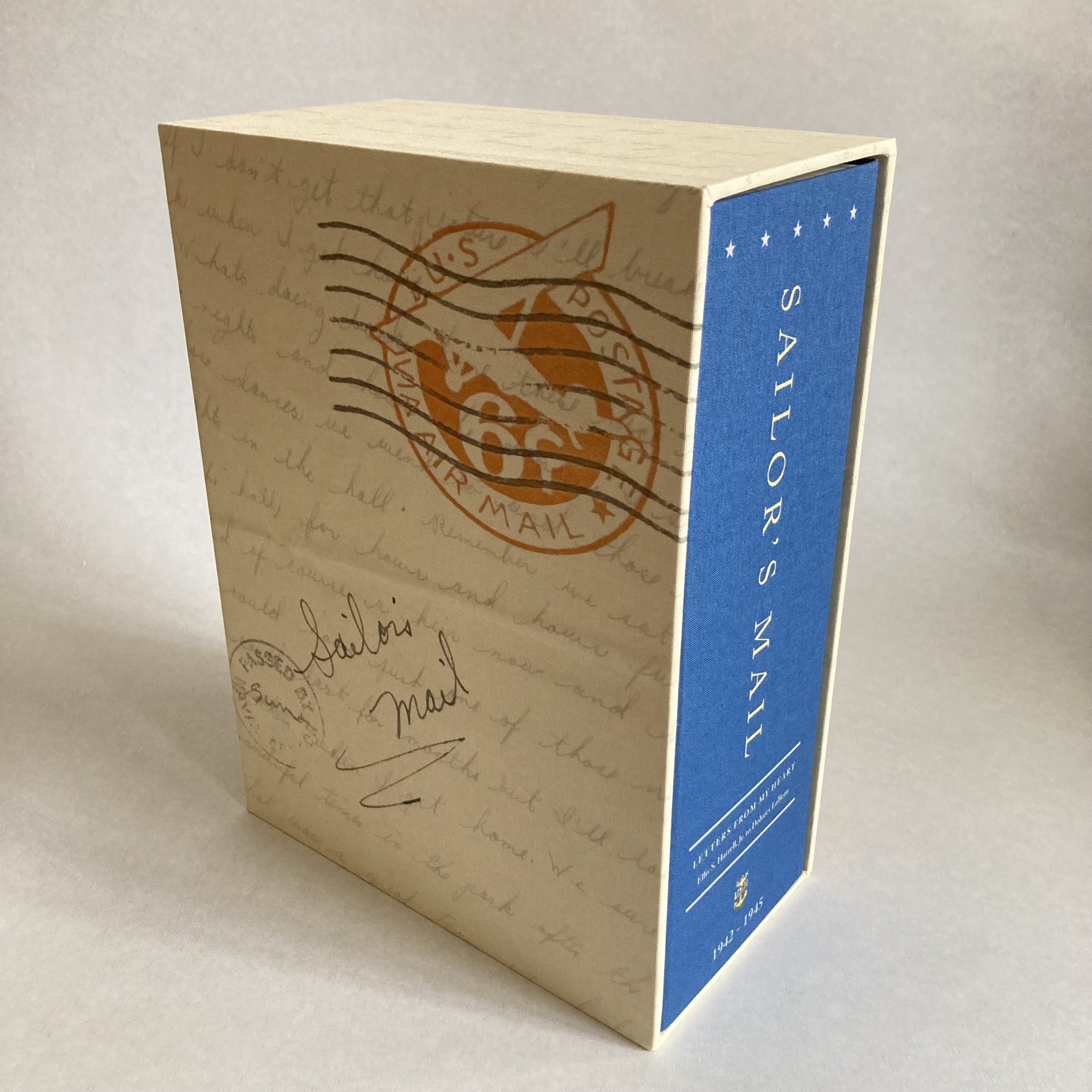
The envelopes were as integral to the story—with their stamps and postmarks—as the letters themselves. I recommended having the letters and envelopes professionally scanned and digitally printed, creases and all. When I saw how prolific Dolores and Red had been, and how voluminous their correspondence was, I showed Kevin another family history-type project I had bound, and we agreed that a similar multi-book set would be the ideal format for his edition. The pages are 9 x 12, to accommodate the letters at a slightly enlarged size, making them easier to read.
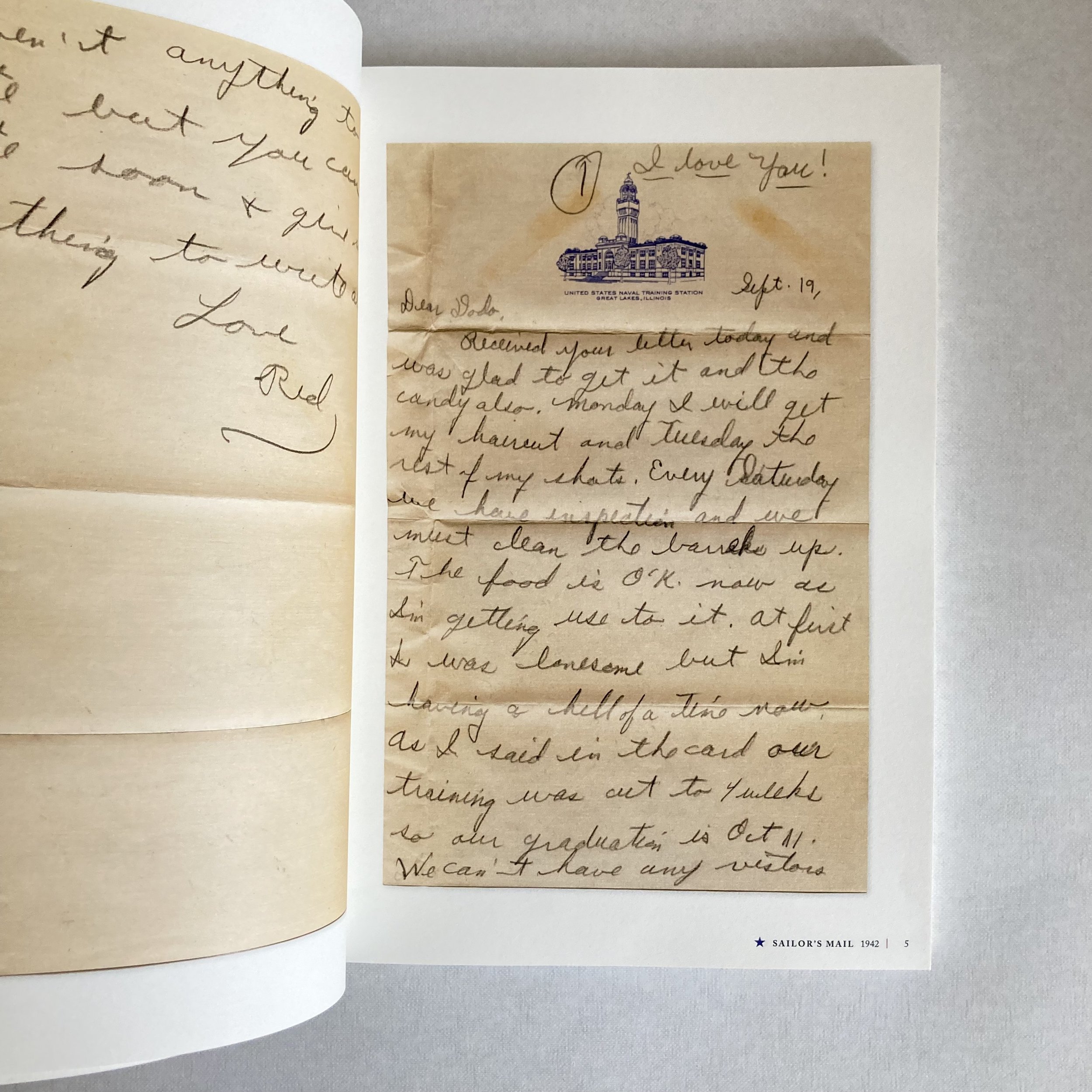
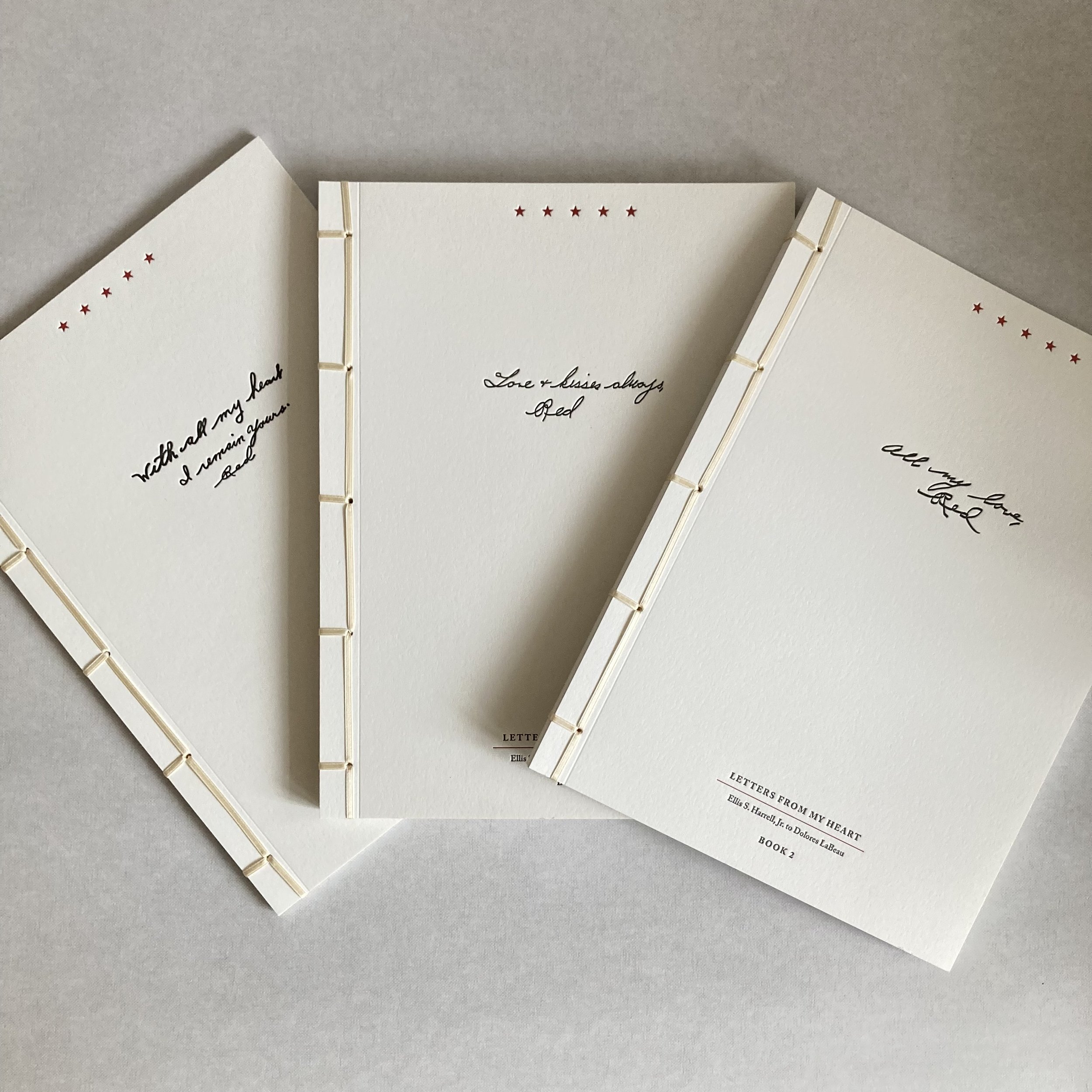
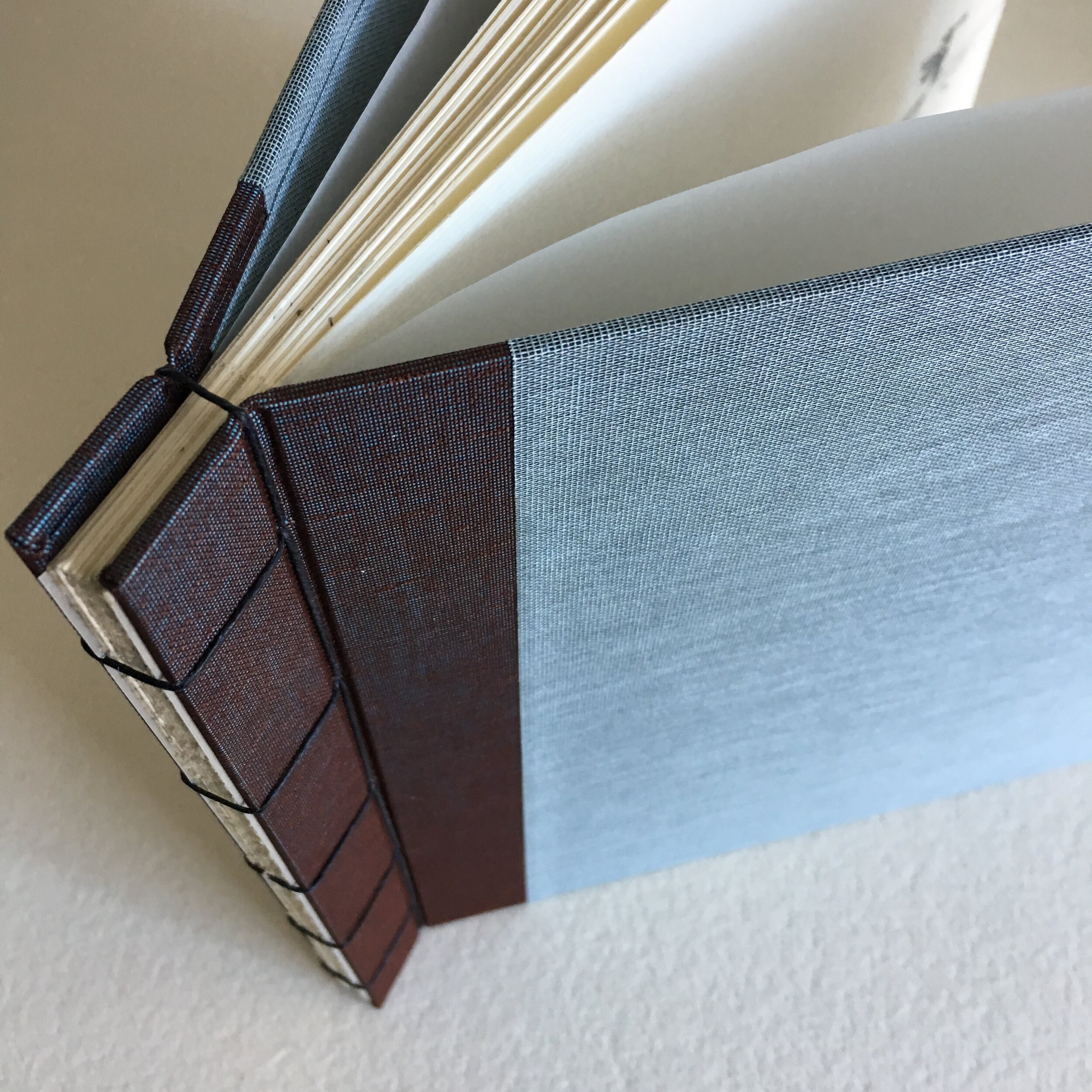
We divided the letters into nine booklets, plus an introductory booklet of family photos, all annotated with names and dates. I bound each book with ¼-inch ivory satin ribbon, in a traditional Japanese style. The covers are letterpress printed, each with a different sign-off from Red’s letters—a lovely detail! And, last but not least, a sheet of vellum is bound in between the cover and the first page of each booklet.
I made a hardcover portfolder in which the books sit. It is covered in linen bookcloth printed to look like the spine of a single book. I also covered the interior of the portfolder in bookcloth, printed with a map of the world from the 1940’s. The slip-case I built, into which the portfolder slides, is also covered in linen bookcloth, ink-jet printed with a montage of the letters and postmarks.
The complete set measures 9½ x 12¼ x 5, and weighs nearly 10 pounds! You can read Kevin’s telling of his parents’ tale here, a wonderful tribute to Dolores and Red…and the U.S. mail.
Graphic design: Donna Somerville, Chicago // Letterpress: Stacey Stern, Chicago // Covers: 100% Cotton Lettra by Crane // Scanning: Gamma, Chicago // Printing: Dupli Graphics, Chicago // Pages: Mohawk Superfine // Fabric printing: The Print Lab, Chicago // Ribbon: Soutache, Chicago
A delightful double bind
[ July 2021 ]

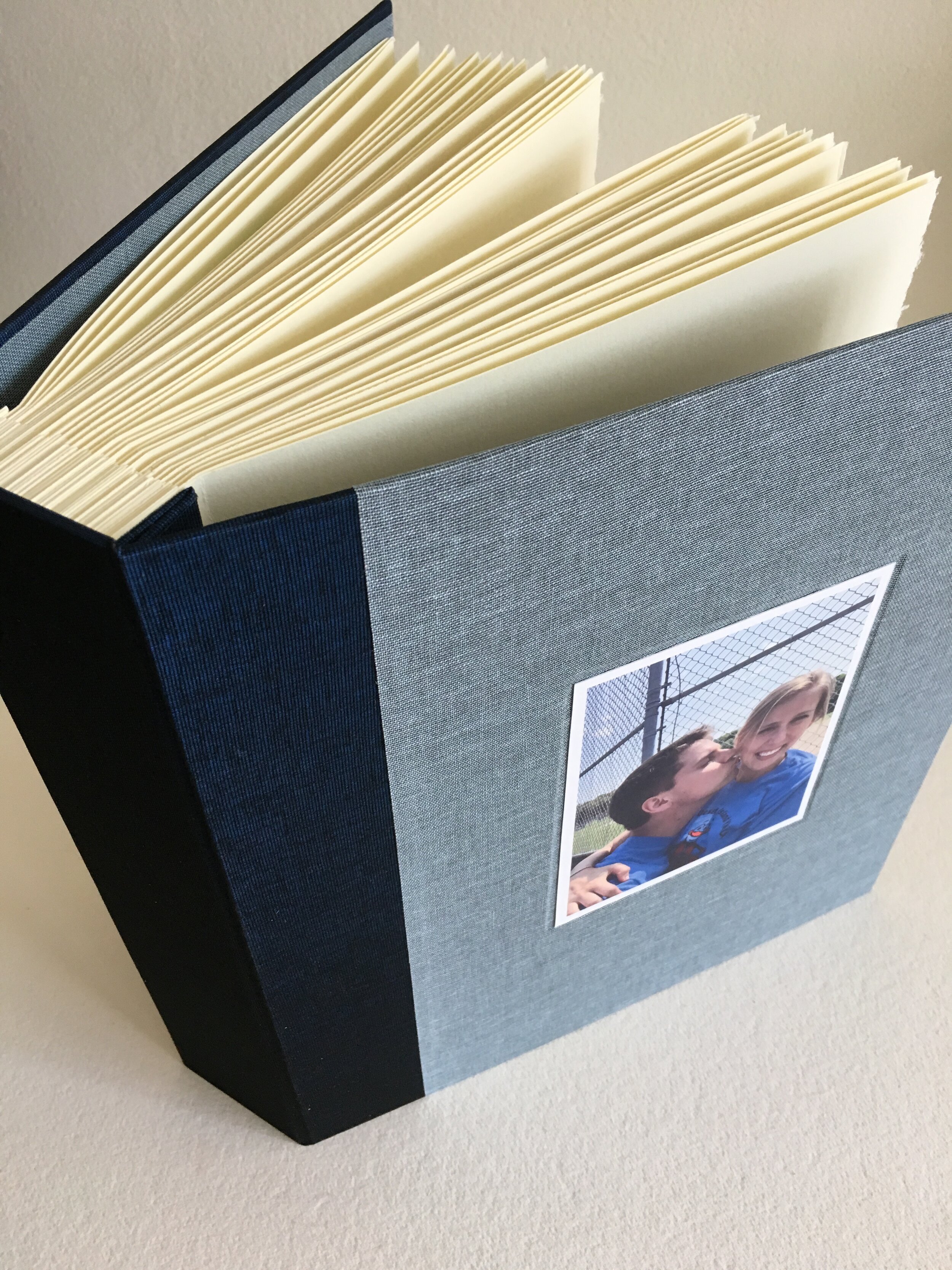
Stephanie, Donald’s wife, had a treasured cache of personal letters she’d received from friends and family after a spiritual retreat back in 2008. She had kept these very special notes together in a brown bag in her nightstand. As a Mother’s Day gift for Stephanie, Donald envisioned some sort of book that would preserve and protect the letters as a set, something she could easily open, revisit, and reread.

Donald’s only request was that the book cover include all the colours of the LGBTQ rainbow, honouring his wife’s consulting work focused on LGBTQ+ inclusion, affirmation, and allyship. I assembled two different rainbow palettes for him to choose from, and he settled on the more muted of the two.

The book measures 5 x 10 x 3, and it is basically 22 “envelopment” pages I made from creamy Stonehenge drawing paper. I was able to retain the dreamy deckle for the envelope flap. Each sender’s name is calligraphed at the bottom left edge of its envelope, so that Stephanie can flip through the envelopes and know whose letter is within.

I stitched in the envelopments using the multi-needle Coptic-stitch binding with Natural (meaning undyed) Irish waxed-linen thread, so as not to detract from the colourful cover. This binding style allows the book to open entirely flat, so the envelopes can be opened easily.
Stephanie’s book lives proudly on her bedroom bookshelf—where she can see it every day. She knows what’s within!
Storybook: by Bradford for grandson Charlie
[ December 2020 ]
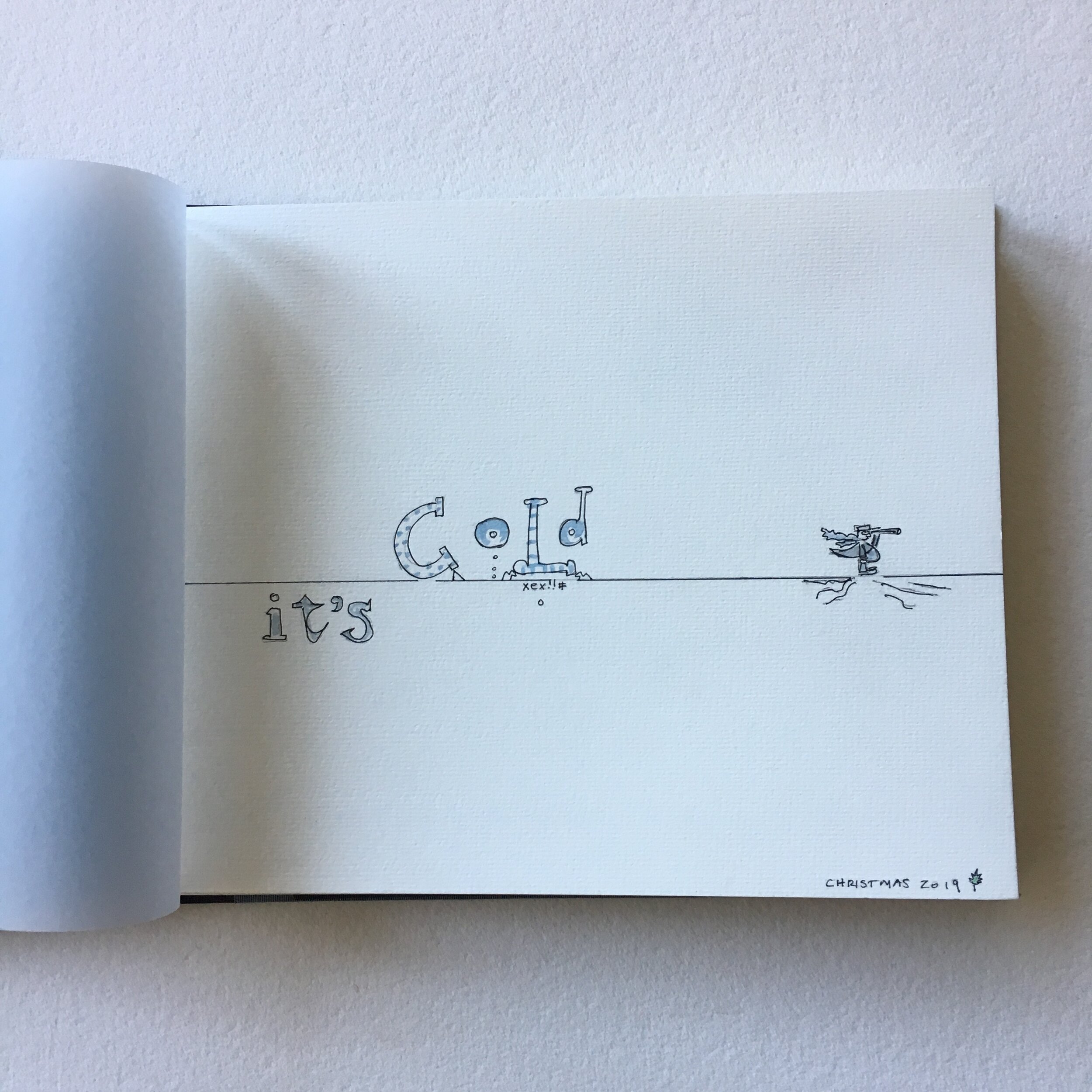
Bradford and his family are delightfully bookish. When Bradford commissioned us to make a book combining his watercolours and a little story he’d written for his grandson Charlie, he shared with me a lovely bit of family history:
“ Our family tradition is for everyone to receive a book and PJs on Christmas Eve. The idea is that we all curl up with a good read as we drift toward Christmas morning. I used to create stories with paintings on newsprint for my two daughters, Nora and Grace, when they were little. I am looking forward to sharing the tradition with the next generation. ”
We wanted the book to be sturdy as well as handsome, so that Charlie can handle it comfortably and enjoy turning the pages. I showed Bradford swatches of various materials, and here’s what we came up with.
The Japanese-style binding involves two covers, which I pierced with an awl. The cover fabric is Duo bookcloth. It’s 100% rayon and comes in colours with divine names, of which a couple of my favourites are Magpie (grey-black) and Dragonfly (blue-green). We used Mudbath at the “spine” edge and Blue Jeans on the front and back covers.
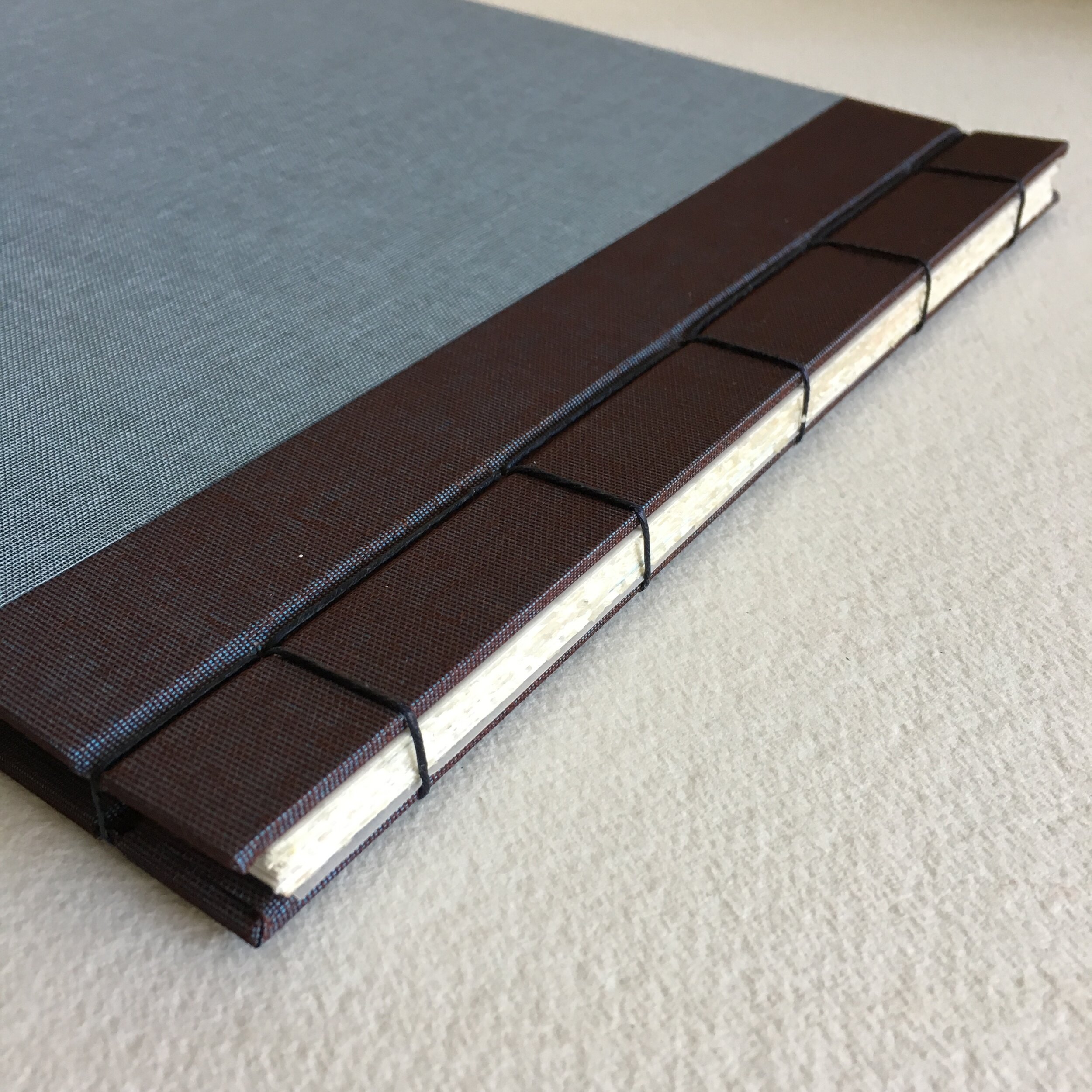
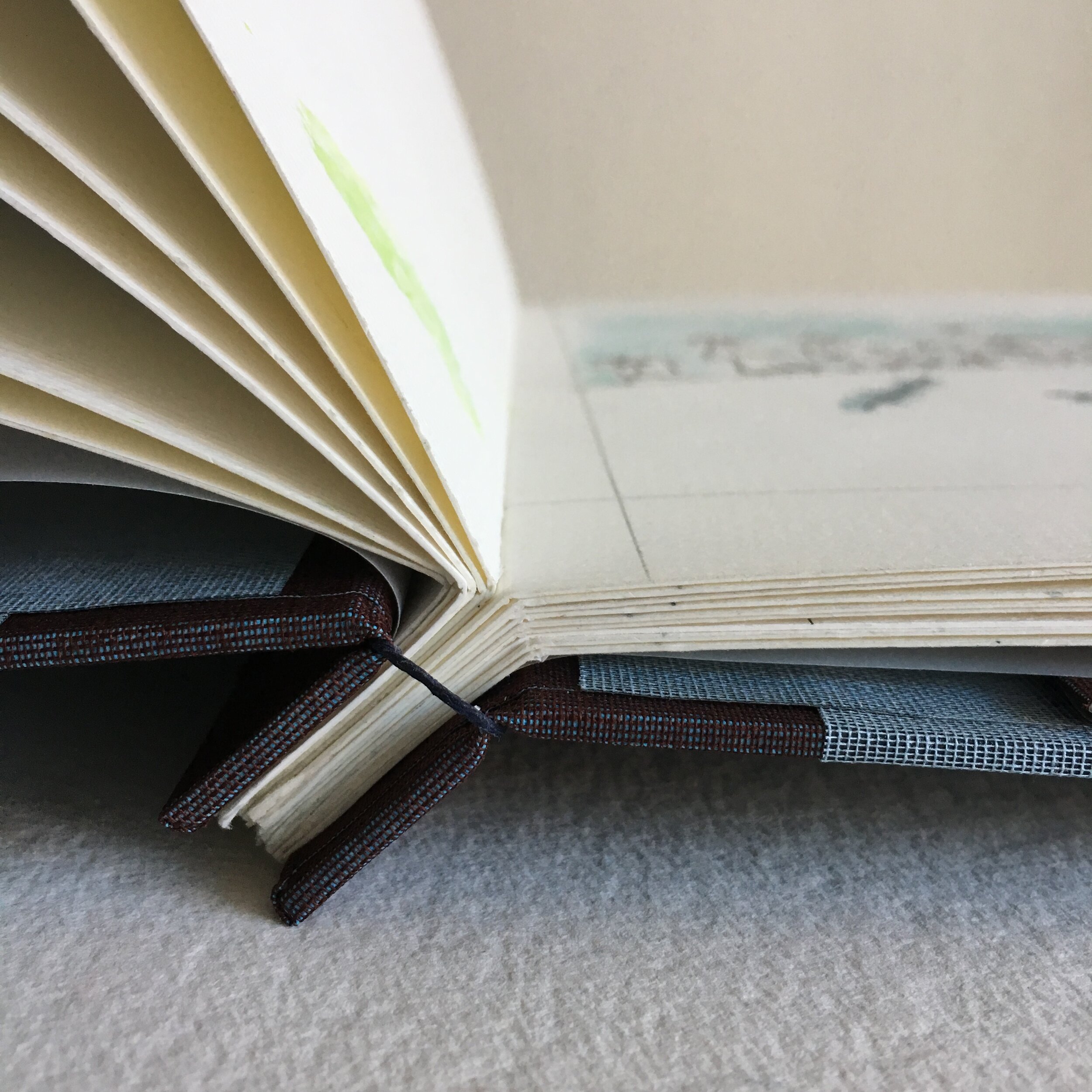
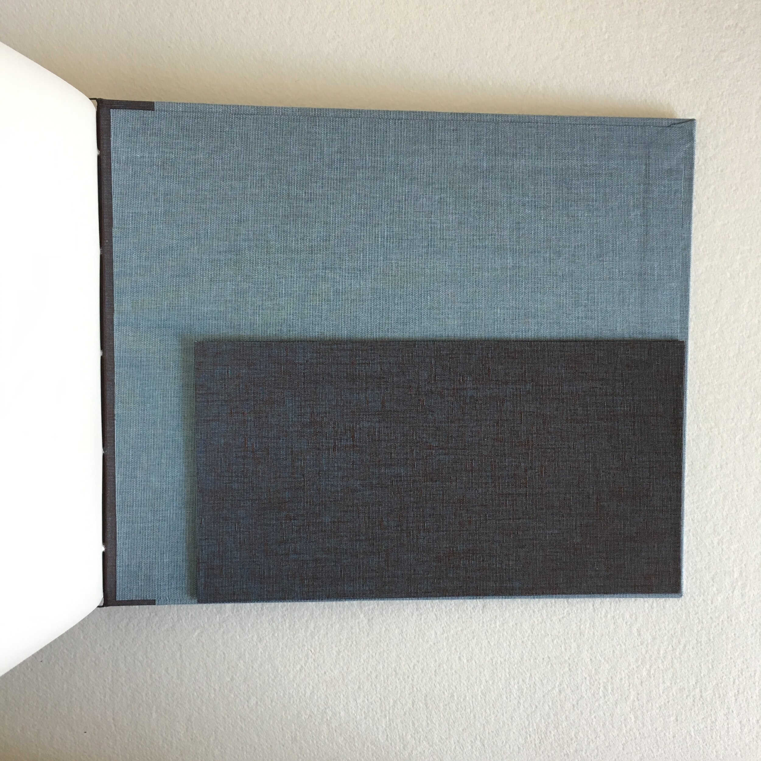
The fabric wraps around the bookboard and glues inside. I also used the Blue Jeans for the inside panels. The flysheets are frosty white vellum, and the stitching is Dark Forest Green 7-ply waxed linen thread.
Bradford requested that I make a pocket on the inside back cover, so he could include a letter to Charlie. I made the pocket out of Mudbath, so it’s contrasty with the inside panel. Bradford has graciously allowed me to quote an excerpt (one of several I love) from his letter:
“ This is the kind of book where the words can change depending on how you are feeling or who is reading it to you…. Anyway, I hope you enjoy this book now, and then come back to it years later—maybe when you have a grandchild of your own. ”
And they read happily ever after.
Emily & Spenser: a madly romantic scrapbook
[ August 2019 ]
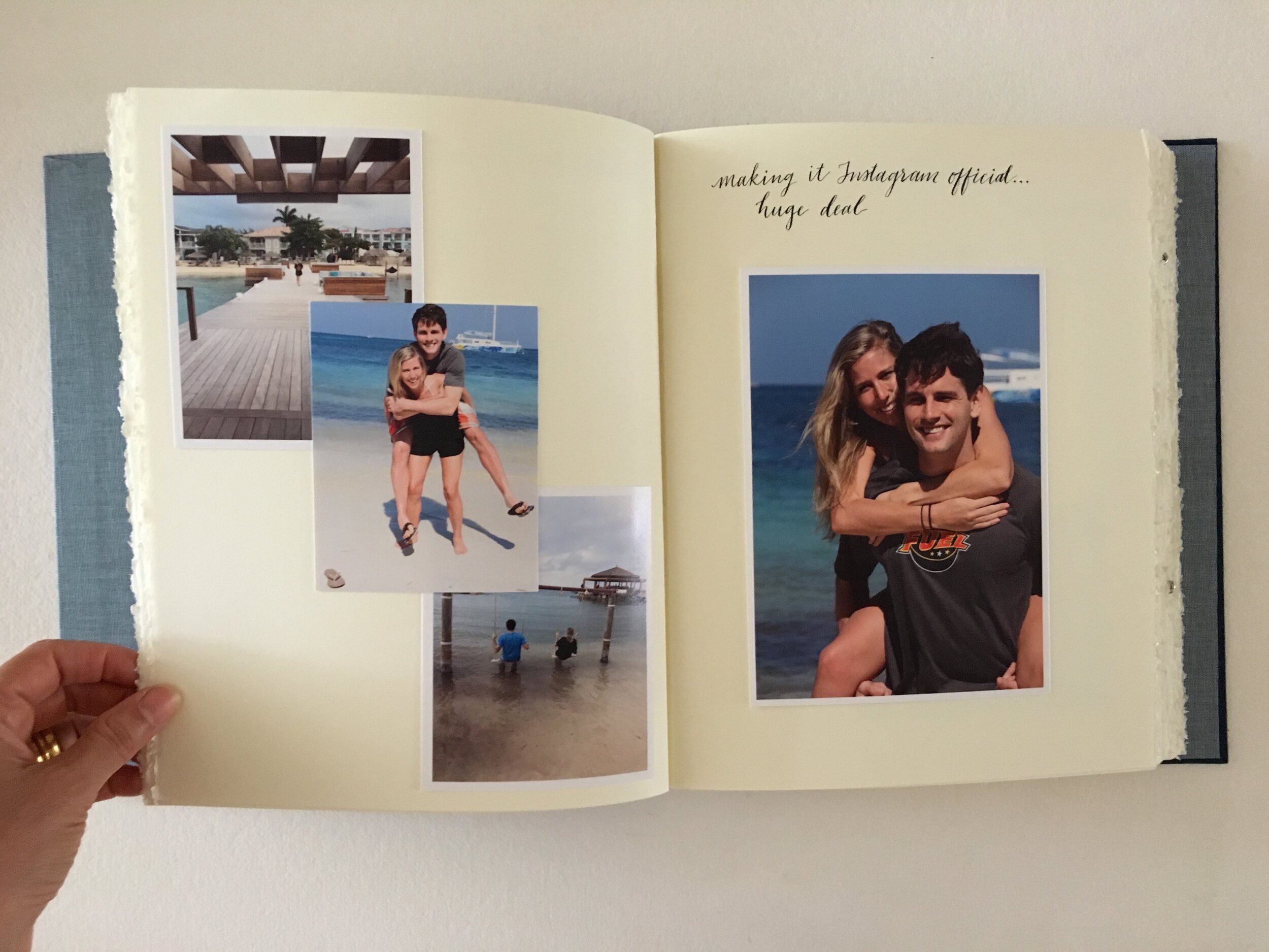
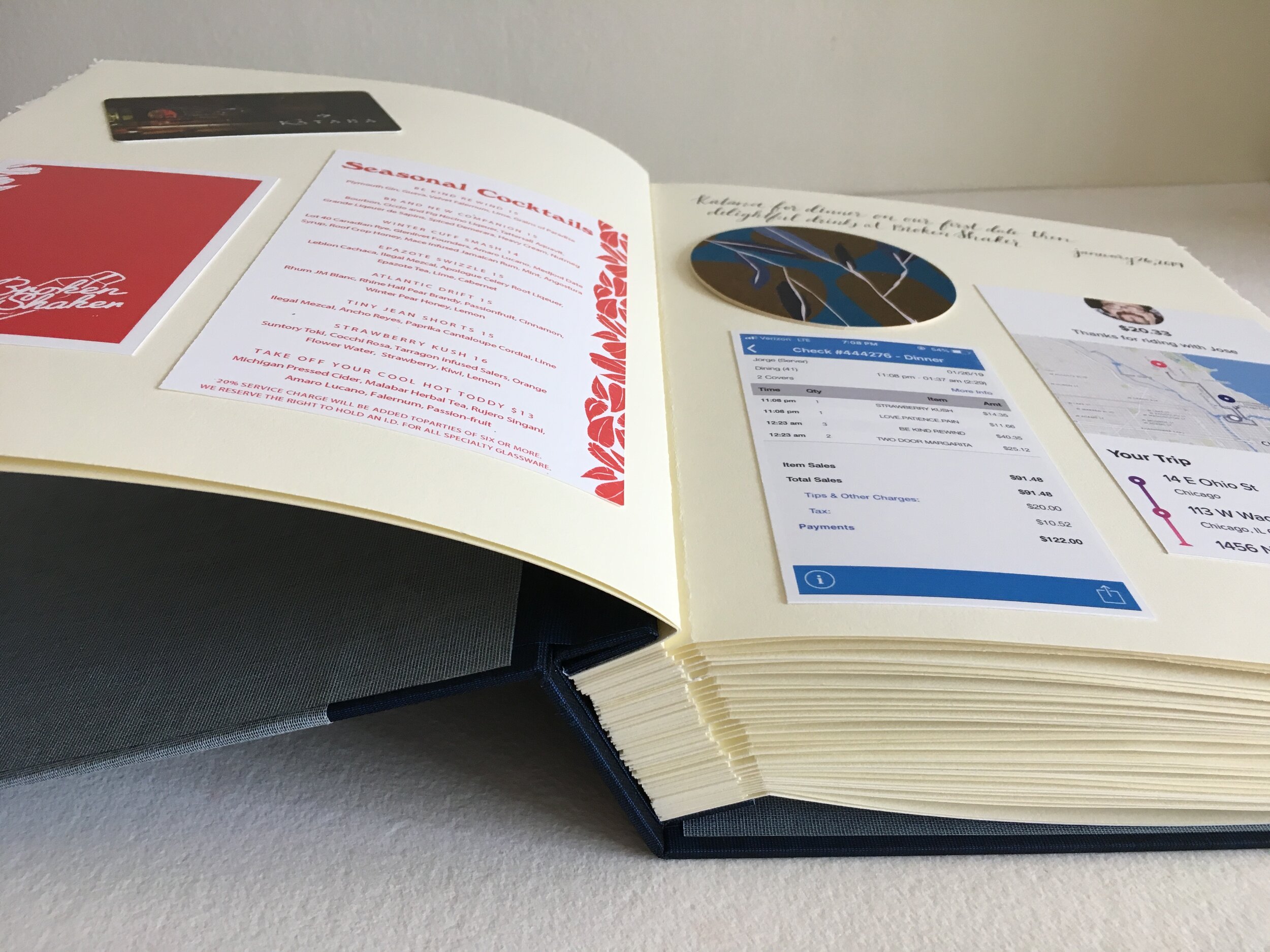
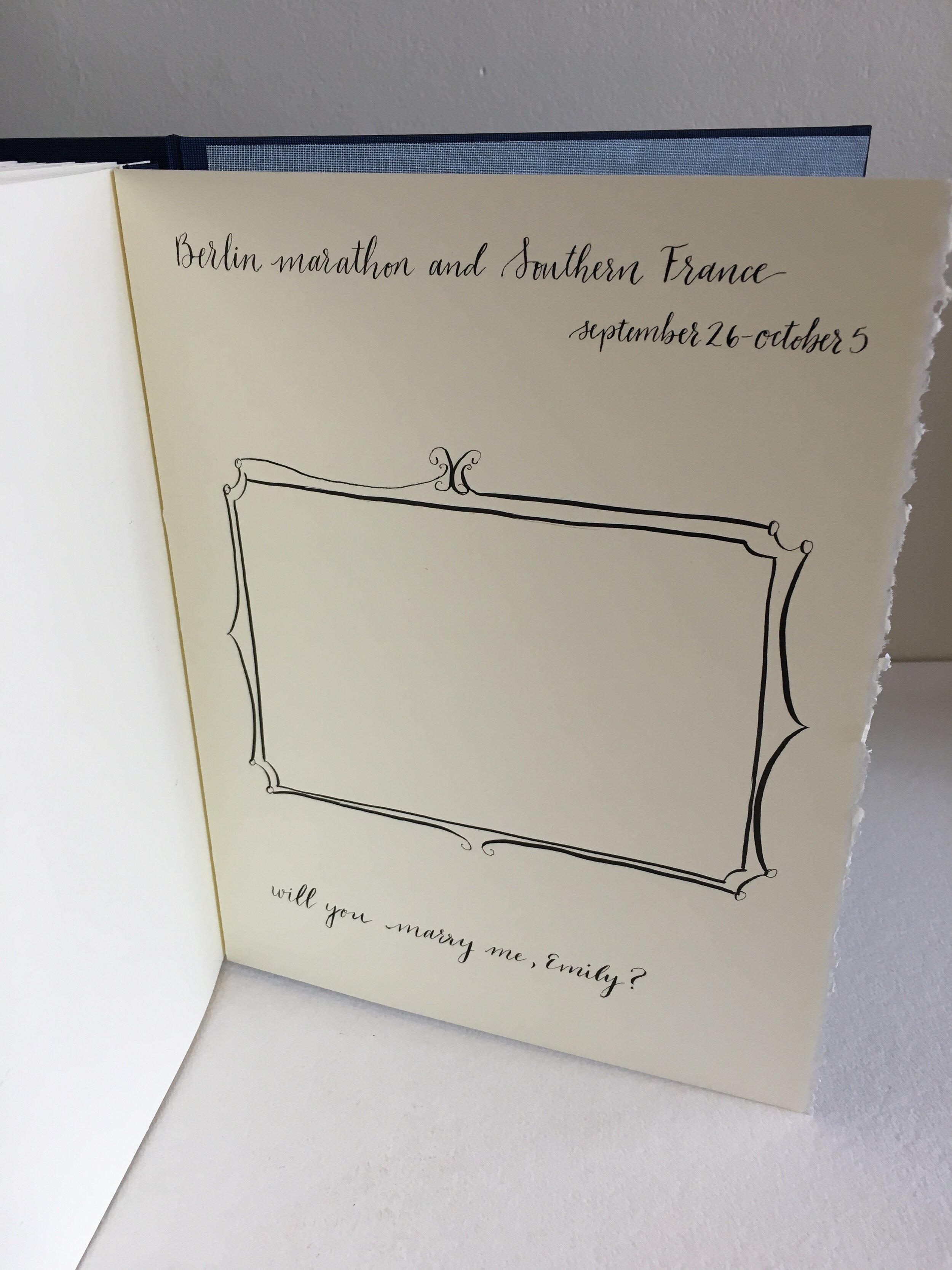
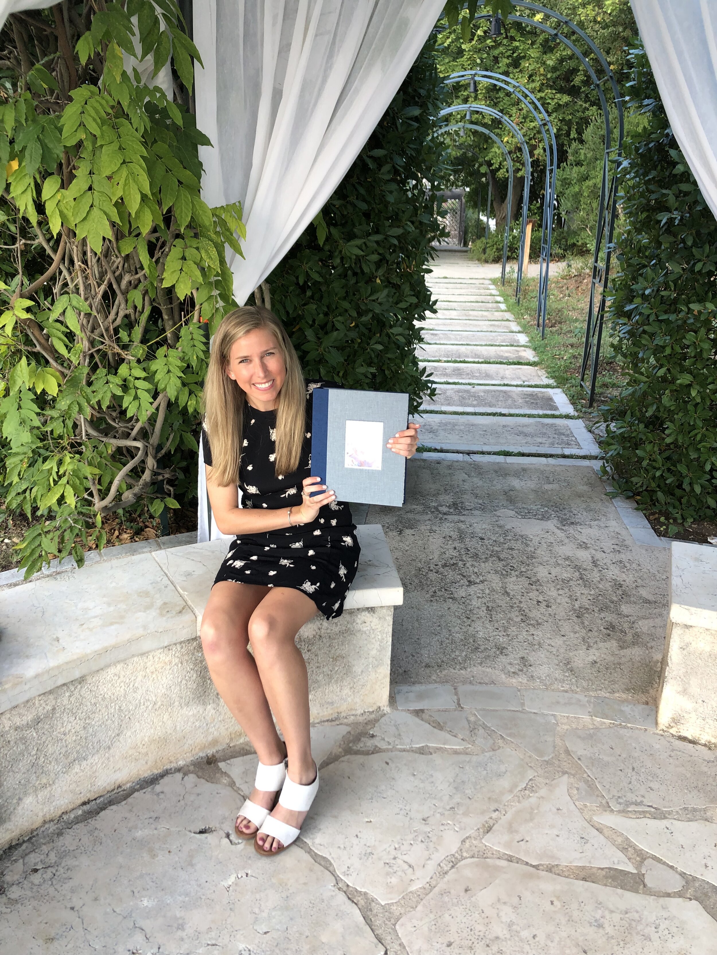
Spenser wanted to document the story of his & Emily’s romance in a “proposal book.” He planned to smuggle the book in his luggage, to present to Emily when he proposed to her in the South of France.
Spenser’s pre-proposal travel schedule was such that a couple of our meetings took place on Facetime, to confirm which ephemera—menus, receipts, tickets, and other keepsakes—went with which date. Spenser also emailed me wonderful photos, which I printed on my Epson with photo-lustre paper (a beautiful surface, not flat matte, it has a hint of shine).
I recommended a screw-post binding, with spacers in the spine between all the pages, to make the spine as thick as the book would become. The pages (almost 30) are Stonehenge, which is my favourite paper for basically everything; from drawing to bookbinding, from envelope-making to shop tags. Each page features a photograph and/or ephemera, all affixed with archival adhesive.
The cover and spine are two shades of blue linen. A recess in the front cover frames a photo of Emily & Spenser. The charming calligraphy at the top of the pages—and the hand-drawn frame on the last page (which will hold the official proposal photo!)—is the hand of Ashley Reich, a budding Chicago calligrapher and long-time habitué of my studio.
I was thrilled to receive Spenser’s three-word email from The Continent: “She said yes!” Once again, I marvel at how technology has become such an integral part of my bookbinding life, culminating in the creation of a handmade, totally tactile, incredibly personal book … in the name of love.
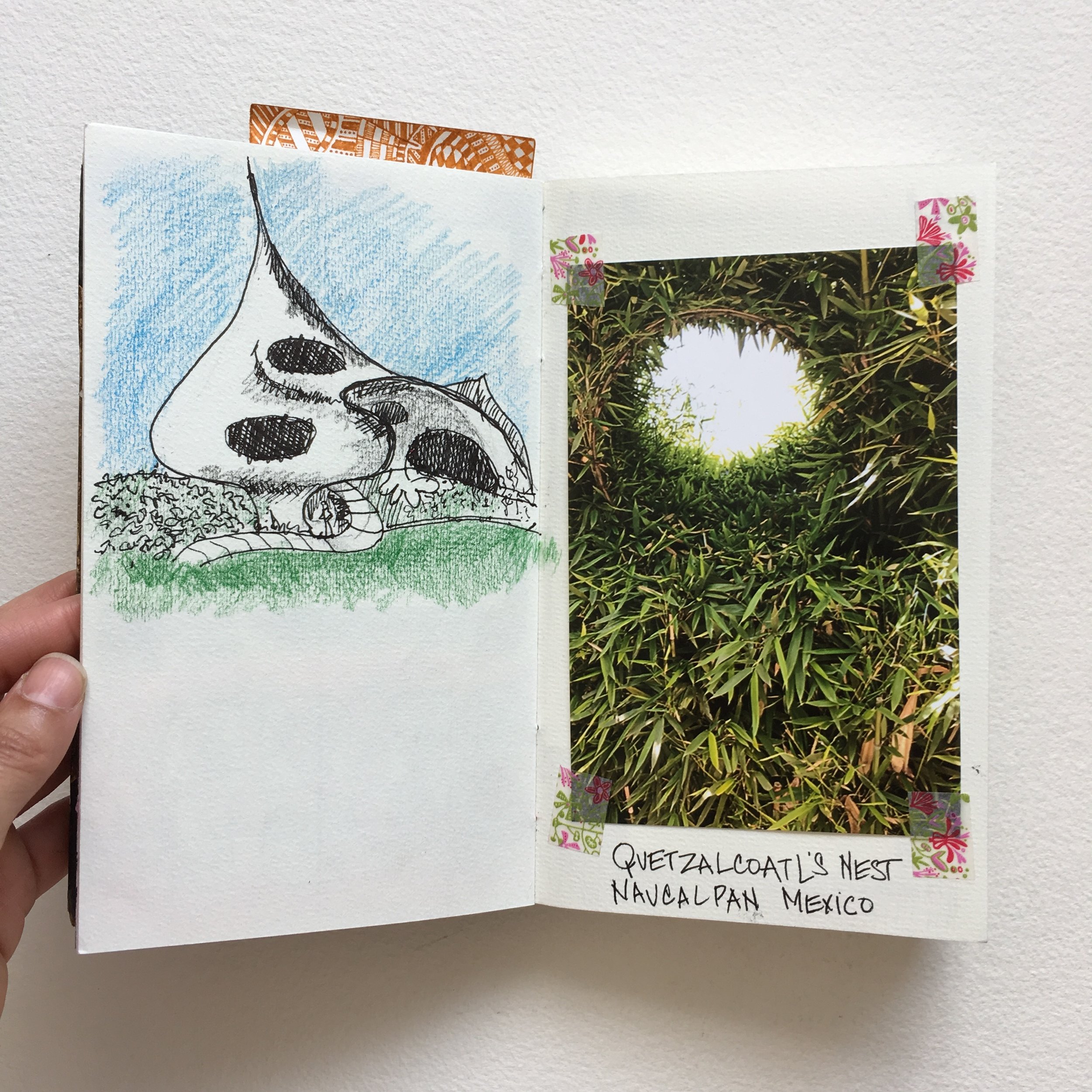
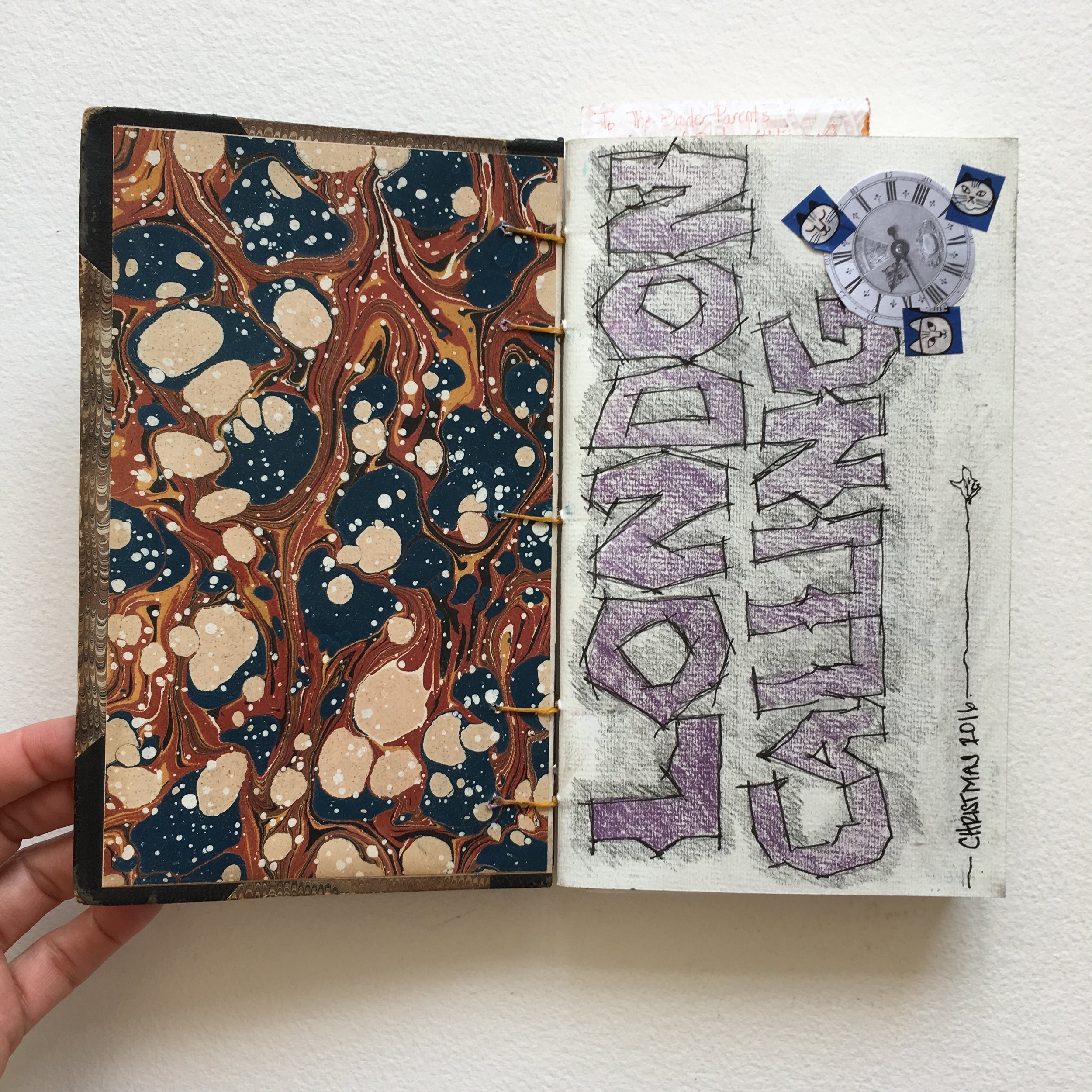
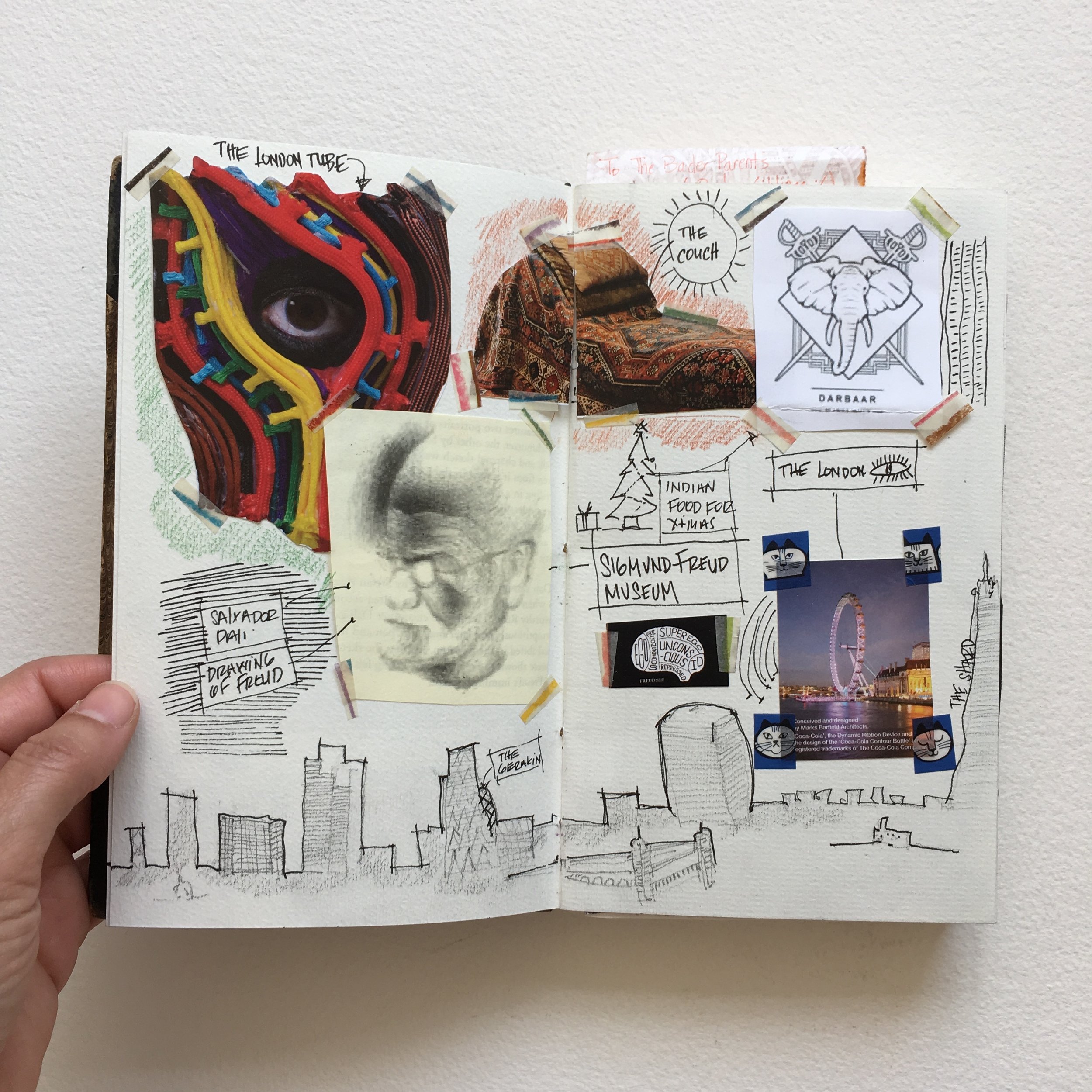
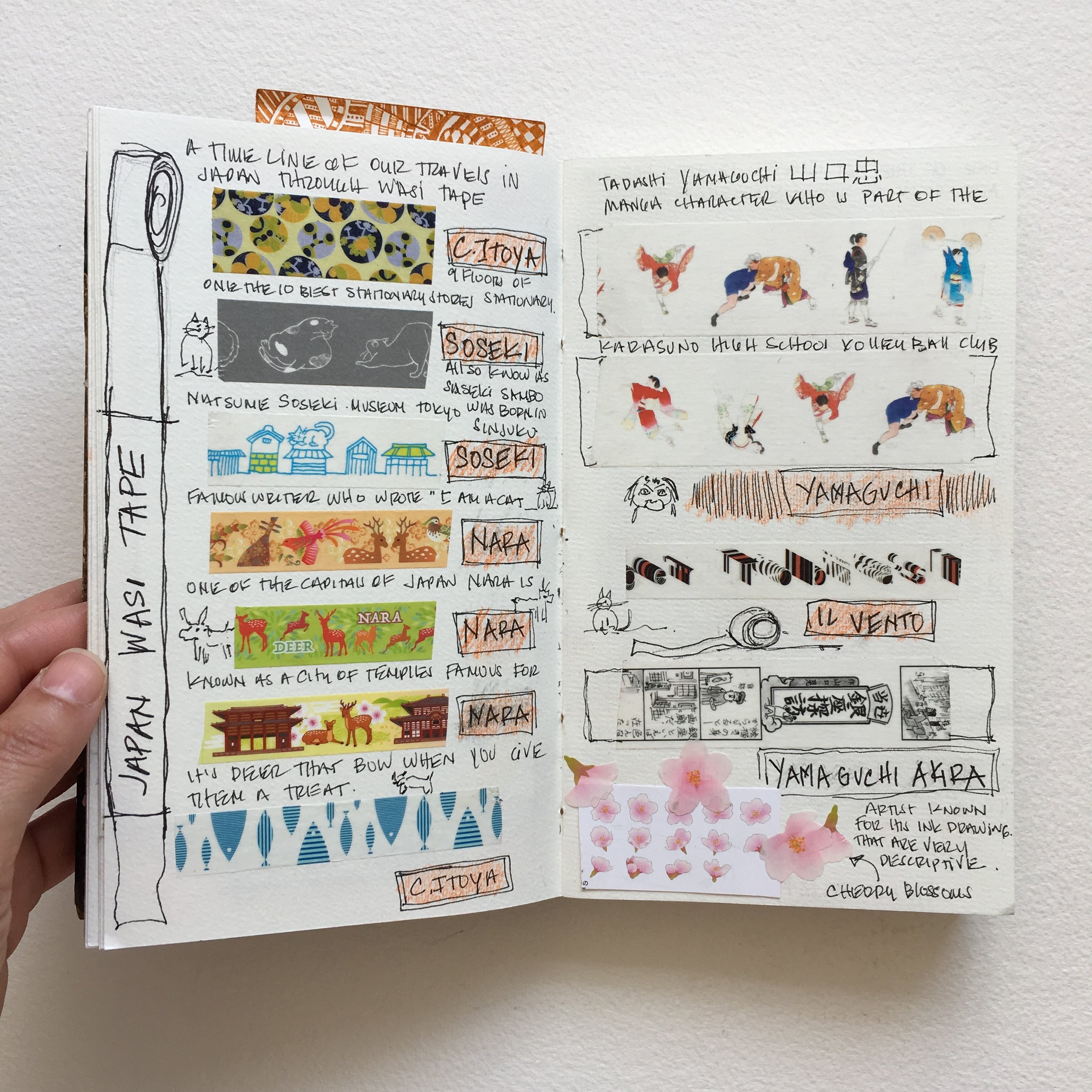
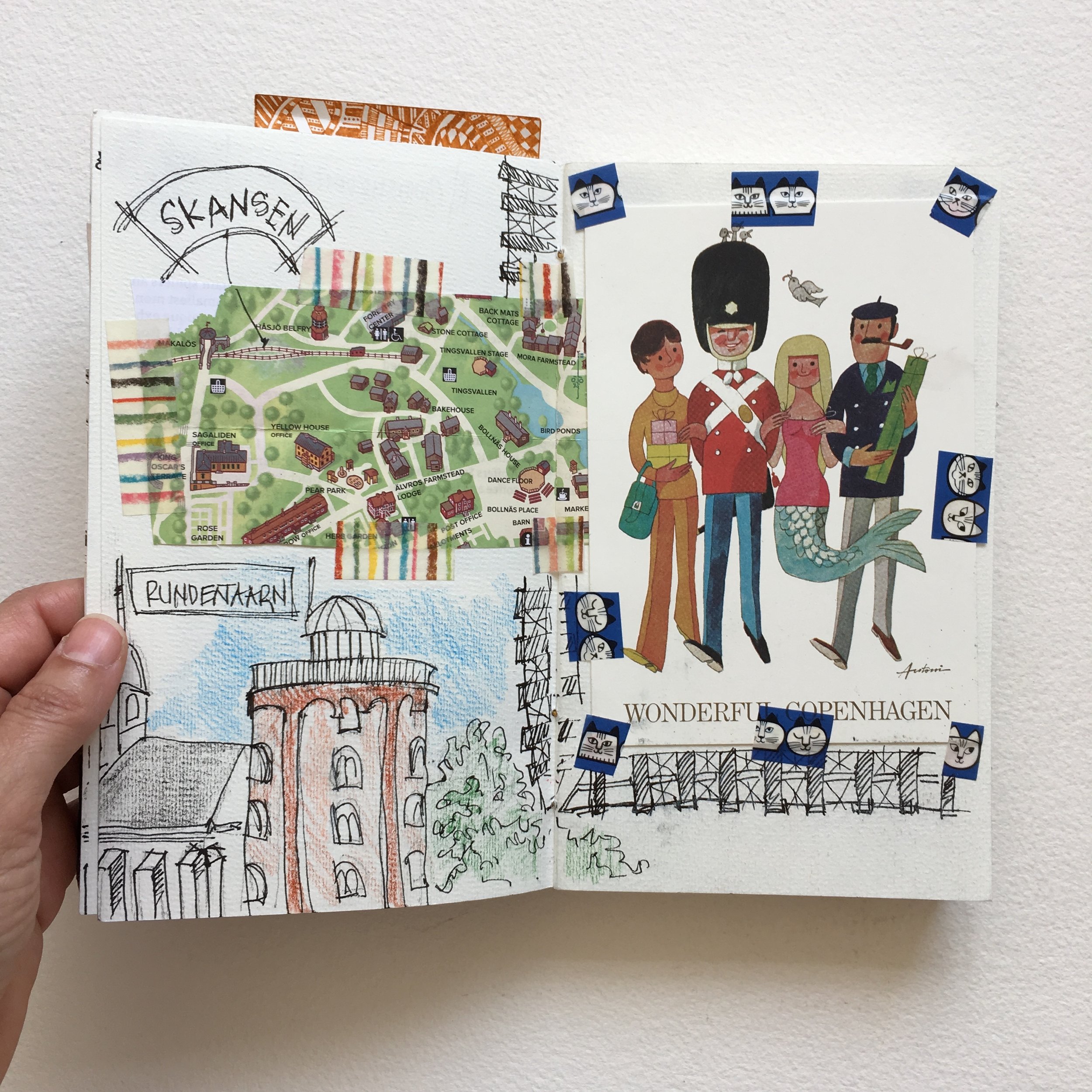
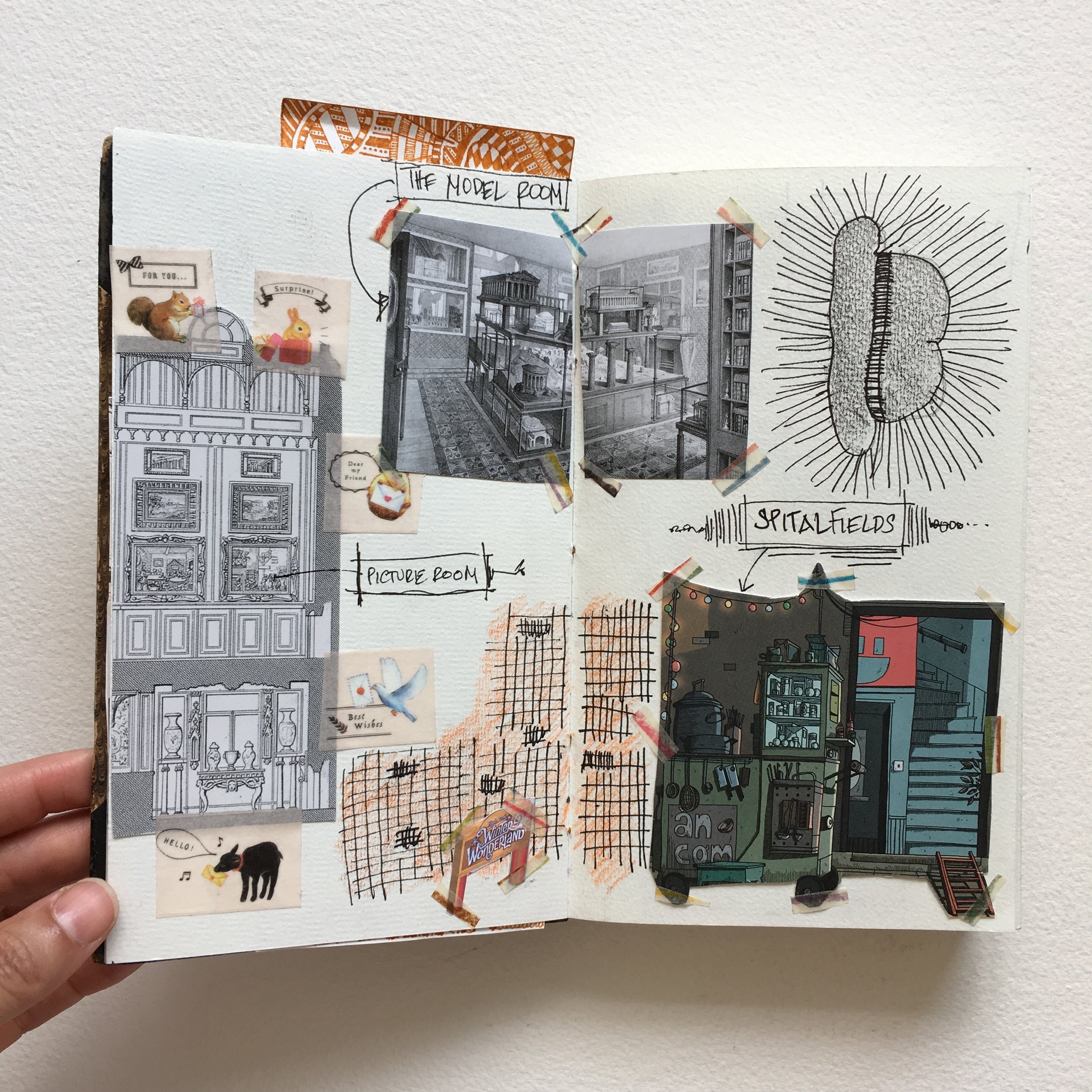
Travelogue: around the world in 80-some pages
[ June 2018 ]
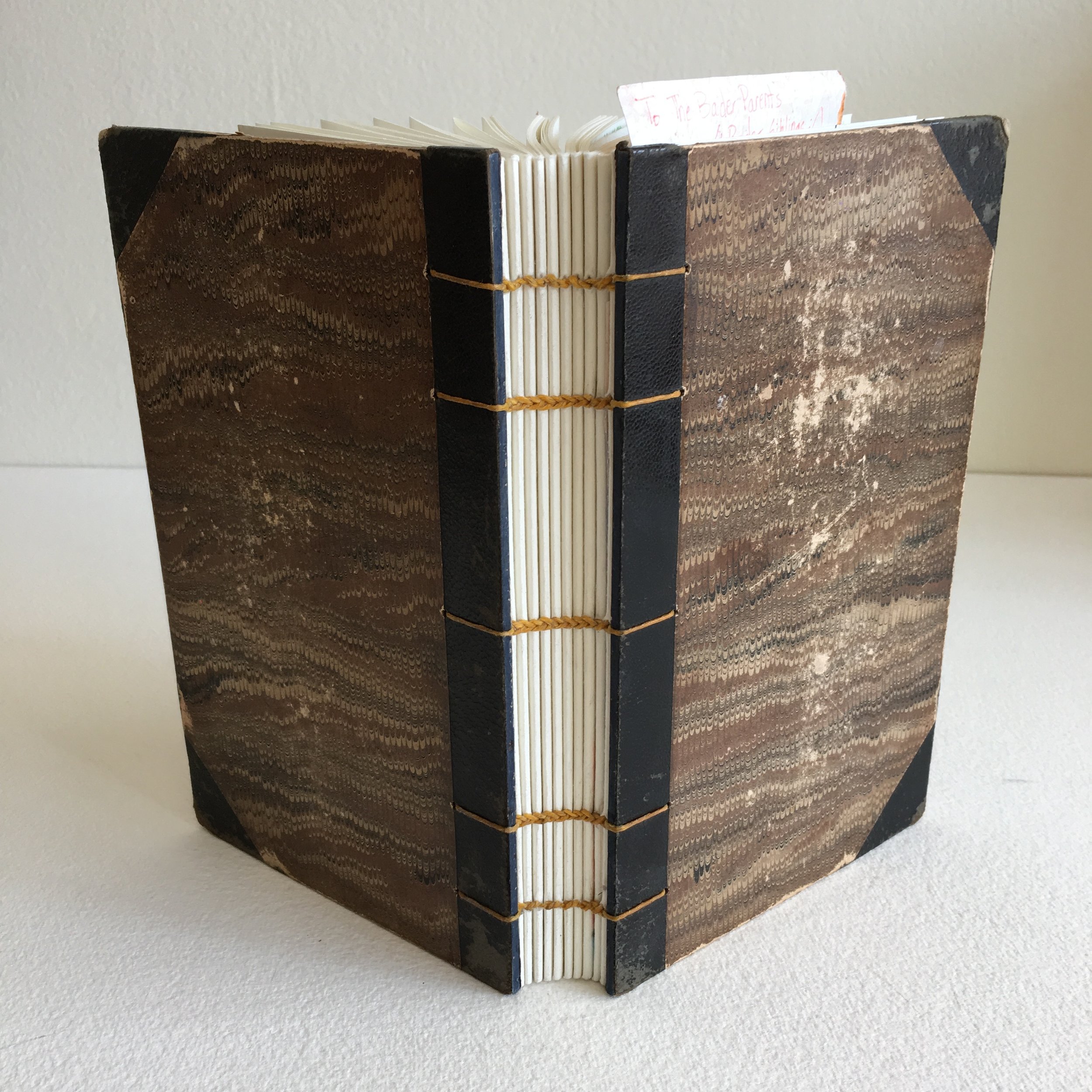
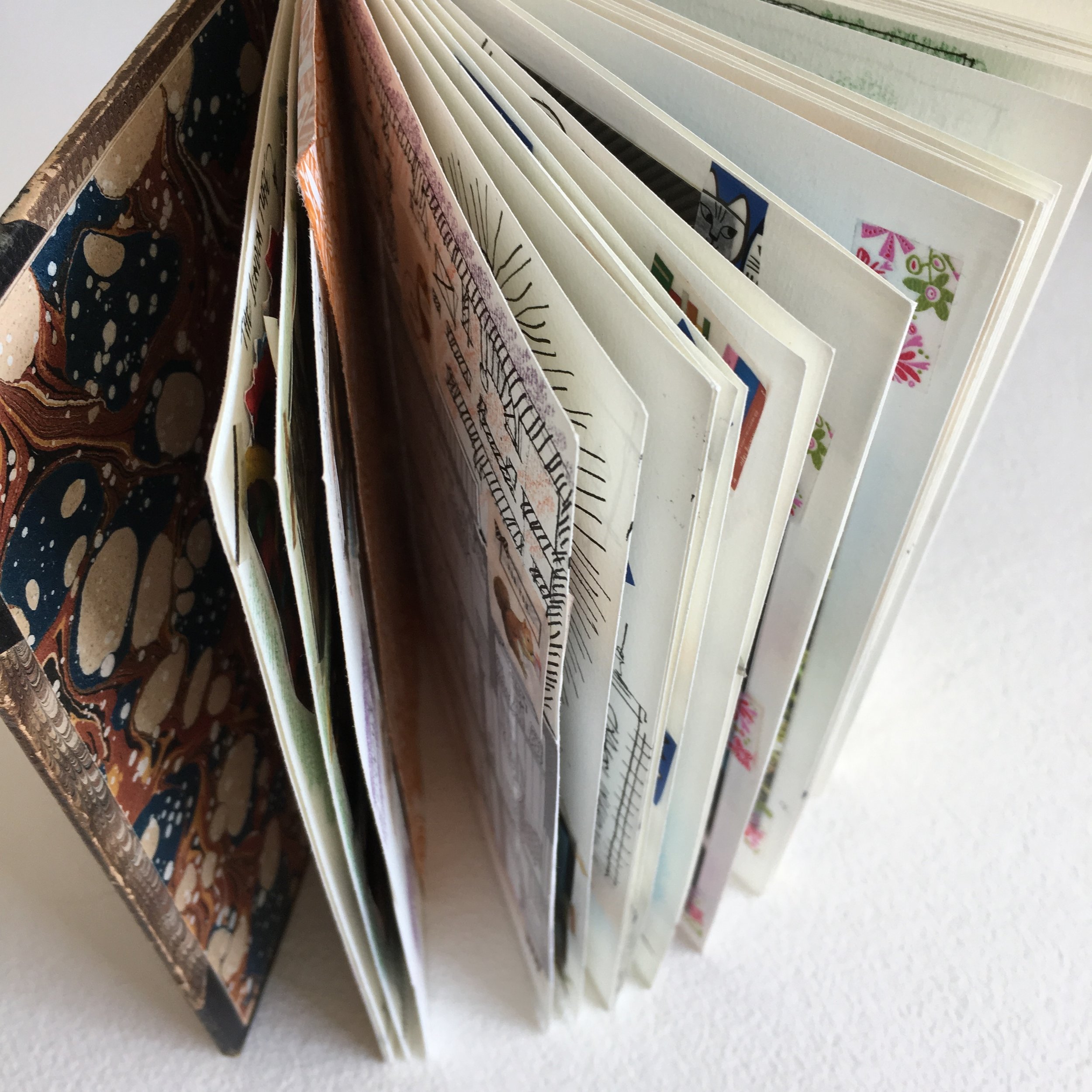
Several years ago, a dear customer purchased one of my Coptic-stitch blank books with a vintage cover— before she had any particular plans for it. Four or five years later, she decided it would be a perfect home for her travel ephemera collected on various trips. Coptic-stitch binding involves making a series of knots in the stitching, and these provide a smidge of space between pages at the spine edge. Thankfully, this spacing allowed the client to attach her bits of paper, ticket stubs, and magazine clippings to the pages without the book starting to bulge.
The blank book she had chosen had no title on the original cover. The hand-marbled paper was protected with leather corners, which had become pleasingly distressed. The endpapers had fared less well and were so damaged that we decided to replace them with surplus endpapers we had liberated from another vintage book. The interior pages of the blank book are Hahnemühle Bugra mouldmade paper from the Czech Republic. How nice that one of our go-to papers forms the backdrop for this global travelogue.
Johnston: a family memoir
[ December 2018 ]


Grace Roth Johnston (1877–1962) wrote her memoir manuscripts in the 1930s, ’40s, and ’50s, intending their primary audience to be her children, who had long prompted her to record various aspects of her life. My client, one of Grace’s grandsons, wanted to produce the memoir in a very printerly and elegant manner for generations to come.
The three shorter memoir sections are bound pamphlet style; the four lengthier are bound Japanese style. All sections are stitched with the same silk linen thread. The limited edition covers are handmade paper, made from table linens that had belonged to Grace. For one of the sections, papermaker Pam DeLuco pressed a piece of lace tablecloth into the still-damp paper, creating a beautiful embossed pattern. For the trade edition, the covers are printed on Mohawk Superfine (matching the text pages of both editions). In the trade edition, we included a swatch of the “tablecloth cover” in a glassine sleeve, so that recipients can use it as a bookmark.
Minotaure: French art revue from the 1930s

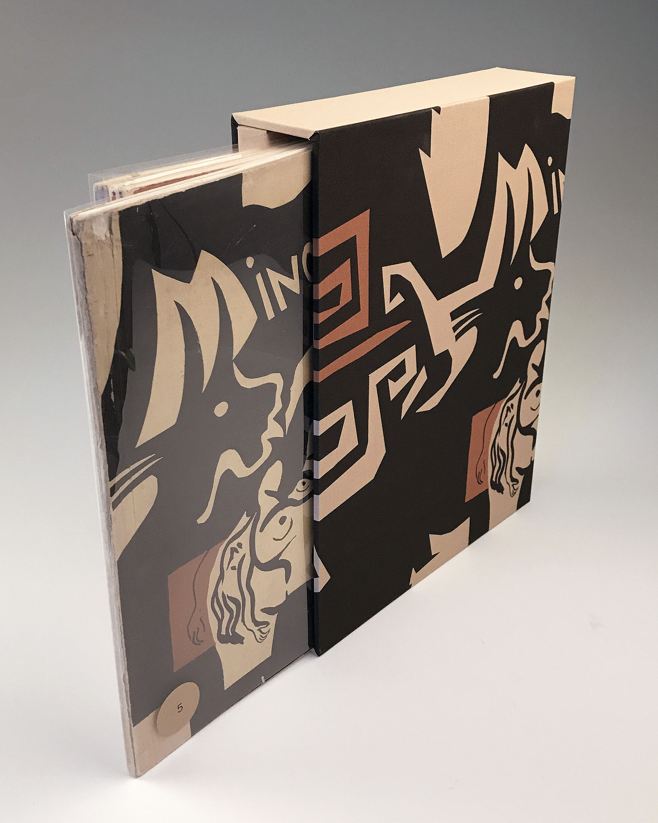

The client wanted a way to present her complete set of Minotaure magazines. Published in Paris between 1933 and 1939, each of the 11 issues features richly-illustrated articles on the art, architecture, and design of the day. Each cover showcased an original representation of the mythical Minotaur by prestigious artists, including Pablo Picasso and Salvador Dali.
The client’s creative muse and I decided to cover the four slipcases using a single enlargement of one of the client’s favorite Minotaure covers. The image, inkjet-printed on bookcloth, was reproduced four times, to wrap each slipcase separately. However, the image needed to shift 2 inches on each slipcase, to create one continuous spine image.
I made a spacer for the interior of each case, ½ inch wide, to hold the magazines upright. Without this, the slipcases wouldn’t have been wide enough for their spines to show the entire image. The spacers are covered in tan fabric and glued in place.
Family Album: off the wall & onto the page


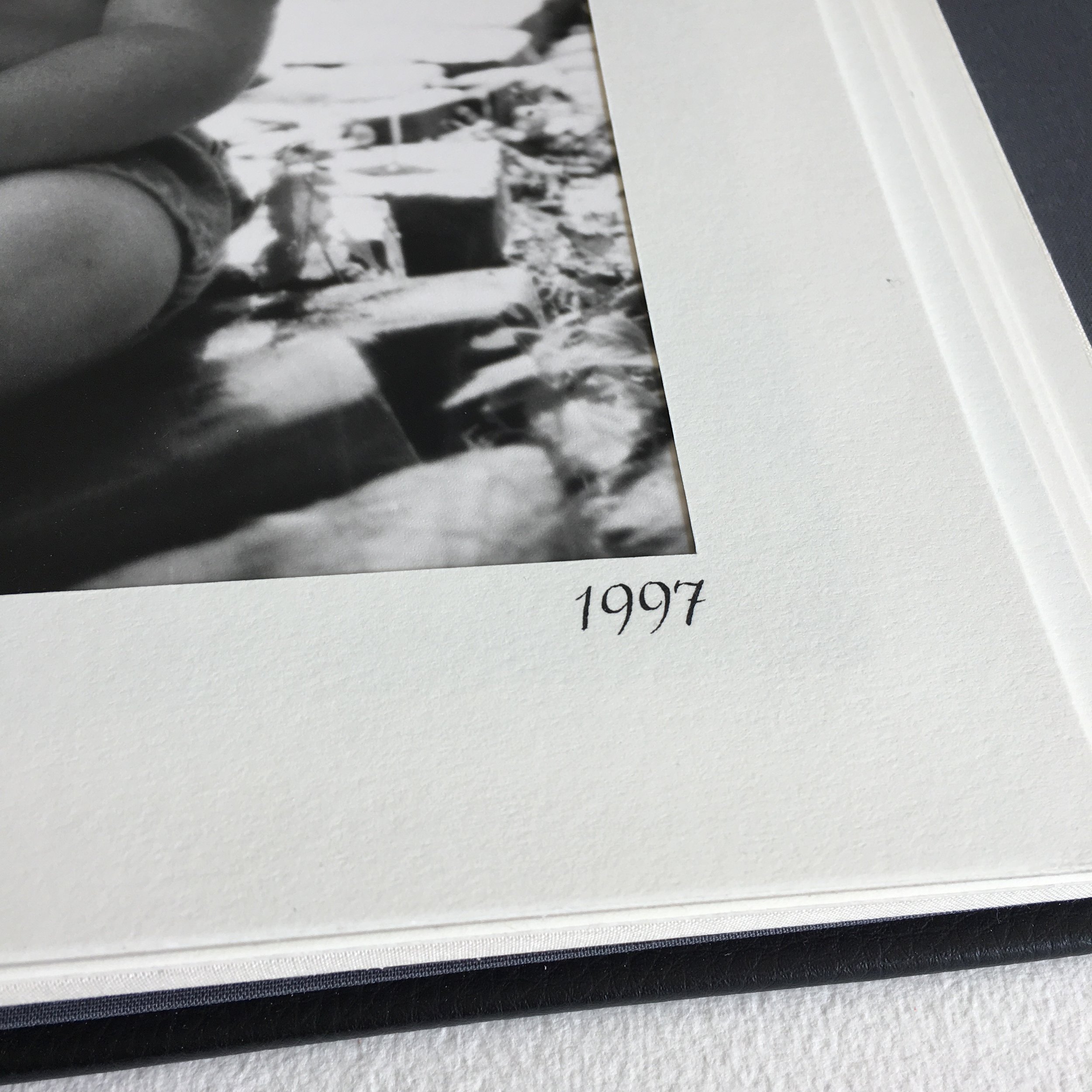
The client wanted to transfer her collection of framed large photographs of her four children to an album. The photographs, all professionally shot, documented four entire childhoods, from infancy to young adulthood. Fortunately, all of the photos were the same size.
However, once we began removing them from their frames, a variety of backings were revealed, including board and archival foam core—presenting significantly different thicknesses. We left the backings intact. The next phase involved cutting an archival mat to frame the image, and completely covering the backside with the same archival paper. So, the pages match on both sides, making for a lovely aesthetic experience. The pages are double hinged for easy turning.
We made a pair of albums, each presenting 16 photos, which allowed for more comfortable browsing (and reminiscing). The screw-post albums are covered in upholstery leather, foil-stamped in matte silver. Finally, calligrapher Julie WIldman noted the year of each photograph on the front mat.
Phone Case Duo
The client wanted to replace his smart phone’s aging protective case, which he liked to also keep notepaper in for jotting. The one design detail he wanted to replicate was the ribbon closure with embedded magnet. To cover the case, we proposed a sturdy coated buckram for longevity, with a complementary grosgrain ribbon. The client promptly decided to also commission a large-format version to hold a pad of letter-size legal paper.
Noteworthy detail: The phone case is the most shallow box we’ve ever built, just about ½ inch. When we began designing the box for the legal pad, we made it exactly the same depth.


Wedding Card Book


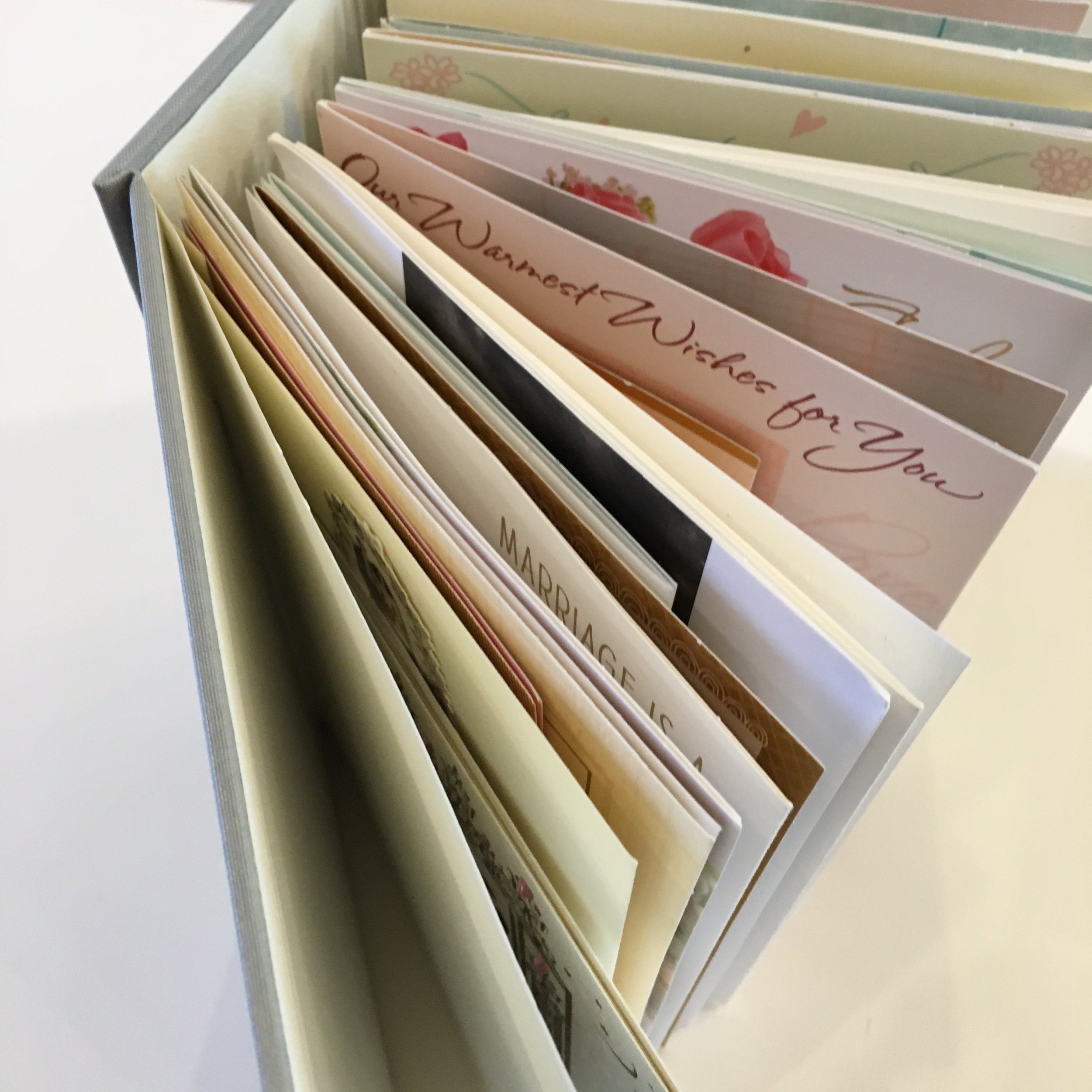
The client entrusted to me all the cards she and her husband had received on the occasion of their marriage. The stack was 4 inches tall, and the cards were of varying sizes, including a couple of fairly tiny ones. It would have been simple to construct a beautiful box to hold them all, but the client had seen a “book of cards” online and loved the idea.
Each card is individually sewn by hand along its fold to bind it into the book structure. The cover (front, back, spine, and hinges) houses the book block. We debossed (by hand) a small panel on the front to inset a card with the date of the wedding and a graphic motif from the invitation.
Noteworthy detail: This is the thickest book we have sewn (yet)!


Alphabet of Distinction
Lettering artist Julie Wildman (wildmandesigns.com) purchased this book at my studio sale in 2013. The long-stitch binding uses waxed linen thread. The archival paper for the cover, handmade by Timothy Barrett, is 100% flax. (Timothy is director of the University of Iowa Center for the Book and the recipient of a 2009 MacArthur Foundation Genius Grant for his papermaking.) Interior pages are Fabriano Artistico.
Julie used this book to create an alphabet book as her entry in the Chicago Calligraphy Collective’s annual exhibition at the Newberry Library. Each year, the Library purchases one work from the show for their permanent collection… and Julie was the recipient of that year's Newberry Purchase Prize.
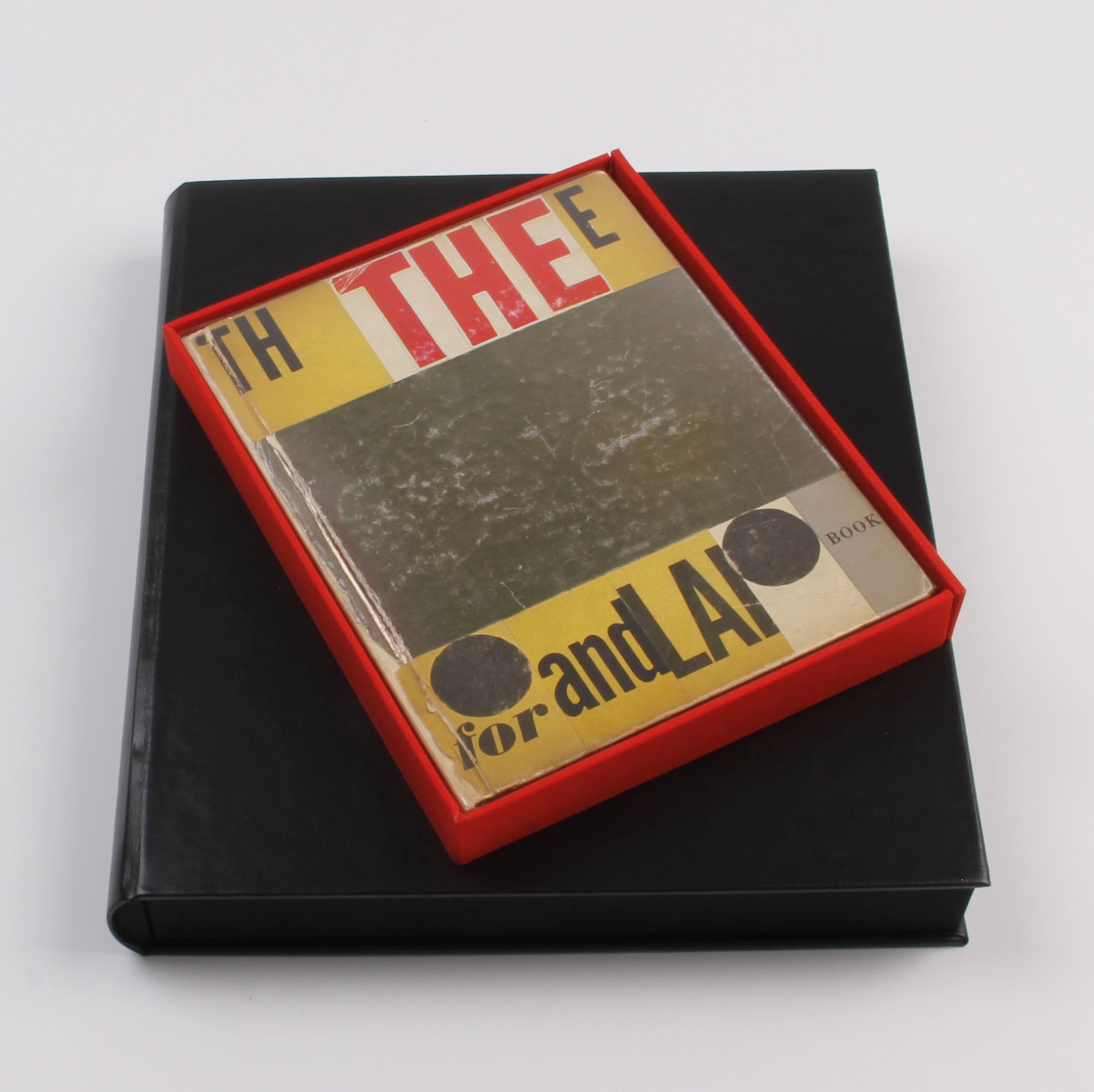
Presentation Box
The box to house this altered book by Fluxus artist Ray Johnson is a rounded drop-spine construction, covered in leatherette. The tray holding the book is covered in red linen, and the entire right edge of the tray is a drop-leaf with a pair of magnetic closures.


"Socialist Industry" designed by El Lissitsky


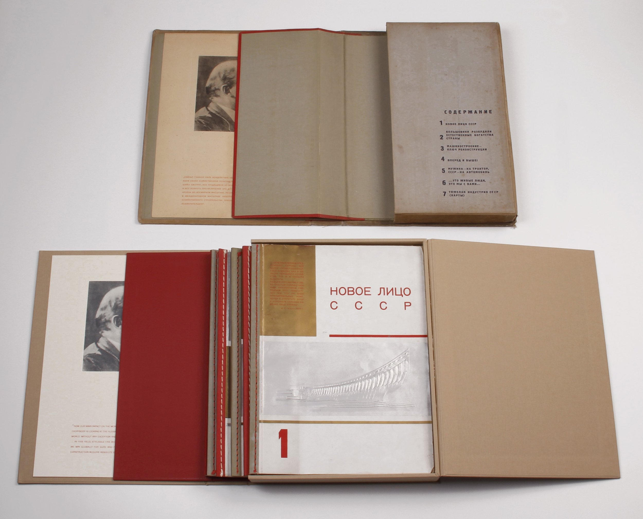

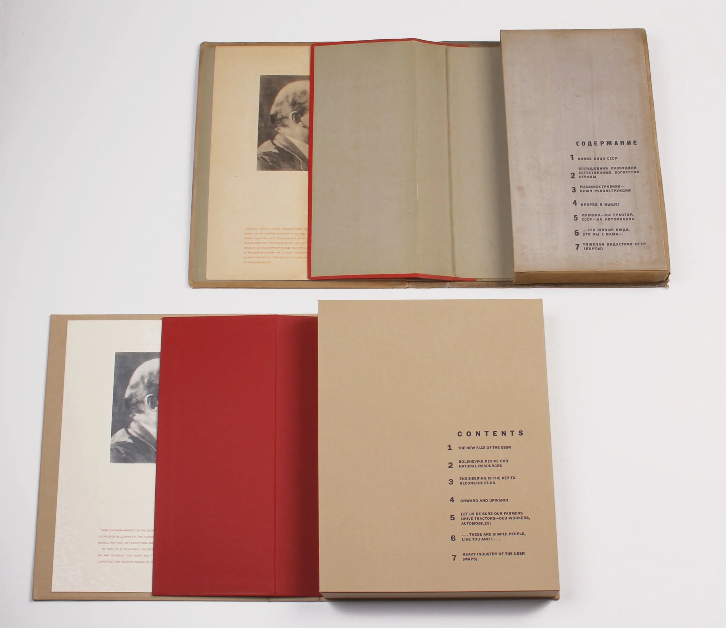
This project involved creating a portfolio (approx. 14 x 10 x 3") to house a set of Soviet propaganda booklets from the 1940s in their vintage box, which had been “doctored” at some point. I designed a drop-spine box to allow easy access to the artworks without risk of further bending or crushing them. Four separate elements are foil stamped (2 red and 2 silver), requiring precise registration when covering the box. New archival materials maintain the look and feel of the original case.
Family History

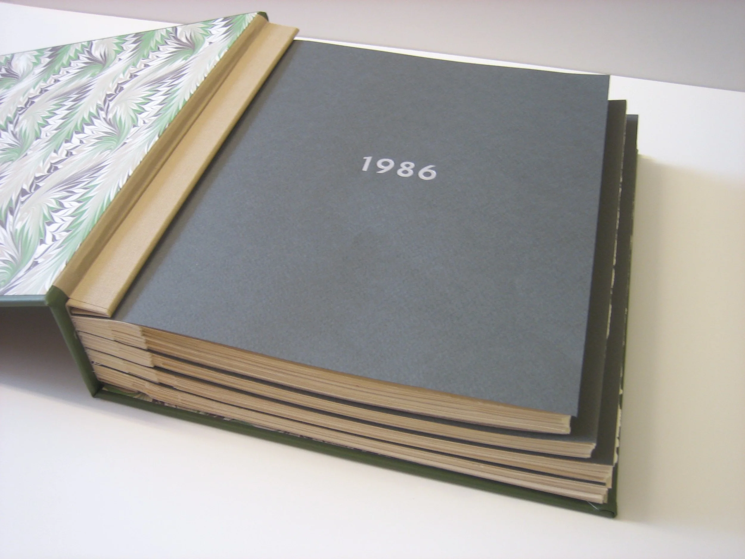


Starting in the 1970s, the client's mother made calendars for her family. Her son Jim wanted his children to enjoy their grandmother's handiwork, so he commissioned two albums. The calendar's size varied from year to year, and the albums' divider pages (Fabriano Tiziano, foil-stamped in matte silver) follow suit. Each calendar page is hinged and scored to French fold. End-sheets are hand-marbled Cockerell from Britain. A recess in the cover holds a family photo.


Paper Party Favors
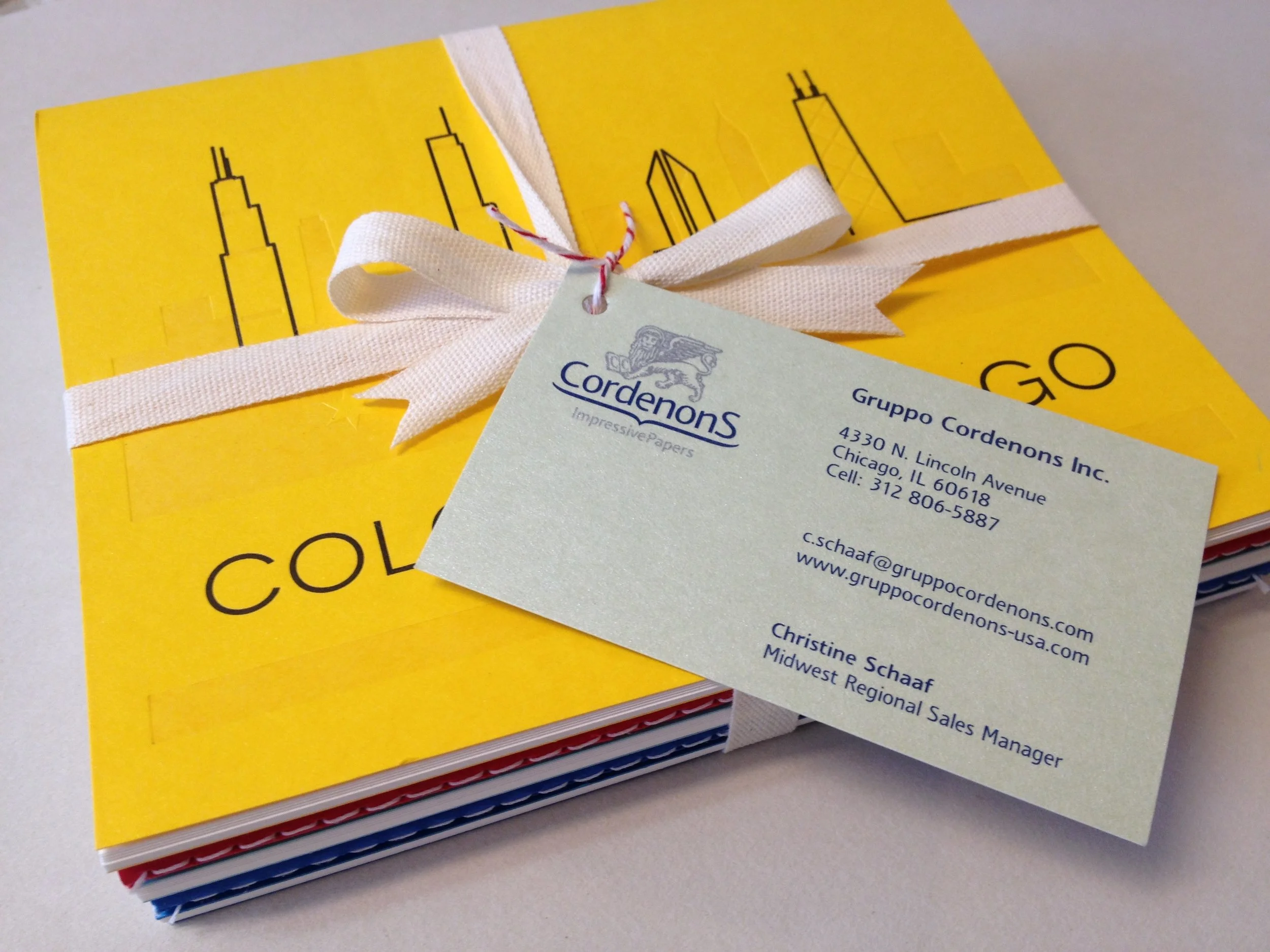
Italian papermakers Gruppo Cordenons hosted an event in Chicago, to re-introduce their papers to the design community. Each guest received a swag bag, including a set of pamphlet-style notebooks made for the occasion. I suggested a stitched binding (rather than stapled). Five notebooks were tied together with Italian cotton ribbon and the business card looped on with baker's twine. (500 sets)

Custom Storage
We constructed and covered ten boxes in Missoni fabric imported from Italy. The fabric was paper backed to allow for gluing. The finishing touch is a double-thick, double-wide Mokuba satin ribbon tab that allows the box to slide out easily in the dressing room where the boxes now live. These are the largest boxes I’ve built (so far!).
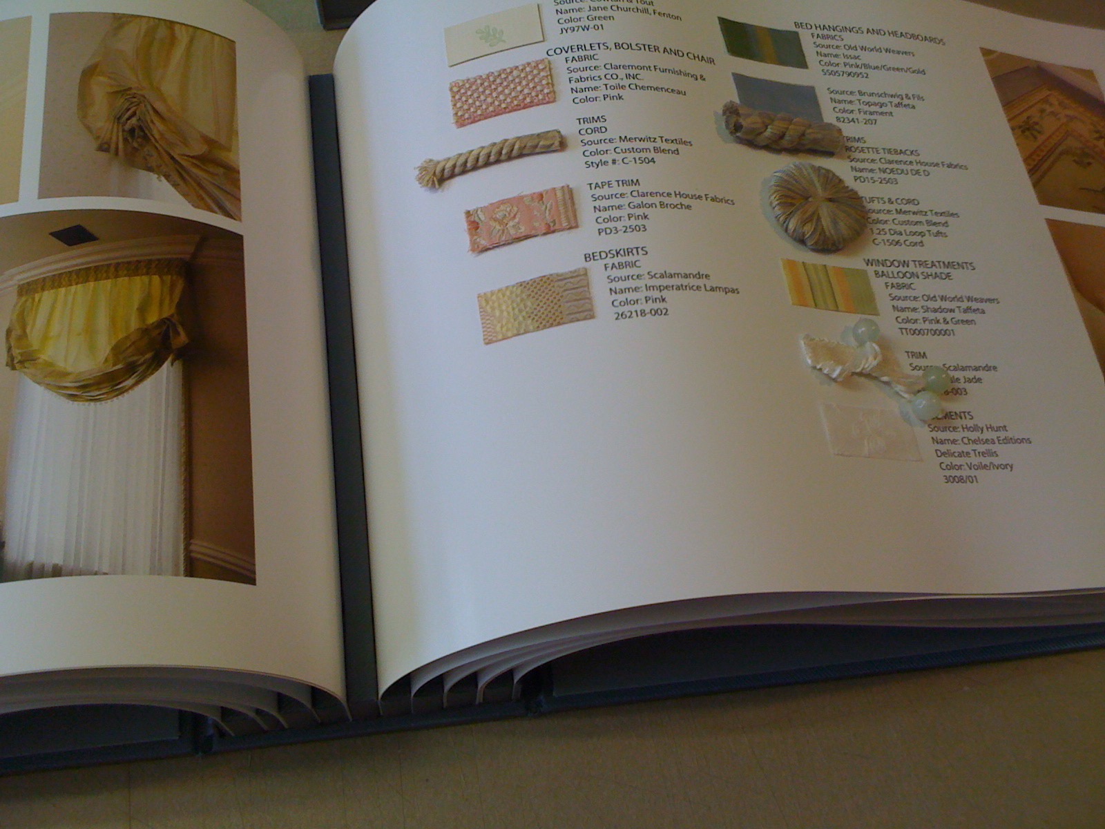
Delight Is in the Detail
An interior designer commissioned a keepsake album for her client, documenting the fabrics, passementeries, other materials, and wall and window treatments in the home. To accommodate the thickness of the various samples, I created spacer bars of foam core, covered in fabric matching the album binding and box.

To Hold a Cherished Volume
This drop-spine box is lined and covered in black linen. The Japanese decorative paper is stencil-dyed.

Set of Gentleman's Portfolios
Interior architect Darcy Bonner is a long-time client. For his new portfolios (13 x 19 inches), he selected the paper and ribbon combinations. Two of the marbled papers are from Atelier Flavio Aquilina, a Neapolitan hand-marbler whose "marbling concoction" gives the papers a vintage look. The other three are from Payhembury Marbled Papers in Cambridgeshire in the UK. All five portfolios have coordinating Japanese grosgrain ties. Each portfolio has three archival interior flaps to protect the contents and hold them in place.

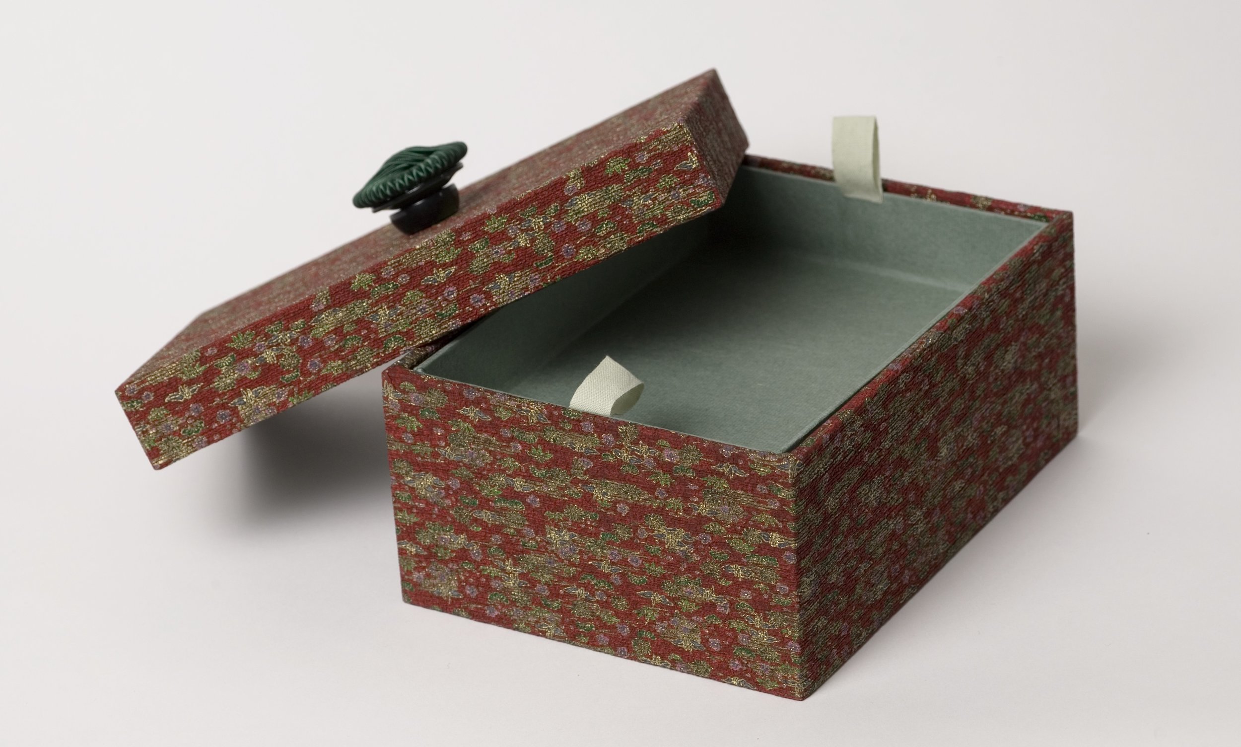

Jewelry Box a la Japonaise
This box is simply elegant on the outside, with a button for lifting the lid. Outside dimensions are 7 x 9 x 4 inches The box is covered in crinkly Kodai paper from Japan.
Construction: The tray (très perfect for pearls) rests atop built-in compartments. Tray is fully covered in Moriki, a complementary uncrinkly paper; cotton ribbon loops attached to the tray allow easy removal and resetting. Compartments are lined in Japanese Momi, a crinkly paper.

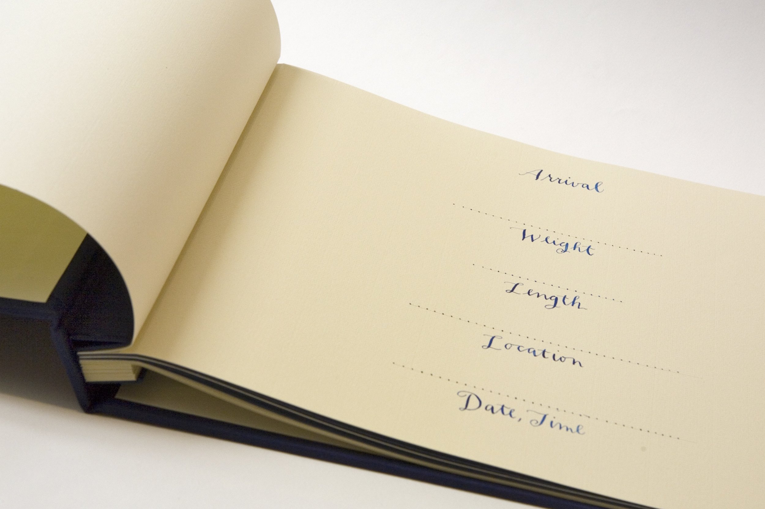
Owen's First Book
Screw-post binder (10 x 12 inches) with Japanese cloth cover and recessed panel for calligraphed name card. Multi-coloured pages: pale blue and deep blue are hand-lettered in white; cream and white pages are hand-lettered in blue. Many pages provide spaces for recording Owen's statistics and memorable moments. Calligraphy by annebenjamin.com.

Tribute Book for Patty
Commissioned for a long-time executive with McDonald's on the occasion of her retirement to honor her years of service. The client provided a continuous digital output — taller than Patty herself! — which I scored and folded into an accordion-format and then affixed to covers, in this case heavy bookboard wrapped in linen. A recessed square on the cover frames a tipped-on McDonald's logo. Overall dimensions: 6 x 8 inches.
Photos Courtesy of Joe DeNatale


S.R. Crown Hall
Presented to the Crown family to commemorate the 50th anniversary of the dedication of S.R. Crown Hall, and to celebrate the Hall's completed renovation. (For a virtual tour of this Ludwig Mies van der Rohe landmark on the campus of the Illinois Institute of Technology, visit www.coudal.com/mies.php)
Right: Warm gray linen wrap-around cover. The front is debossed with a large line drawing of S.R. Crown Hall. Overall dimensions are 10” x 13”.
Left: Three 1/2“ screw-posts are hidden by a covered tab. The binder holds approximately 30 pages with drilled holes and opens completely flat for viewing. Architectural drawings make the perfect endpapers.