May we draw your attention to the first-ever BZS drawing?

Dear Everyone ~

We invite Everyone to enter our drawing, to be held on Monday, May 13, 2024. Guess how you enter? By sending a 5 x 7 postcard (no envelopes, please) to A–Z at Bari Zaki Studio, 3858 N. Lincoln Avenue, Chicago, IL 60613. Your card will require real stamps (at least 68¢, not the postcard rate), and it must be received, via USPS, by Friday, May 10. Further practicalities below.

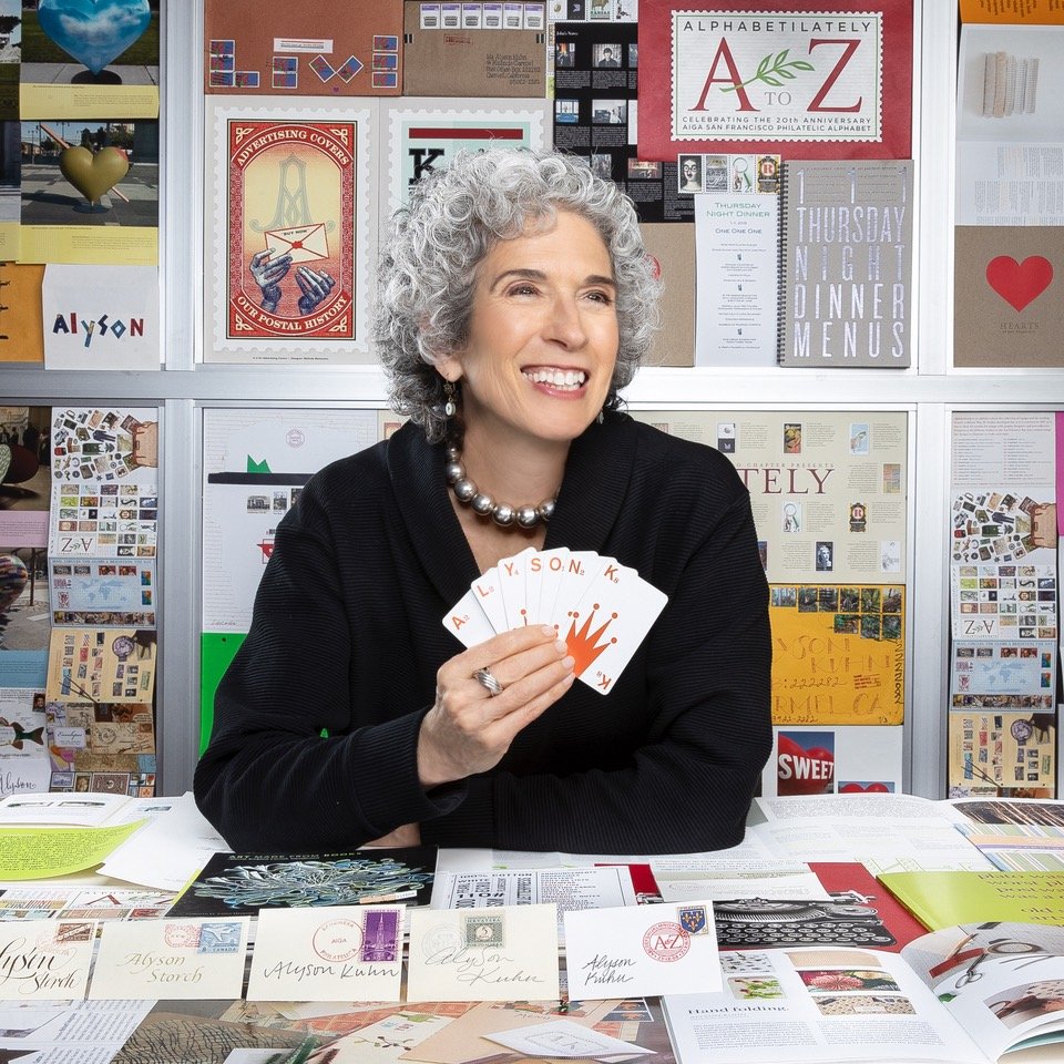
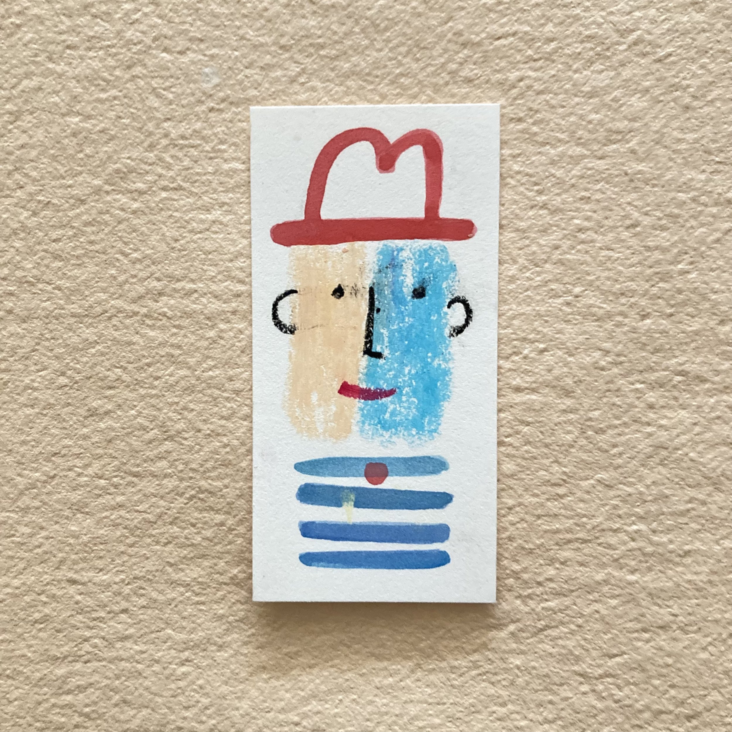
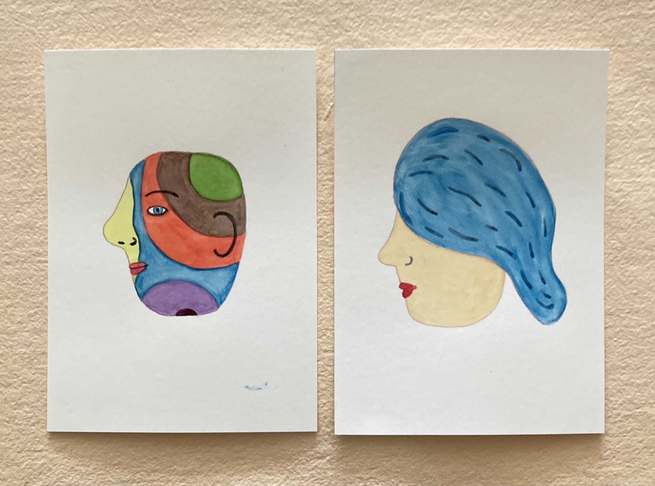
Let us not put the card before the hoarse. Here, as pithily as possible, is an explanation of why we are having a drawing. My postal muse, Alyson Kuhn, is coming to Chicago with her niece Audrey Kuhn, another AK. (Photographer John Madere chose his favourite shot of Alyson, commenting, “You look like you’ve just won the Academy Award for Stationery!”) Audrey has her aunt’s stationery-hound inclinations, and her own jaunty hand-lettering style. Here is my freshest missive from Audrey, an homage to the arrival of spring. She notes, “This neon ombré ink pad is a bit more aggressive than I planned but maybe it reads as SPRING vs. spring.”

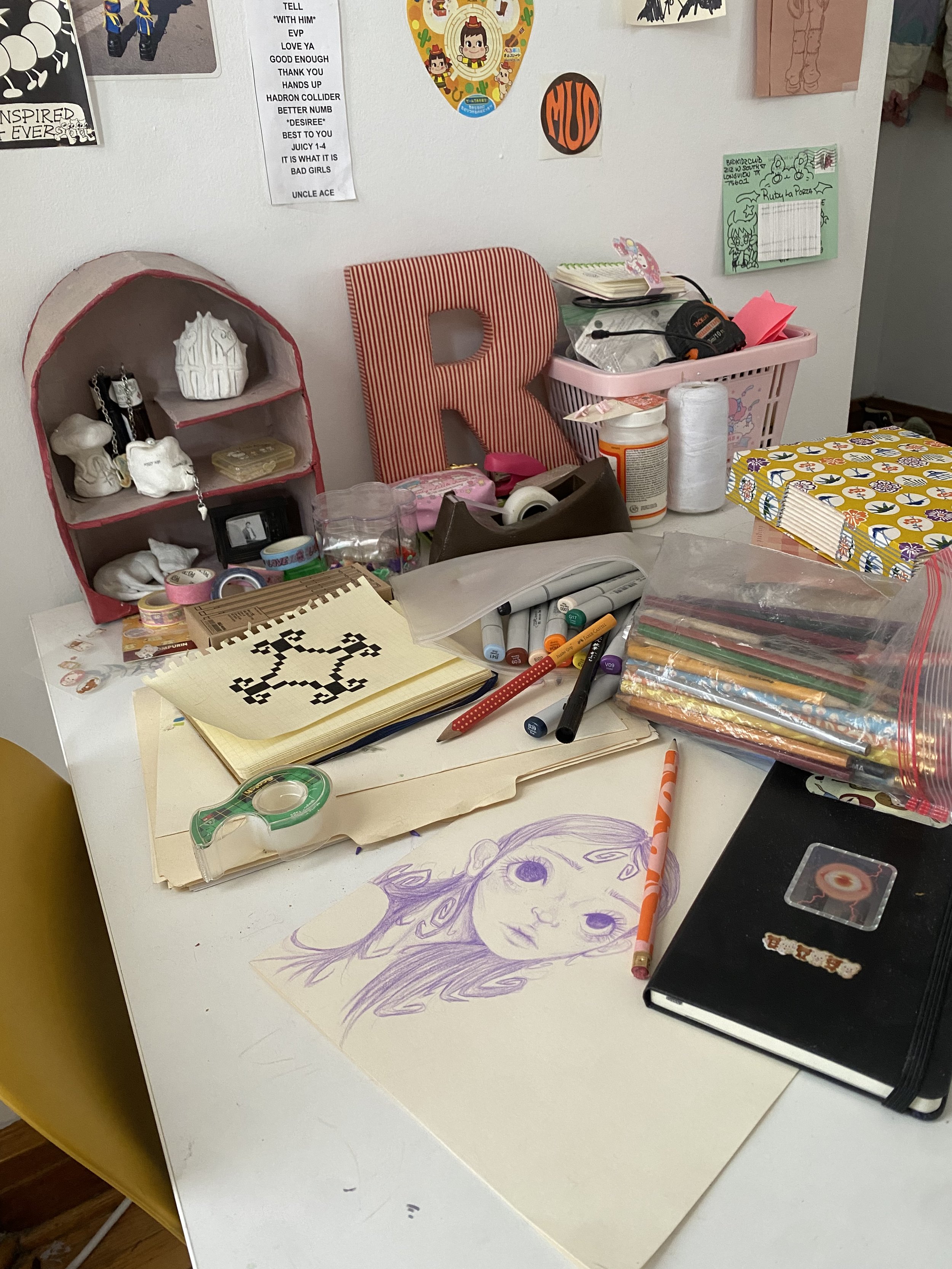
Who else will join our papery party? Ruby LaPorta, my current nimble shop assistant extraordinaire, will be there. Scene below is her desk in action.

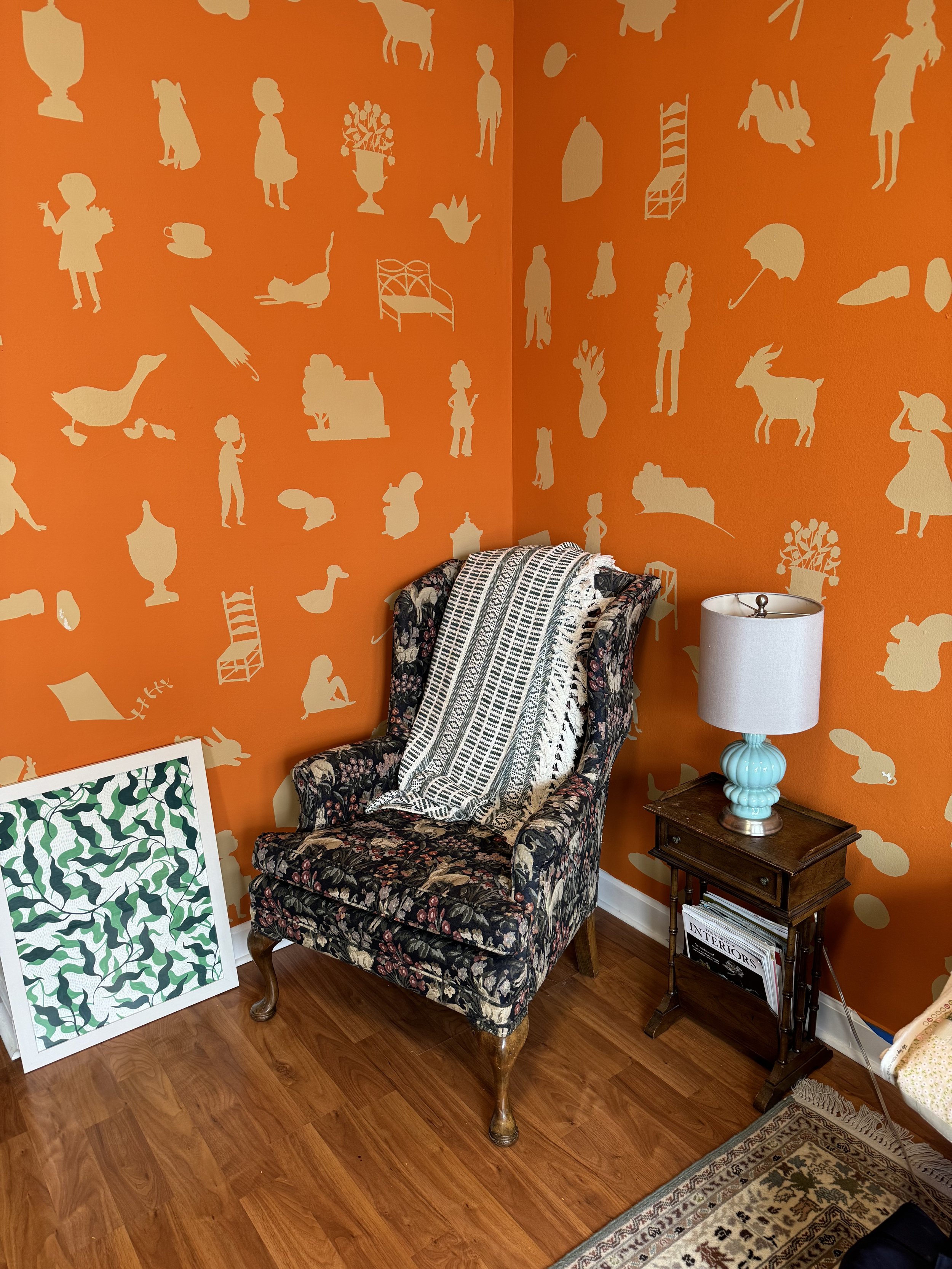
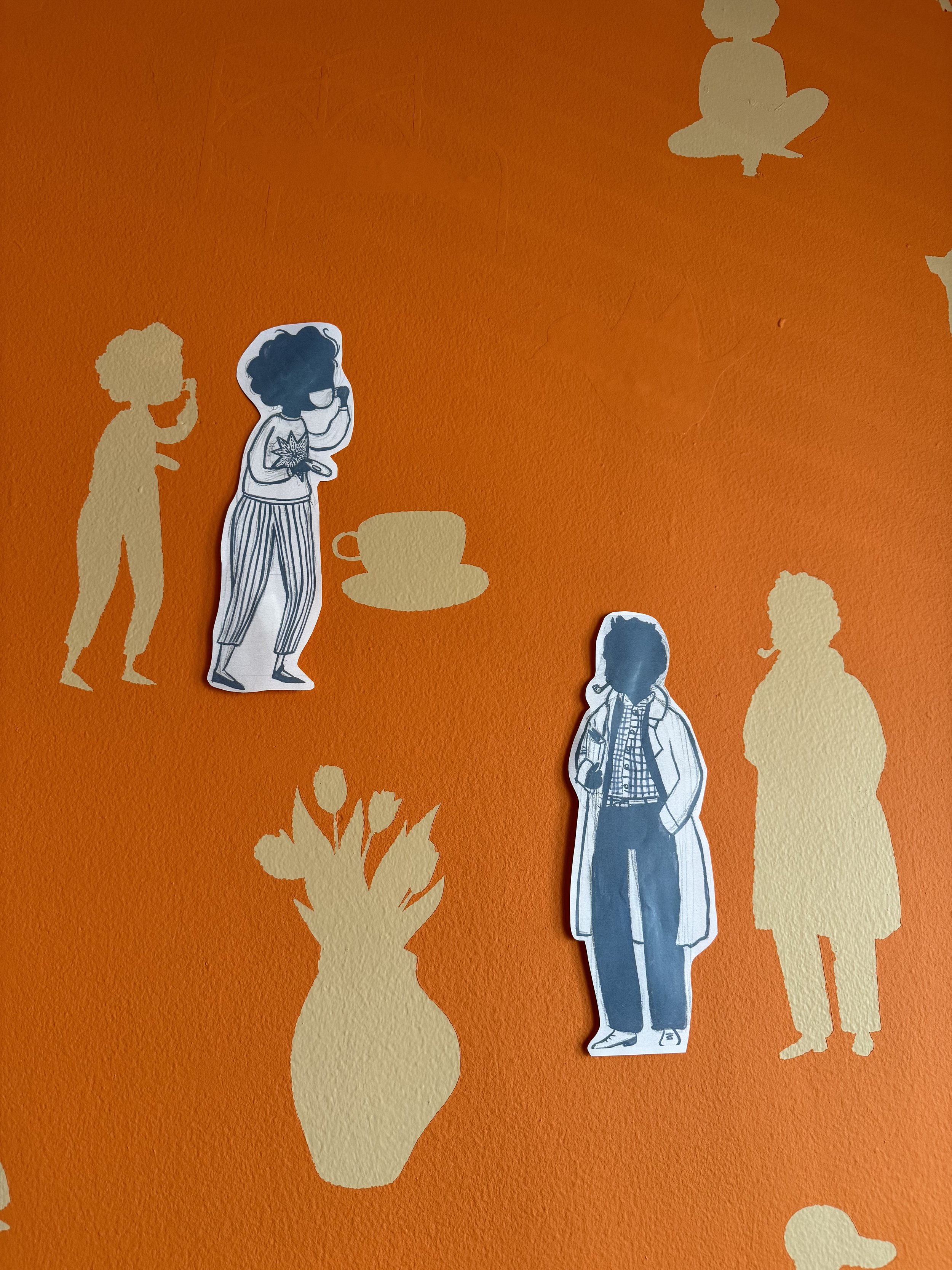
And Emmy Kennett, my original nimble shop assistant extraordinaire (now emerita). Scene below is her sitting room without her sitting in it. She’s in the process of painting the walls.

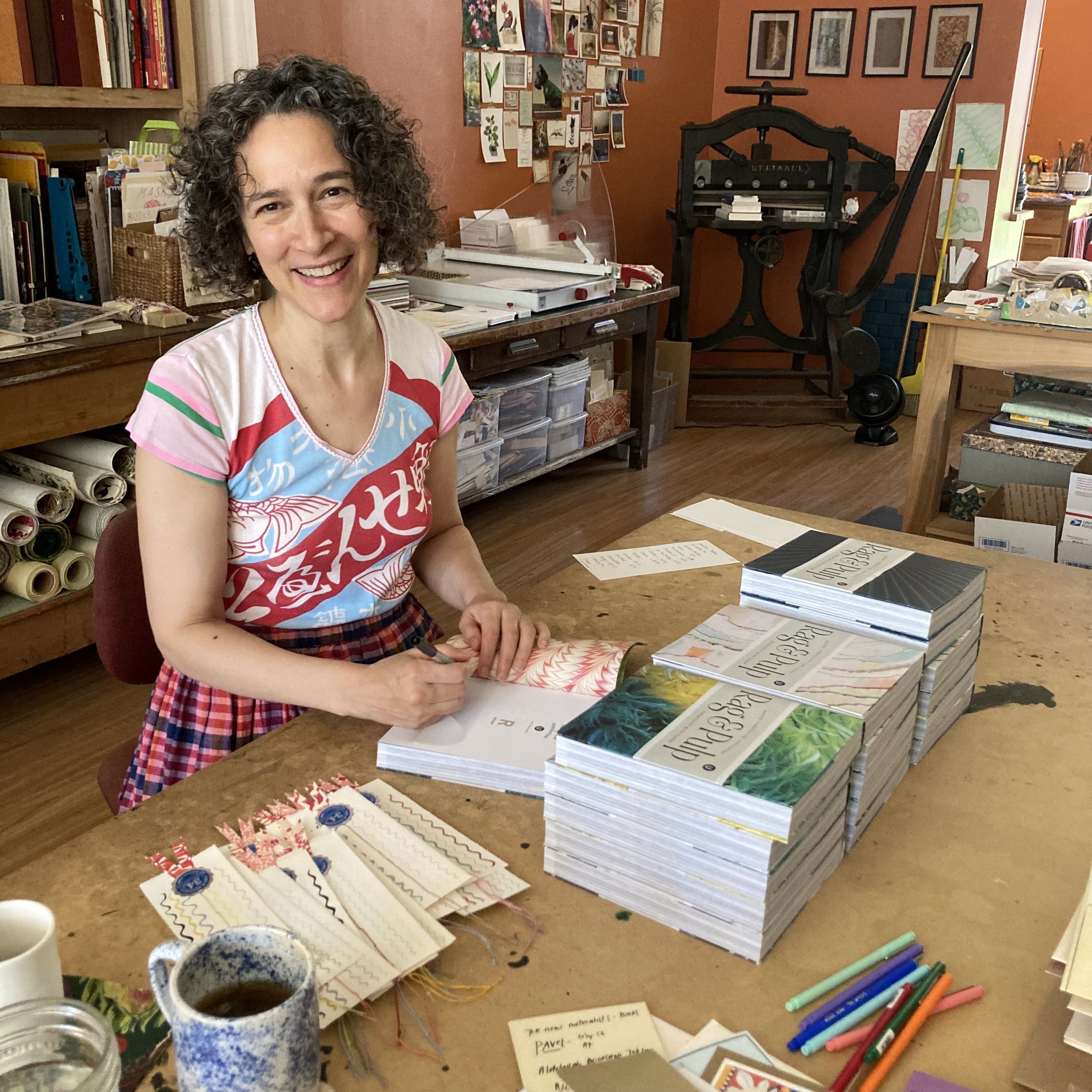
And Janet Bouldin, BZS’s in-house watercolourist & illustrator. Here she is in her home studio, painting BZS’s Rag & Pulp bookmarks.

And Tammy Stams, my co-stitcher, waxed-thread winder, and vintage-postage assembler. Below is Tammy’s craft emporium.

We have also invited Wendy Sherwood to motor in from The Wiilds of Minnesota to join us. Wendy is not The Mystery Guest, she is The Marble-y Guest, and she has made a previous guest appearance at BZS. Here she is, in her studio, with a wallpaper of actual sheets she has marbled… and a bounty of boxes she has covered.

So, the octet of us will have a paper-palooza. We will talk ourselves silly. We will bring each other papery party favours. And, most importantly, we will make something together… to give away to The Winner of the Drawing, who could be You! Not a kit, not a keepsake, more of a mini-compendium of our papery predilections… which is apt to be wrapped in a multi-media manner.
 
And Audrey will fabulously photodocument, both via vignette and video, the proceedings. Here she is, shooting for one of her restaurant clients. (Photographer Frankie Frankeny, Audrey’s mentor, took this photo, frankly perfect for our purposes.)

Back to your postcard: Include your full name and email address and show-or-tell us, on either side (or both!), visually or verbally, why you are entering, or something about your relationship with paper, or something else altogether. We will enjoy reading Everyone’s response—possibly together, possibly out loud— but this is not an essay contest. The winner will be chosen totally at random. In fact, the winning card will be pulled out of a hat. We cannot divulge at this moment who will do the actual drawing, but we can hint: We would describe the person as a local epistolary celebrity.  

And what will become of the glorious postcards? It’s absolutely too soon to tell. But when we know, so will you!
 
 Excitedly, Bari
Spring into spring with our freshest papery provisions

Dear Everyone ~

Organizing the array of cards on my card cabinet is a labour of double love, because the cabinet itself was a gift from Chuck when Aiko’s closed in 2008. For me, arranging a display of cards is akin to working on a jigsaw puzzle, which I find endlessly satisfying—especially when new cards arrive and I have a rationale for rearranging. The base of the cabinet has six roomy drawers, where I keep assorted paper & envelope reserves. The cabinet & its contents provide constant inspiration for envisioning what I will showcase.

Last week I received a much anticipated parcel from the U.K. brimming with notecards by colourist painter & printmaker Sophie Harding. For many moons I’ve swooned over her paintings and am delighted to be the first stockist of her cards in the U.S. 

 Also in the Department of Whimsical Mailables are sets of notecards by British artist Mary Fedden. I’ve stocked these pocket portfolio sets in the shop for several years. In-person shoppers have loved them, and I’m delighted to finally debut them online.

The delightment continues with a menagerie of PasteSF collage cards. Our current selection has been amply restocked and then some. We are pleased as paste to now be offering 18 Denise Fiedler cards.

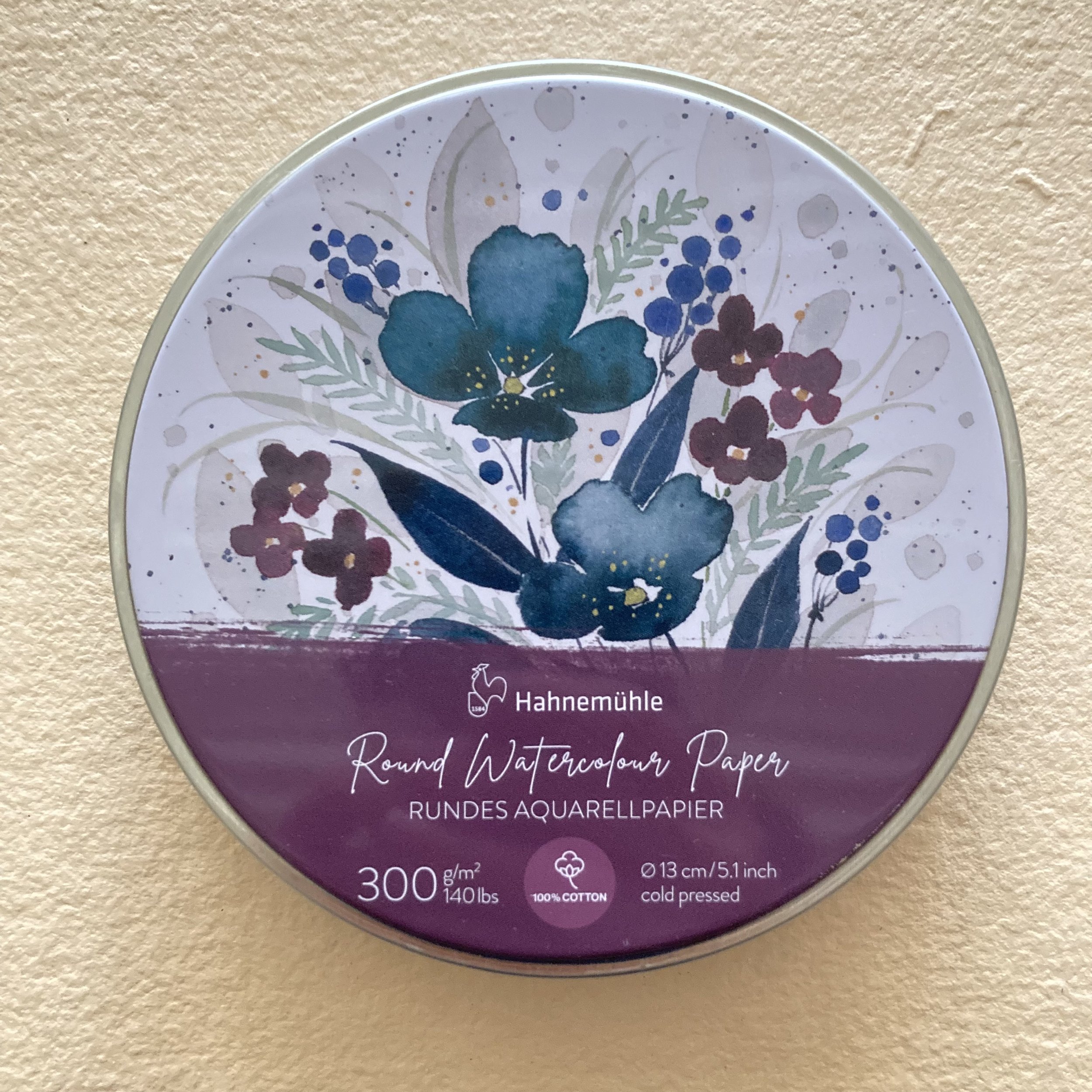
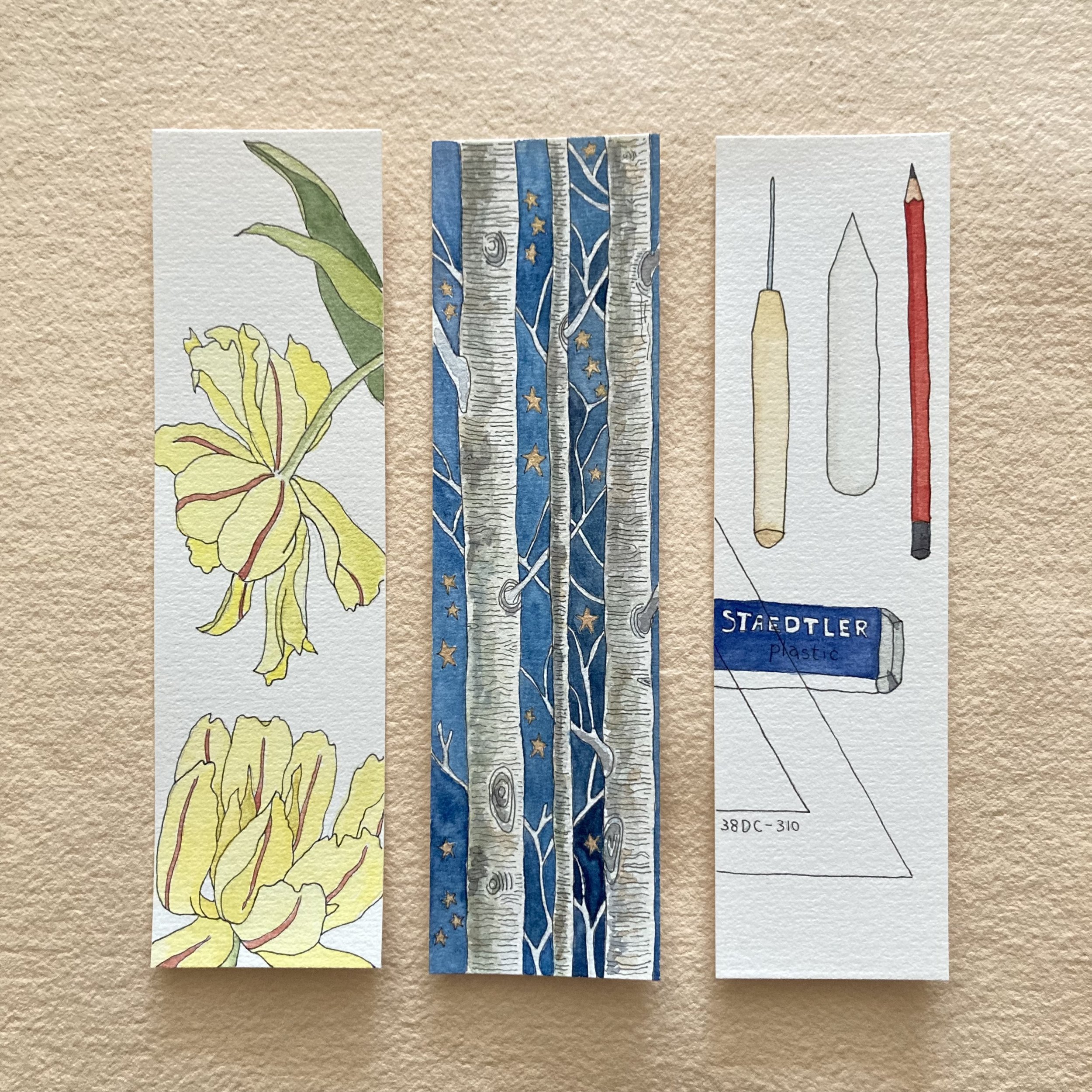
Hahnemühle recently added two irresistible new paper products. The most apropos is a pad of watercolour bookmarks, with an enchanting cover. The other is a set of round watercolour-paper disks presented in a handy tin. I asked Janet Bouldin, our in-house watercolourist, to test drive both products. I think her samples speak for themselves, but here’s what Janet said, alphabetically speaking:
 
“ A) The precut shapes are beguiling and freeing. B) The bookmark size is perfect for designing a bookmark or making a special gift tag. C) The round size provides an easy way to highlight a piece of something in my view—I’m always drawn to the smaller details of life around me. D) The paper can take an adequate amount of water, and it will handle pen and ink too. E) I plan to always have some of these precuts on hand. I loved using them! ”

The Grey Pad, also from Hahnemühle, has been added to my repertoire of lovely padded papers in two portable sizes, A6 & A5. Its counterpart, the Cappuccino Pad, is delighted to have company and be part of a papery pairing.

Treat your correspondence to an album of its own

Dear Everyone ~

Correspondence Album via group Zoom debuts March 23, coming up next Saturday, the first weekend of spring.

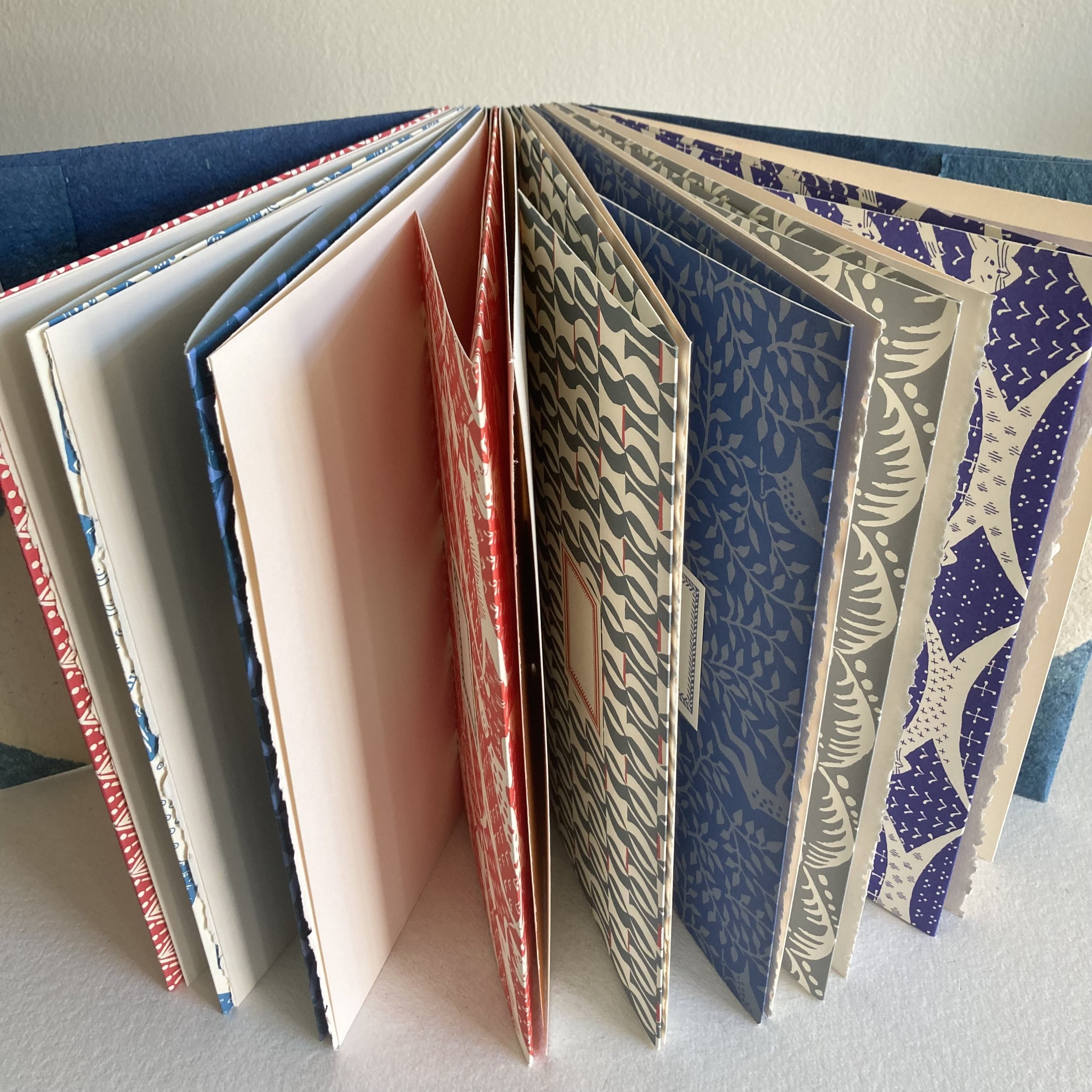
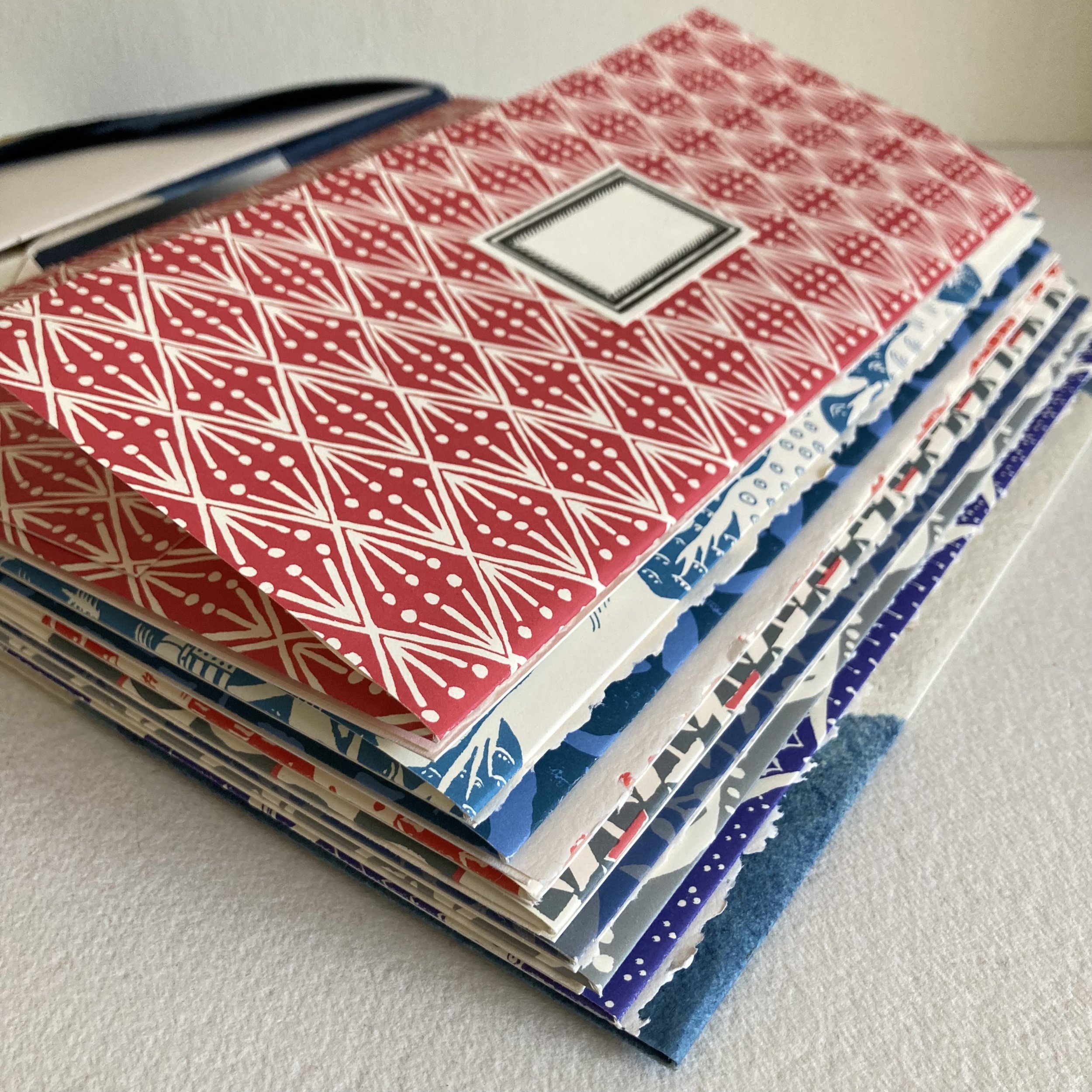
The structure students will make is a voluminous & voluptuous buttonhole-stitch album (9½ x 11½ x 2½). The octet of hand-folded envelope-pages can hold letter-sized sheets, including A4’s. The book’s spine is ’specially spacious (2½ inches wide), providing a fabulous file book for organizing your correspondence. You can, for example, assemble all the elements of an outgoing communiqué in an envelope-page. Or, you can file by element: stamps in one envelope-page; letter sheets in another; postcards in another; and so forth (and fifth…). Or, your album can become an incredible scrapbook or memory book of special correspondence received. I look forward to hearing students in the workshop describe how they envision using their books. 

The completed album will be a papery patchwork quilt of eight different Cambridge Imprint patterns, tucked into a cover of indigo-dyed handmade paper from Cave Paper. My mini-rave about Cave: I find it beguiling—and beyond sturdy. I love working with it. Our interleaving sheets (16 pages/32 serendipitous sides) are Stonehenge with a deckled fore-edge. You can use these pages to record communiqués sent & received and/or to jot what-not. Kits are currently winging their way almost around the globe—to Canada and Austria, and to students from Hawaii to the Eastern seaboard.

The Correspondence Album will be the largest book I have taught via Zoom. I have already tested elevating my overhead camera to showcase my hands working with lusciously large full-sized sheets. You can read more about the structure and materials here.

If you’d like to try your hand at measuring, scoring, trimming, folding, and stitching a large buttonhole-stitch book, but you haven’t yet registered, you are not too late. A handful of kits are at the ready for extra-expedient expediting!

 
No previous bookbinding experience is necessary. The pace is calm and there will be ample time to ask questions whilst we work. I will live record this workshop session, and it will be available to you later the same afternoon to watch and rewatch at your leisure. If you have any questions now, please feel free to call or e me to discuss!

Correspondence Album
 
Feeling springy, Bari
 
PS:
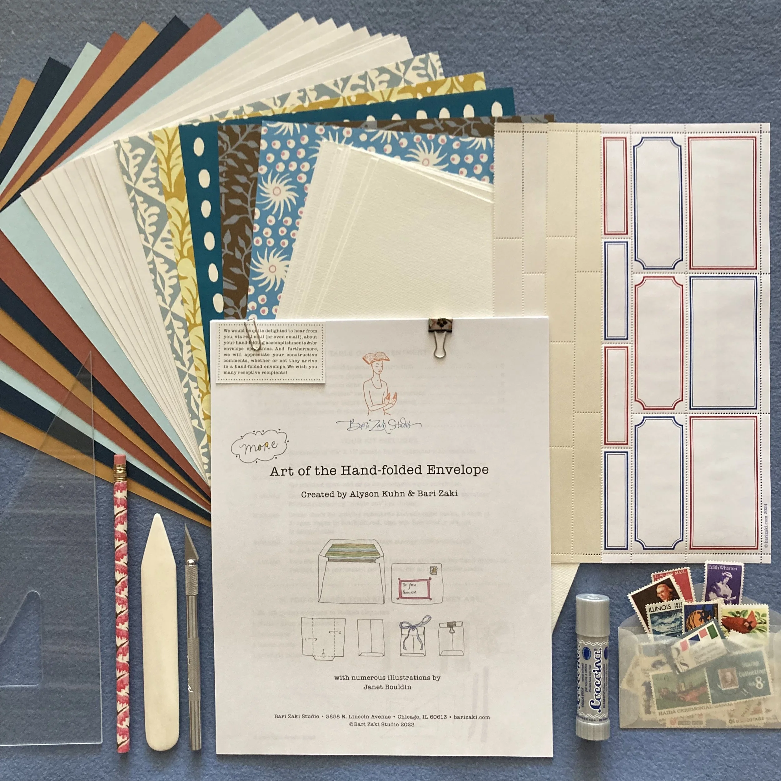
We have yet MORE news in the envelope department! The kit for last week’s Hand-folding Envelope Happiness workshop debuted a new-to-BZS paper from India—a recent discovery by my postal muse, Alyson. (I was enveloped with ecstasy to receive her “twin-set” of test envelopes.) Students in the workshop ooh’d & aah’d and oh-là-là’d, and gave the Indian paper highest marks for foldability, glueability, and tactility. This joy has inspired us to brew up a trio of fresh (and fabulously foldable) palettes to complement or supplement our MORE Art of the Hand-folded Envelope kit, which we will present next week. The palettes will be available independently.

Presenting ’peccably Perfed Labels

Dear Everyone ~

This past week at BZS was a BZZZ of kit assembly for Hand-folded Envelope Happiness workshop via Zoom, coming up next Saturday, March 9. Overseas kits were dispatched first, natch, and the stateside kits are now winging their way to students’ mailboxes near & far & wide.
 
Backtracking a few weeks, to when I was percolating on my envelope workshop: I received an envelope via Real Mail from Cheryl M. in California. In January, Cheryl had completed the L-s-l-s with Hand-folded Envelope workshop, and has rapidly progressed from hand-folding envelope enthusiast to connoisseur status. 

The envelope structure she made me, which she referred to as an accordion, has inspired me to adapt it for the upcoming workshop. I’ve named it origami-esque gusset, and I previewed it in my workshop announcement blog post. I am truly grateful for Cheryl’s inspiration, and for her follow-up email. She wrote that my envelope-inspired-by-hers was utsukushī! I immediately googled the translation—it means beautiful. Arigata-là-là, Cheryl!

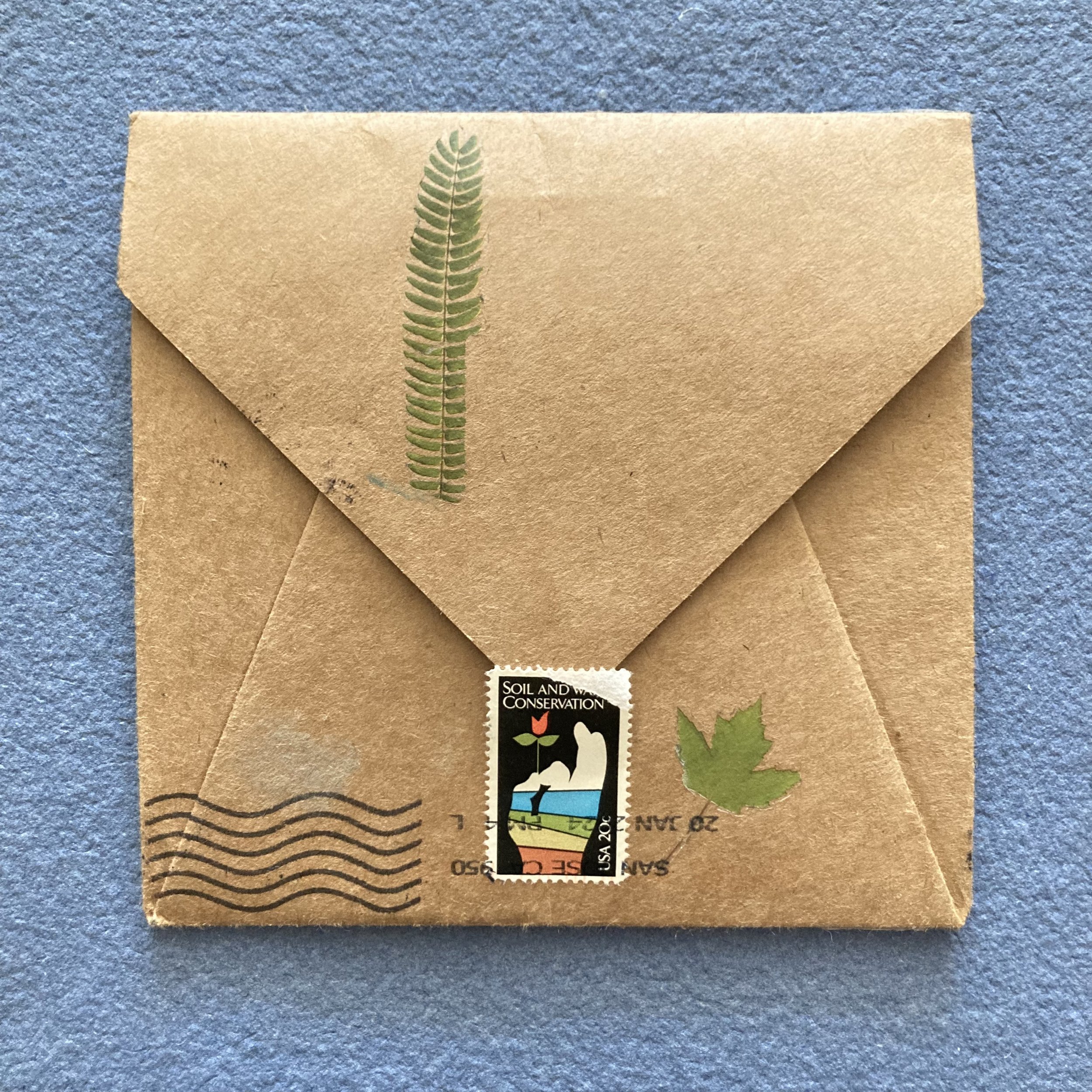
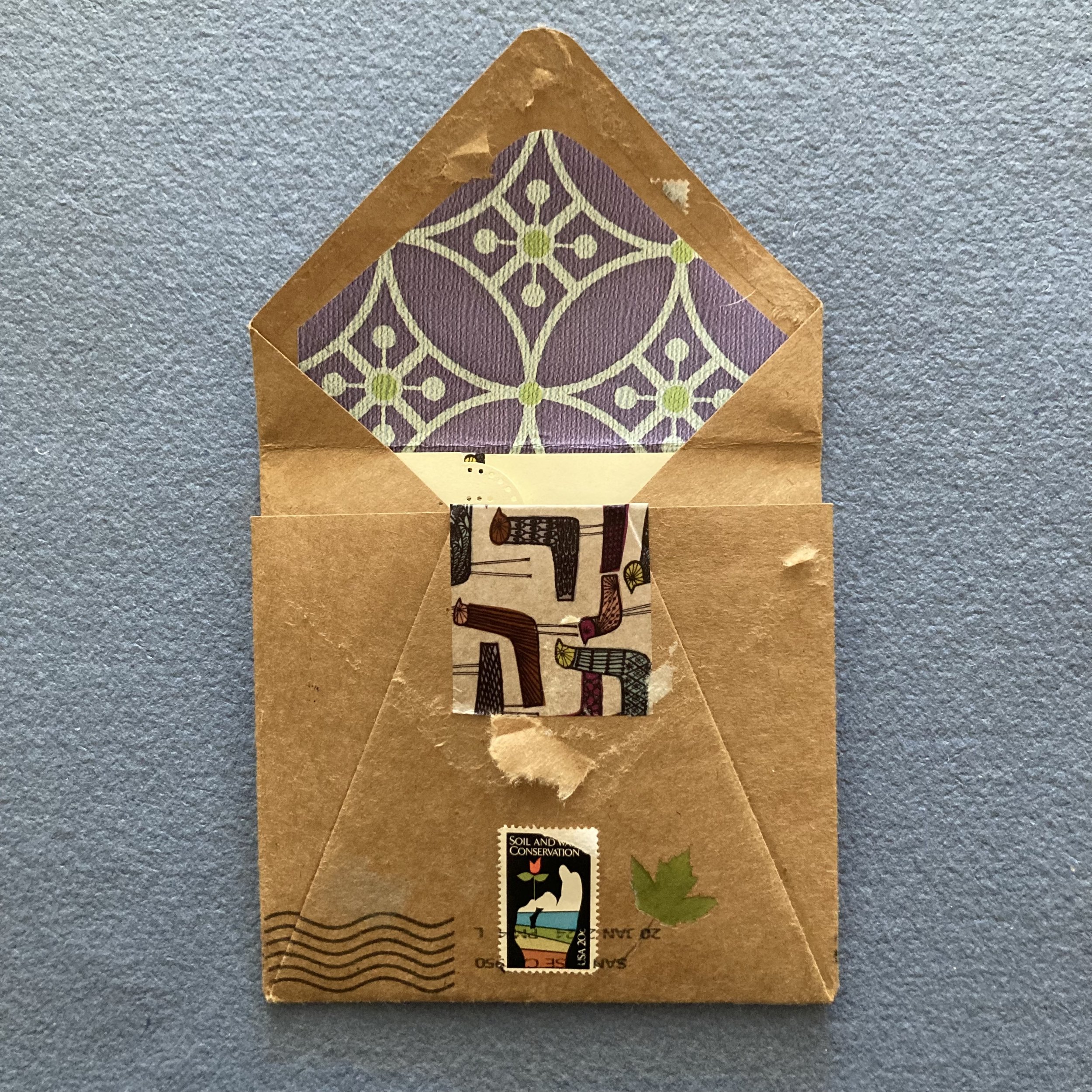
Seen above is Cheryl’s original accordion envelope. And herewith is a tour of the fine points: It’s made from thick kraft paper and lined with a printed pattern. The outer envelope has several embellishments including a strip of Stationery Store Day (SDD 2023) washi tape, Mina Perhonen’s ‘Well-dressed birds’, and splendid sprigs of pressed greenery. To secure the flap she used a 20¢ stamp from 1984. The envelope has also been cancelled on both the front & backside with the classic wavy lines. 

The Hand-folded Envelope Happiness workshop will also mark the debut of ’peccably Perfed Labels. I am perpetually grateful to Alyson, my postal muse, who deployed her math-mind skills (a subset of her envelope-arithmetic expertise) to design a symmetrical 8½ x 11 perforated-label template: three sizes co-existing cozily on one sheet. Her typesetting-wizard colleague, Olivia Bonifacio, designed the classic borders, massaged the template, and whisked the polished pdf to Portland Stamp Co., where Niko & Josh sprang into action. We could not have done it without you.

The right label for the job is, as we like to say, liable to elevate any envelope. With patterned envelopes, the label becomes a fashion accessory. One size does not fit all addresses, and one palette does not complement all patterns. 

The labels are available as a trio or individually. You can read more about them in the shop listing. And wait there’s MORE! We are also delighted to announce that a half-sheet of all three ’peccably Perfed Labels will now be included with the MORE Art of the Hand-folded Envelope kit.

If you’d like to spend a few quiet hours next Saturday morning being enveloped by beautiful papers and learning the why’s and wherefore’s of hand-folding three styles of envelope without a template—I will be delighted to ship your kit post haste! As always, no previous envelope-making or paper-folding experience is necessary. The pace is calm and there will be ample time to ask questions whilst we fold and stitch and glue.

New workshops: Springing into advanced enveloping

Dear Everyone ~

I am doubly delighted to debut two envelope-centric workshops via group Zoom: Correspondence Album and Hand-folded Envelope Happiness.

My inspiration for Correspondence Album has been percolating for some time. Essentially it began with my love of keeping mail recently received and outgoing mail-in-progress organized, of finding a system that works for me, and ideally for that system itself to be aesthetically pleasing—Double Happiness!

Now, I’ve brewed up a voluminous volume (9½ x 11½ x 2½) for keeping track of both your incoming and outgoing communiqués. The album holds eight hand-folded envelopes, with blank sheets in between, for recording what you sent to whom when, with which enclosures. It’s a beautiful way to organize your correspondence however works best for you—and delights you every time you open your album. You can write right on each envelope “who” is inside.

 The cover and binding style pairs two of my favourites: the Buttonhole-stitch—so manageable when you’re working at large scale—and Cave handmade paper. It’s made of 100% Belgian flax, which is incredibly durable, and each sheet of indigo-dyed paper is unique. All are beguiling.

 The kit for this workshop is quite deluxe, and you can read details (and see more photos!) in the shop listing.Two menageries of eight complementary Cambridge Papers are available for your envelope octet: Carousel and Rhapsody.

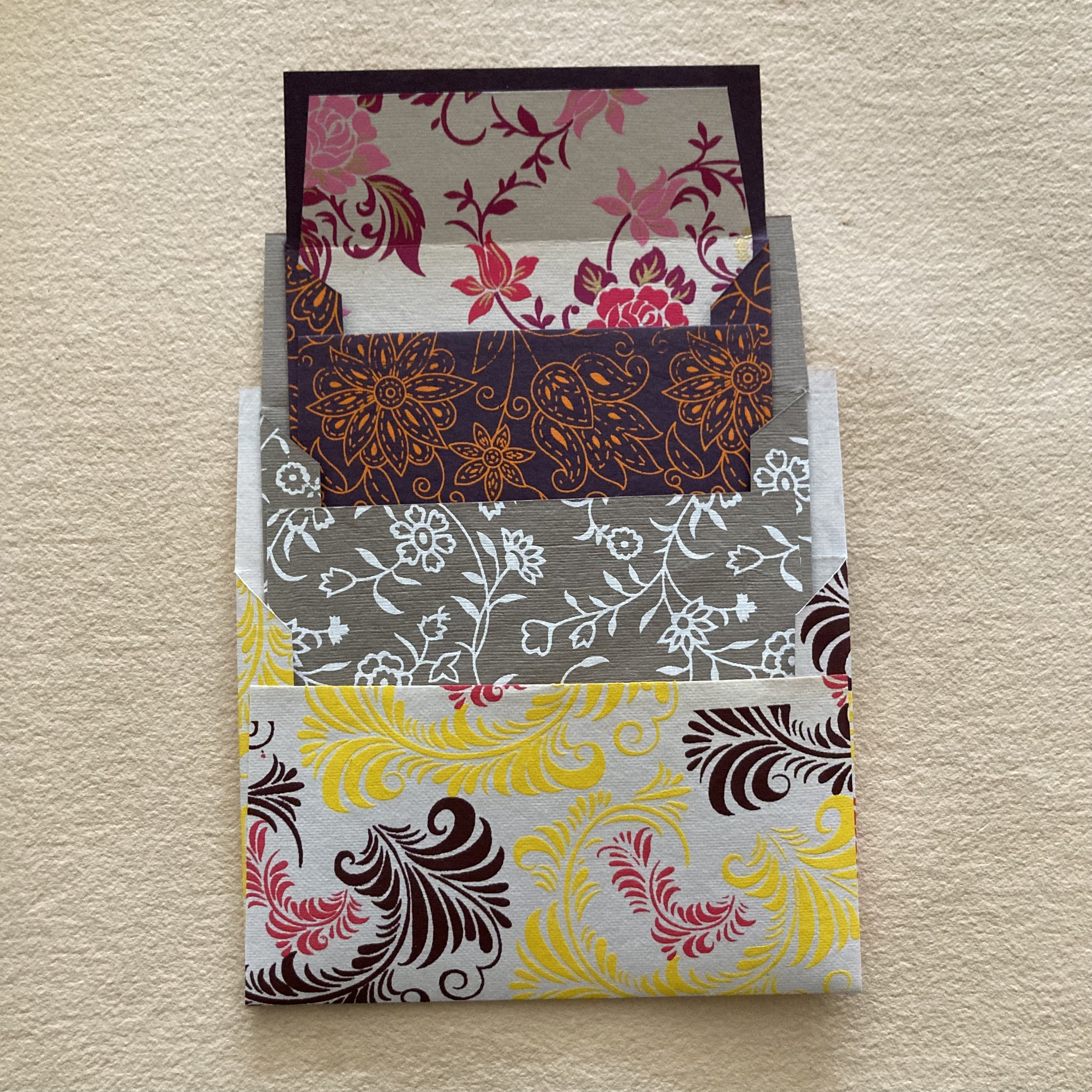
Hand-folded Envelope Happiness is for creative correspondents wanting to up their envelope game. Students will make three different styles of envelopment without a template: a backless, an enveloped booklet, and an origami-esque gusset. All three are mailable and cherishable. 

The range of papers that are ideal for folding and for mixing & matching, is inspiring and can seem overwhelming: almost too much of a good thing! When that happens, it’s tempting to make a duo or trio of nesting envelopes!

I’ve selected a quintet of papers in assorted weights (from 20 lb Plover Bond to 100 lb cover stock from French Paper Co.) and decorative patterns (Grafiche Tassotti from Italy, Shizen from India, and Cambridge Imprint from England) so that you can feel—and experience them—first-hand whilst folding. Their textures are distinctive, and they deserve a different “touch” for scoring and folding. The kit is close to overflowing with oh-là-là. You can read details (and see more photos!) in the shop listing.

On a readymade envelope, the postage is the finishing touch. On a patterned hand-folded envelope, it is the address label that can really set the tone. Depending on your paper pattern and the real estate required for the stamps, you may want the most petite label possible, or you may prefer a large label (especially if you have calligraphic tendencies). The sheet we’ve designed—which is being perforated in Portland right now—is a paragon of versatility. We can’t provide an enticing photo just yet, but we can say: The white sheet has classic red borders in three handy sizes; the other two sheets are unprinted, with the same three dandy sizes of label, on two elegant iridescent stocks. Like friends new and old, one is silver, and the other’s gold.

Correspondence Album
Hand-folded Envelope Happiness
 
May you be enveloped, Bari
 
PS:
Customers who have previously purchased a MORE Art of the Hand-folded Envelope kit will receive a 15% discount on the Hand-folded Envelope Happiness workshop. Students who register for the workshop and would also like to acquire a MORE kit, will receive a 15% discount on the kit.

Newly in stock, from Aquarello Nero to Zeichenblock

Dear Everyone ~

These past few weeks at BZS have been a whirlwind of incoming papers and outgoing parcels. Fortyish kits for Bookful of Fanciful Faces were posted to multiple students in fourteen states, including three to Hawaii; two flew to Canada and one to Austria. Fresh shipments arrived from Carta Pura in Germany, and from Cambridge Imprint and Hadley Paper Goods, both in the UK. All were quickly decanted and displayed. We have a few new items to share with you, including a bit more LOVEly inspiration in the Valentinian Dept.

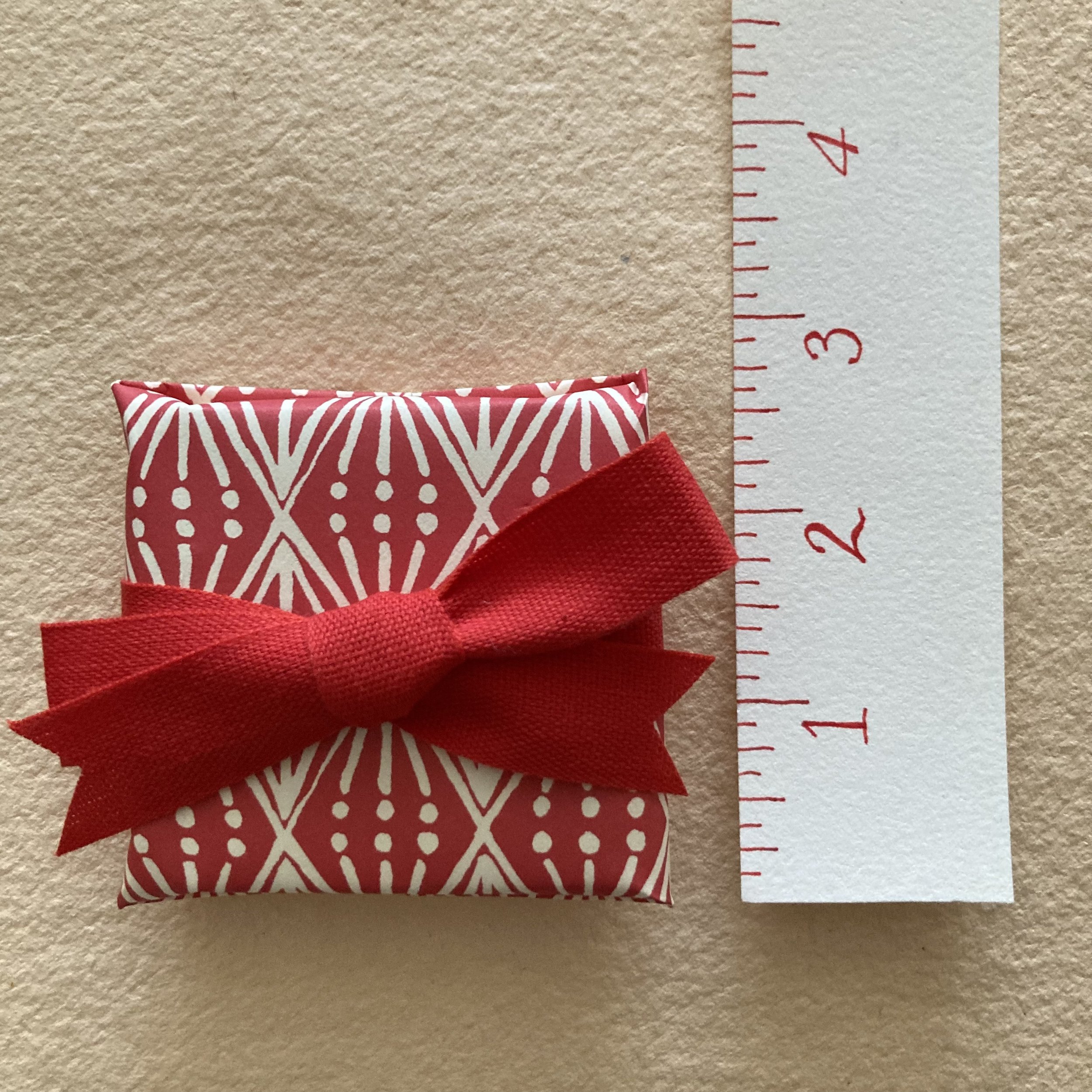
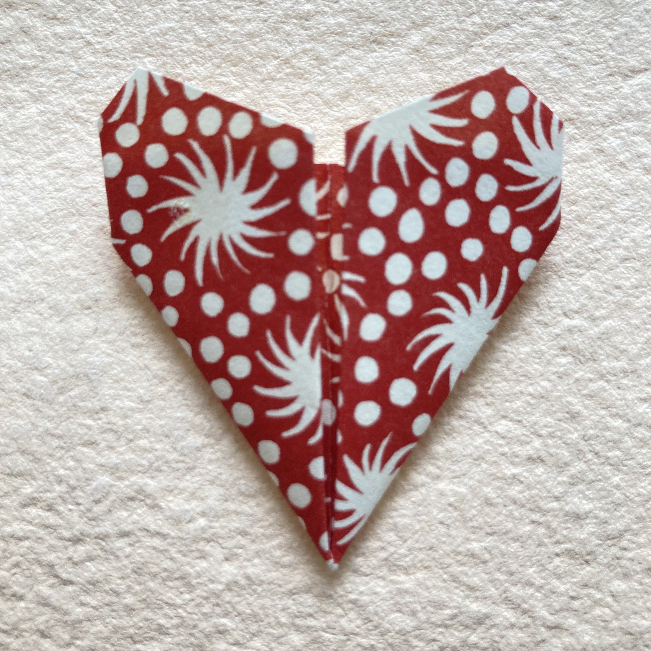
For starters: the 2 x 2-inch Hahnemühle mini-concertina book is back in stock. Ruby has turned one into an incredibly sweet valentine, illustrating a different heart on each of the panels, taking advantage of all the mediums we stock in the shop: Lyra Colour pencils and LePens, washi tape, and waxed-linen thread. On one panel, she has attached a petite origami heart folded from a 3 x 3 piece of Cambridge Imprint paper. I then “finished” the book with a 6 x 6 piece of CI Selvedge Madder pattern paper and beribboned it with a piece of Italian cotton ribbon. You could present it like a bonbon, on a little plate, or hide it in someone’s pocket, or place it atop a pillow….

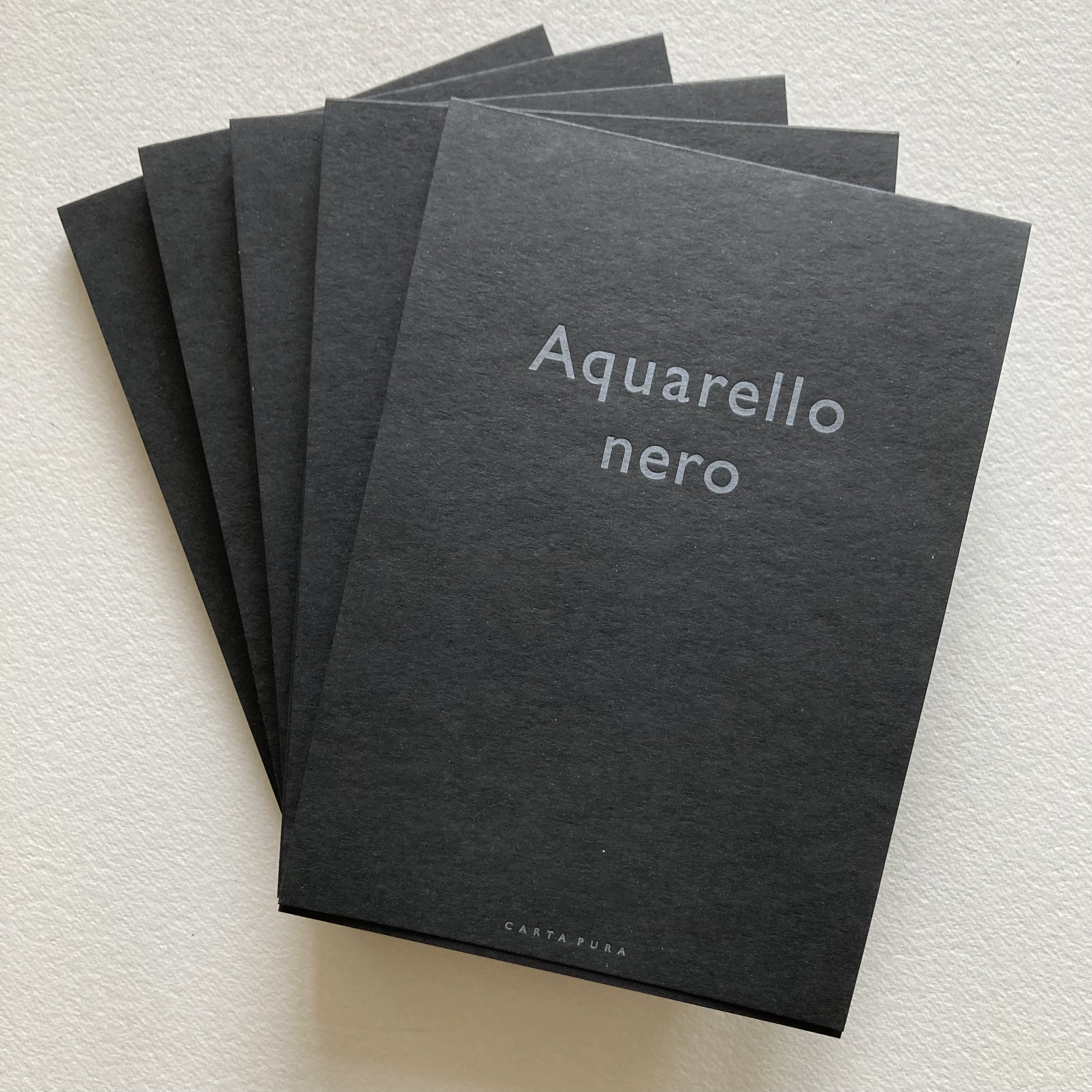
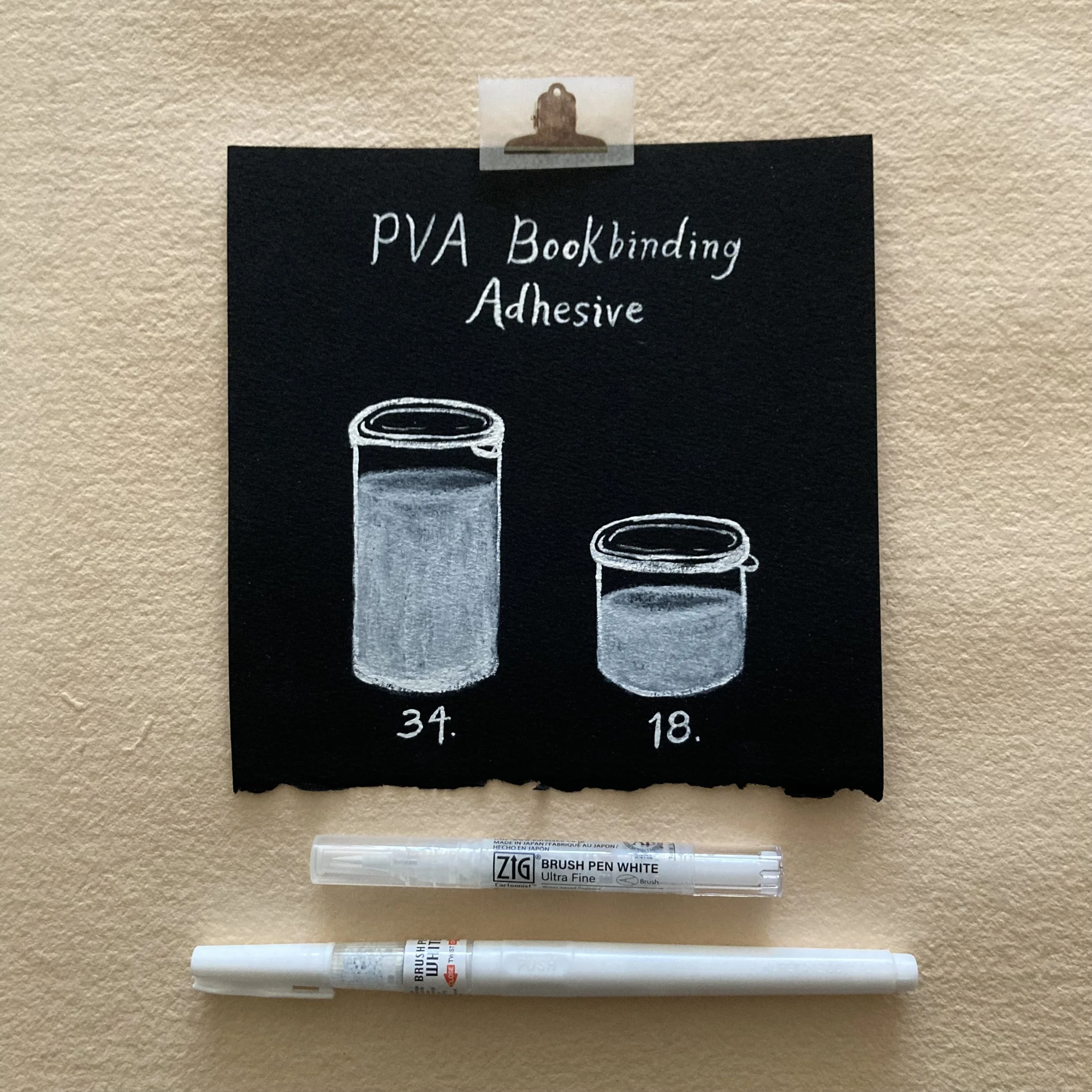
As elegant as a little black dress: Carta Pura’s most recent addition to their paper repertoire is Aquarello Nero (which almost sounds like a cocktail). The pages share the delicious attributes of the Natural White in terms of texture and receptiveness to all manner of mediums. Ruby immediately tested it with both Kuretake white brush pen & fine white brush pen for the PVA glue signage in the shop. I’m stocking two handy sizes of these pads. 

Two new-to-us colours of Carta Pura papers have joined our repertoire of Rivoli Rose: Vanilla and Light Licorice (which you could call Dove Grey, but we are in dessert mode). Available in A6 Rivoli pads & matching envelopes, you can read more about both shades in their respective shop listings.

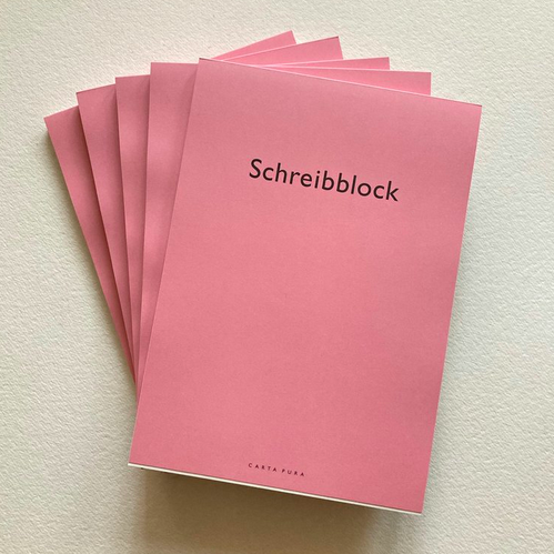
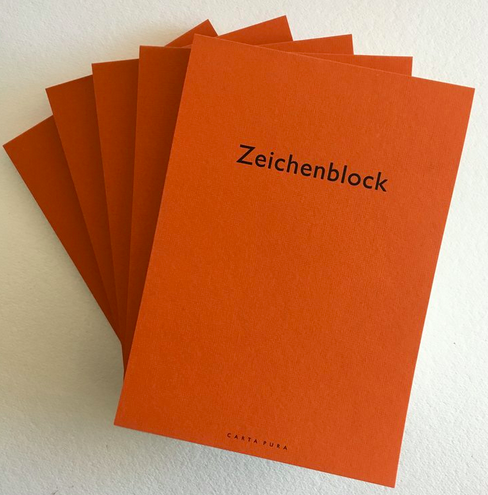
 Blocks are back in stock: The almost everything Schreibblock and Zeichenblock good for everything pads are ready for your sketching, doodling, drawing, and musing pleasure.

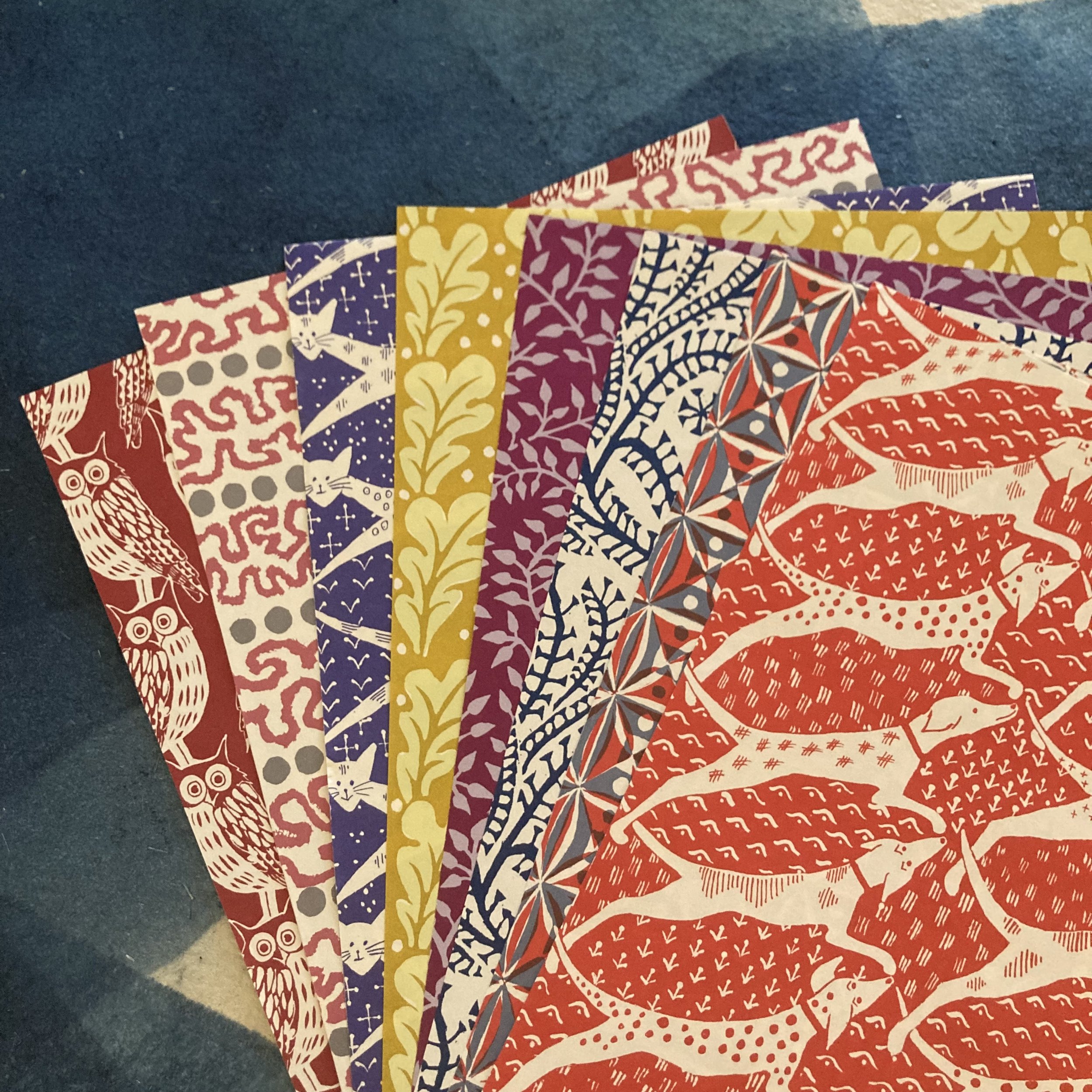
Our Cambridge cup almost overfloweth: We’ve brought in seven new parent sheets from Cambridge Imprint, bringing our ever-growing selection to fifty! That’s a lot of nifty mixing & matching! The feline, canine, and  equine patterns are divine!

Huzzah-là-là: Herewith a preview of six new charmola greeting cards by Hadley Paper Goods, perfect for all seasons and reasons.

Here’s a sampling of lovely emails received from customers about their BZSamplers for Valentines Day. Judith, who lives in Chicago, had motored right over and was quick to pick up her sampler… and to begin mixing and matching and catching up with friends. She wrote “… I have moved many times during my eight decades, leaving friends behind and making new ones. So your offer of a Valentine sampler of lovely papers aroused my creative juices. I was able to put the Heart Bunting origami kit that I already had to good use. Here are the results of my fun afternoon spent folding, cutting and writing. Thank you for putting the sampler together. It’s a beautiful way to tell my friends I’m thinking of them.” She also sent this photo of her heartfelt handiwork.

Laurie, all the way in Hawaii, wrote, “OMG, the package arrived yesterday and it is just gorgeous. Once again I don’t want to touch any of it…I just want to look at it. I am always making my sister a card for Valentine’s Day, so I have to bust into this, but I don’t want to…it is so pretty. Thank you!” 

Aquarello Nero
Rivoli Vanilla
Rivoli Light Licorice
BZSampler for Valentines Day
 
For your heart’s content, Bari

LOVE (stamps) are in the air!

Dear Everyone ~

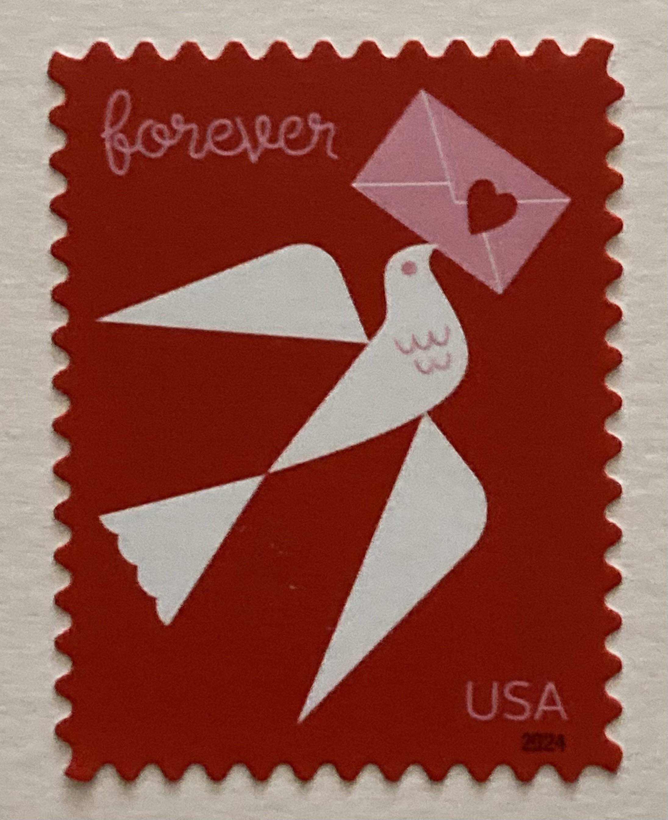
Yes, we love the new LOVE stamp. Its geometric shapes are surprisingly elegant yet whimsical. We—my postal muse & I—were so enthused about the illustration, that we reached out to artist Katie Kirk, who had also done the 2023 Winter Woodland Animals stamps. We asked her umpteen questions about her inspirations and her connections to sending mail. We’ll share her responses below, after we debut the BZSampler for Valentines Day.

The sampler doesn’t come in a heart-shaped box (which you can get almost anywhere, ideally with bonbons). What is far more rare—and delicious in its own way—is a 9 x 12½ Rivoli Rose envelope! Inside reside a profusion of papers eager to provide Valentinear inspiration. And, of course, a suite of more petite Rivoli Rose envelopes. And a trio of notecards we could not resist.

You can read about the extravaganza of enclosures in the shop listing. We have also enumerated and elaborated on an insert, more descriptive than the famous “legend” on a certain classic sampler.

Preview: We have pre-cut mini-pieces (barely bigger than a bonbon) of 12 Cambridge Imprint Special Red Papers for you to fold your heart out with.

How long a piece of red Italian cotton ribbon by Studio Carta have we used to beribbon the sampler? Why use 4 ft. when 2 yds. will do! We’ve left the Rivoli Rose presentation envelope perfectly unembellished, for you to use for whomever you choose.

Katie Kirk’s Valentinear Musings
 
“For me, the dove is the messenger of a love note. I took inspiration from vintage Valentine images and cards, which often used birds. That said, I also love how the symbolism of the dove goes beyond romantic love and can invoke universal love, friendship, and peace. My hope is that it depicts love, positivity, and hope.”

“As a designer and illustrator, I enjoy the tactile quality of sending and receiving letters and prints in the mail. It feels personal and thoughtful in a way that’s unique these days.”

 “I’ve always been attracted to geometry. There is a satisfaction when you can reduce a subject to a simple form. I would say it is both challenging and freeing. The challenge has been finding the balance between abstraction and detail. The freedom has come in learning to listen to the geometry and let it guide the art.”

We had to ask Katie if she plans on sending Valentines this year, and she humorously replied, “I truly had not thought about it until this question! I probably should, huh?”

 BZSampler for Valentines Day

In the pink, Bari
My loopy little stitch-uation

Hello Everyone!

Ruby writing again. It was such a pleasure to introduce myself to Everyone recently when lyricizing about LePens and Lyras, and I have been eagerly awaiting the opportunity to compose another post. There has been so much I am excited to share with you all!

In addition to the illustrative work I have done in the shop, I have gotten to revisit the joys of bookbinding. And what better place to do it than at BZS? When I was in undergrad at The School of the Art Institute of Chicago, I took a bookbinding class and deeply fell in love with the experience. As someone who makes comics and zines, real, traditional binding felt like a huge step up from the way I was constructing my books before (i.e., with staples). The intricacy and delicacy of assembly seemed more personal and more profound. So, when Bari asked me to assemble BZS’s little linen books, I was thrilled.

I had learned Japanese-style binding in my college class, and Bari’s thoughtful demonstration was a perfect way to refresh my memory. I found it so engaging to return to a familiar and gratifying process. The books (at only 3 x 3) are such a pleasing size to work with. The soft linen covers and flowy Plover Bond pages made the task of binding quite comfortable and agreeable. 

These little linen books are such a sweet keepsake as well as a functional object—to keep in your bag or pocket and jot down notes while you are out and about, work on tiny doodles and illustrations, or even turn into a mini story or comic! I used two of them as a gift to my grandparents, writing the lyrics in one of all of the songs I’ve composed. My grandmother also appreciated the other linen book (which I left blank), as she is always looking for a place for her “special jottings.”

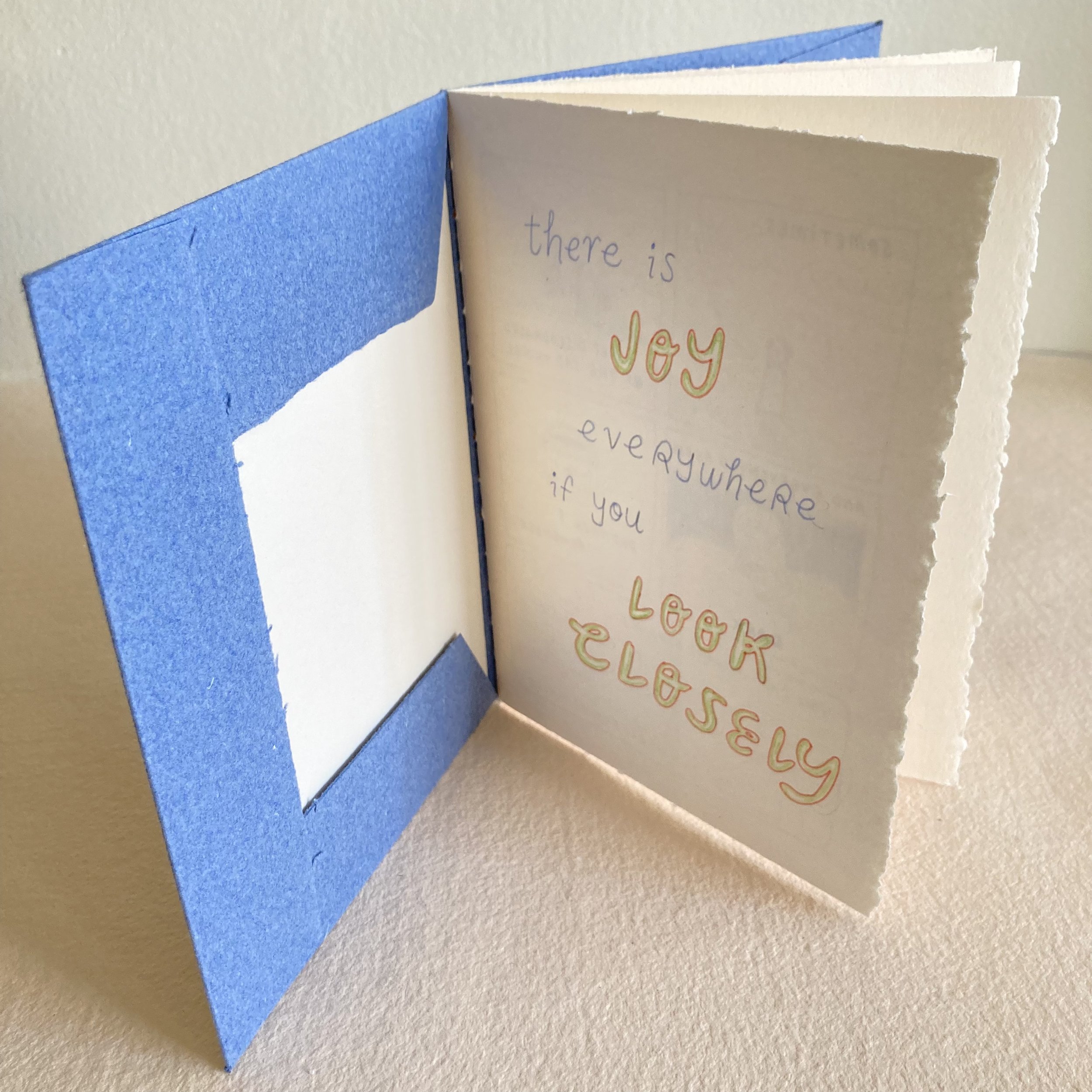
           My next bookbinding opportunity at BZS was working on a fresh supply of loopy link booklets. These booklets have a distinctive, eye-catching binding style on the spine, which added an extra element of vibrancy to the experience. This was a style I had never learned, and it was inspiring and compelling to try my hand at it. The technique took a few books to get used to, and it’s always helpful to remind myself that wonkiness can make something more special and endearing, or at least more personal. I also loved picking out the shades of waxed linen thread to coordinate with the colour of each cover. These books will stand out on any bookshelf and serve as a journal or sketchbook that is exciting and encouraging to pick up every time.

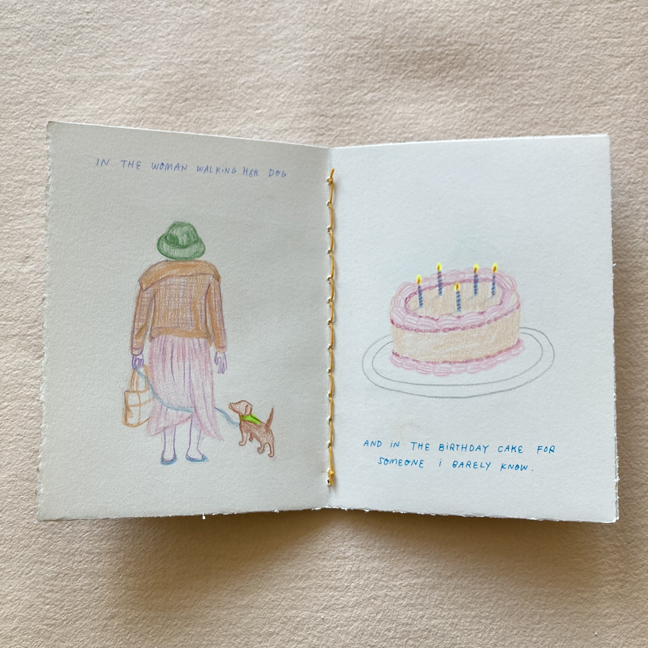
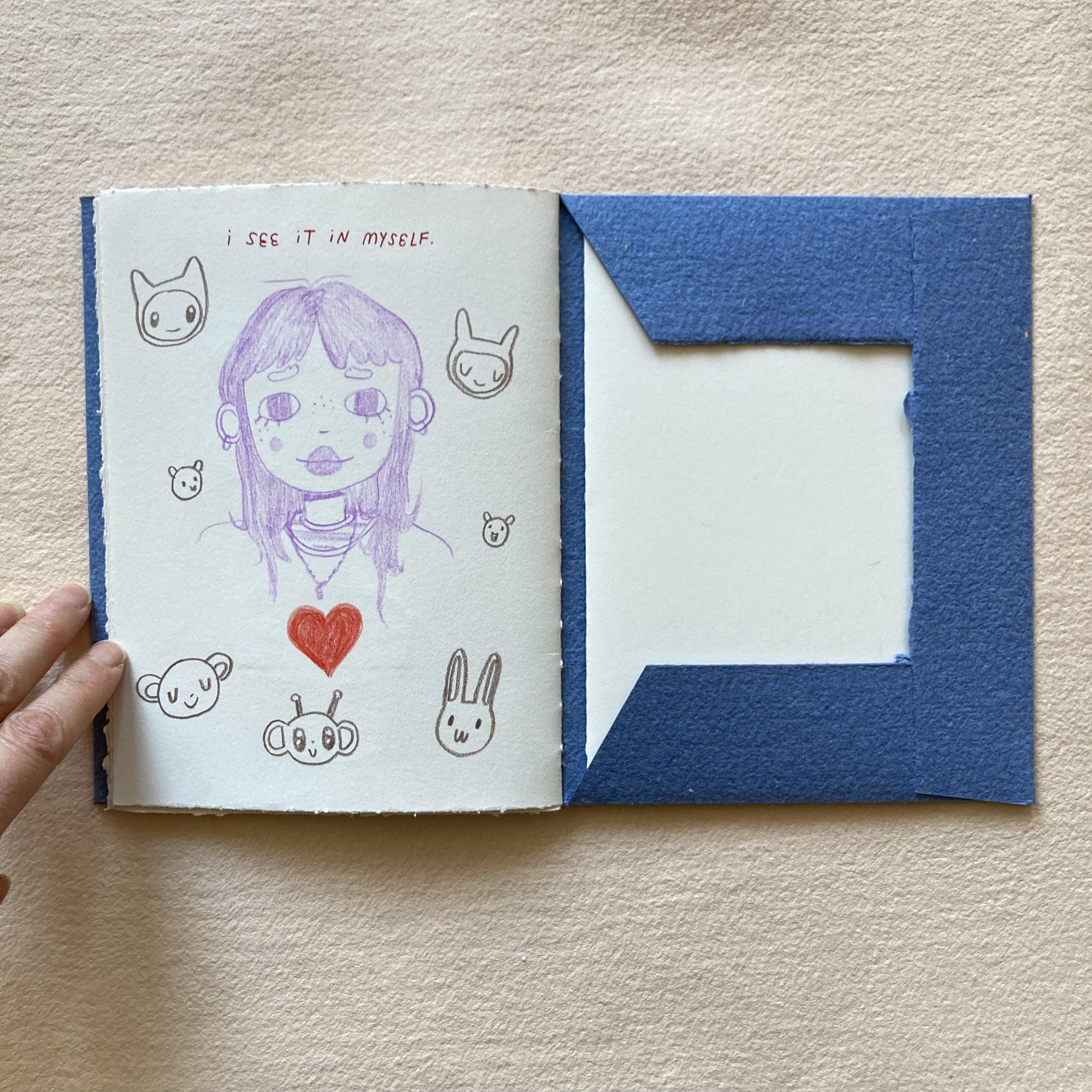
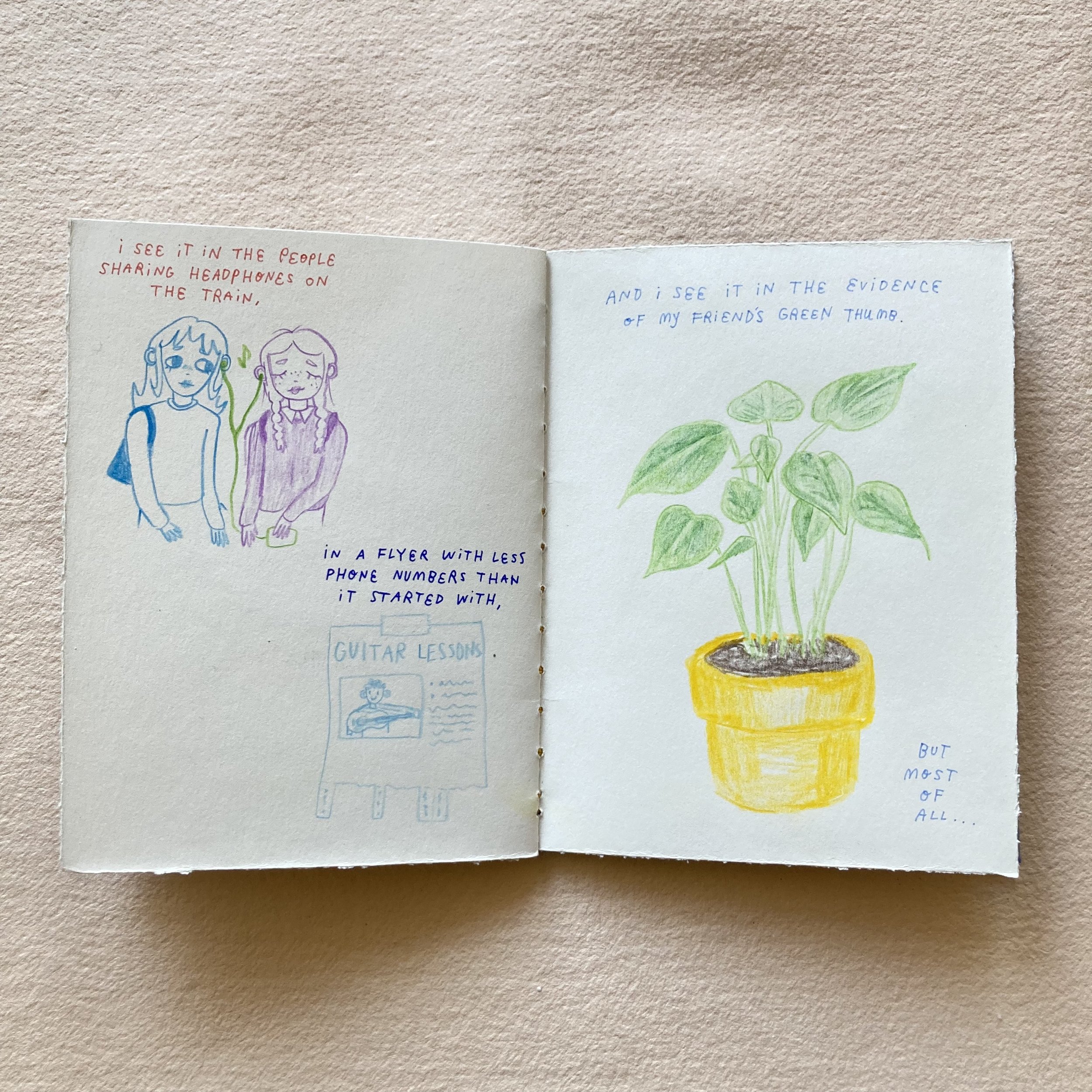
I chose to turn a loopy link booklet into a zine titled “There Is Joy Everywhere If You Look Closely.” I included a one-page comic followed by illustrations of mundane things we often take for granted, accentuating the subtle beauty and love they exude. I often need a little reminder that joy is constantly surrounding us.

   Thank you, Everyone, for reading my musings. I cannot wait to write more posts as I learn to do more at the shop. Wishing you a 2024 full of pages eager to be filled.

Loopy link-stitched booklets
Little linen-covered books
 
Thready for anything, Ruby  

PS:
Bari and her postal muse, Alyson Kuhn, are whipping up a kit of very Valentinear supplies. You’ll be able to see it here later this week. We think you’ll be in the pink!

All eyes on Bookful of Fanciful Faces

Dear Everyone ~

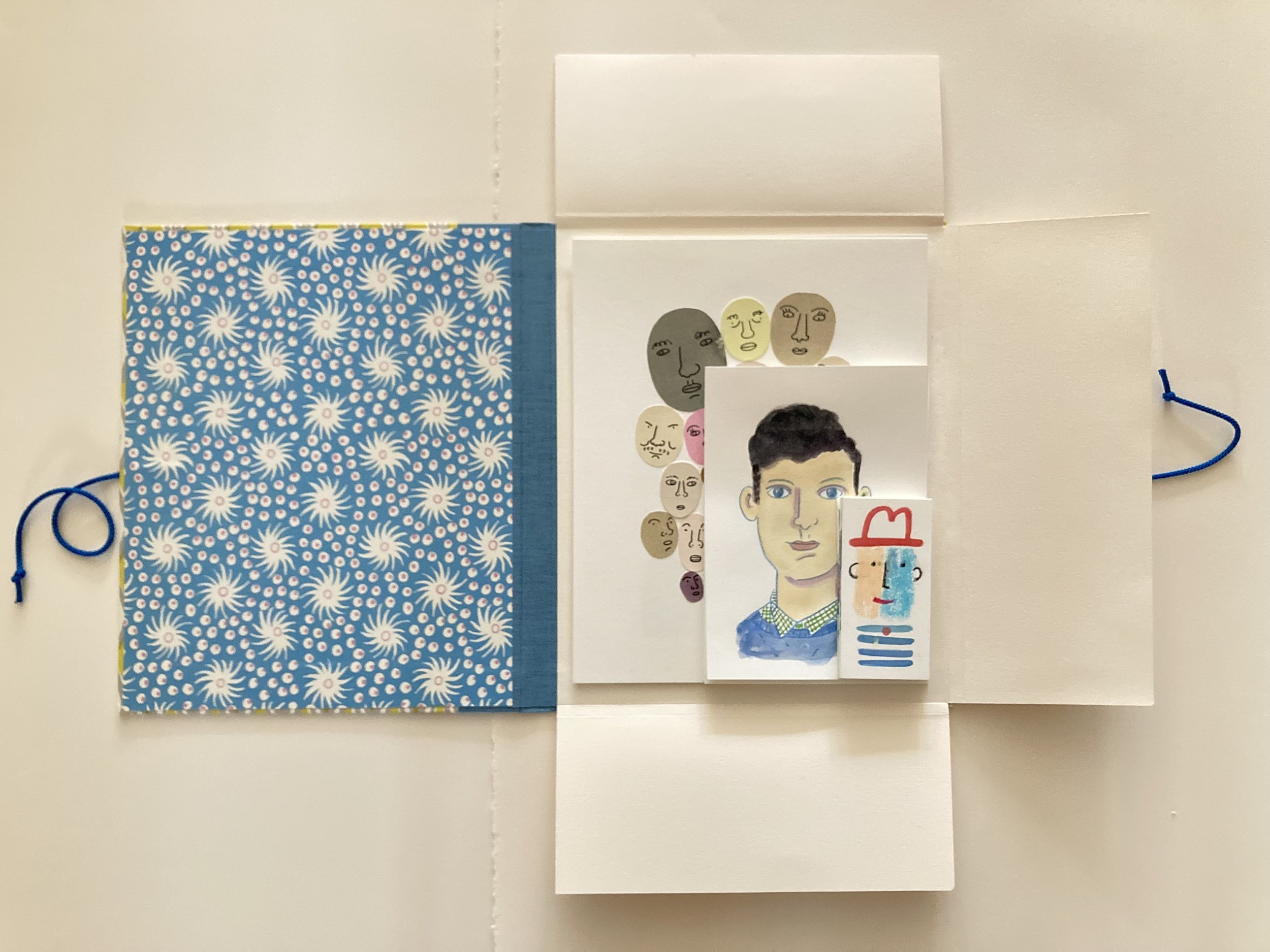
Bookful of Fanciful Faces, my 12th Bookful collaboration with Cat Bennett, begins Saturday, January 27—a mere fortnight hence! The book-ful structure students will make is a portfolder. This is part folder, part portfolio—with three gusseted paper flaps (top, bottom, and side) attached to the back cover. These flaps will encase various sizes of papers together, keeping your drawings, paintings, collages, and scraps organized, pressed & pristine. 

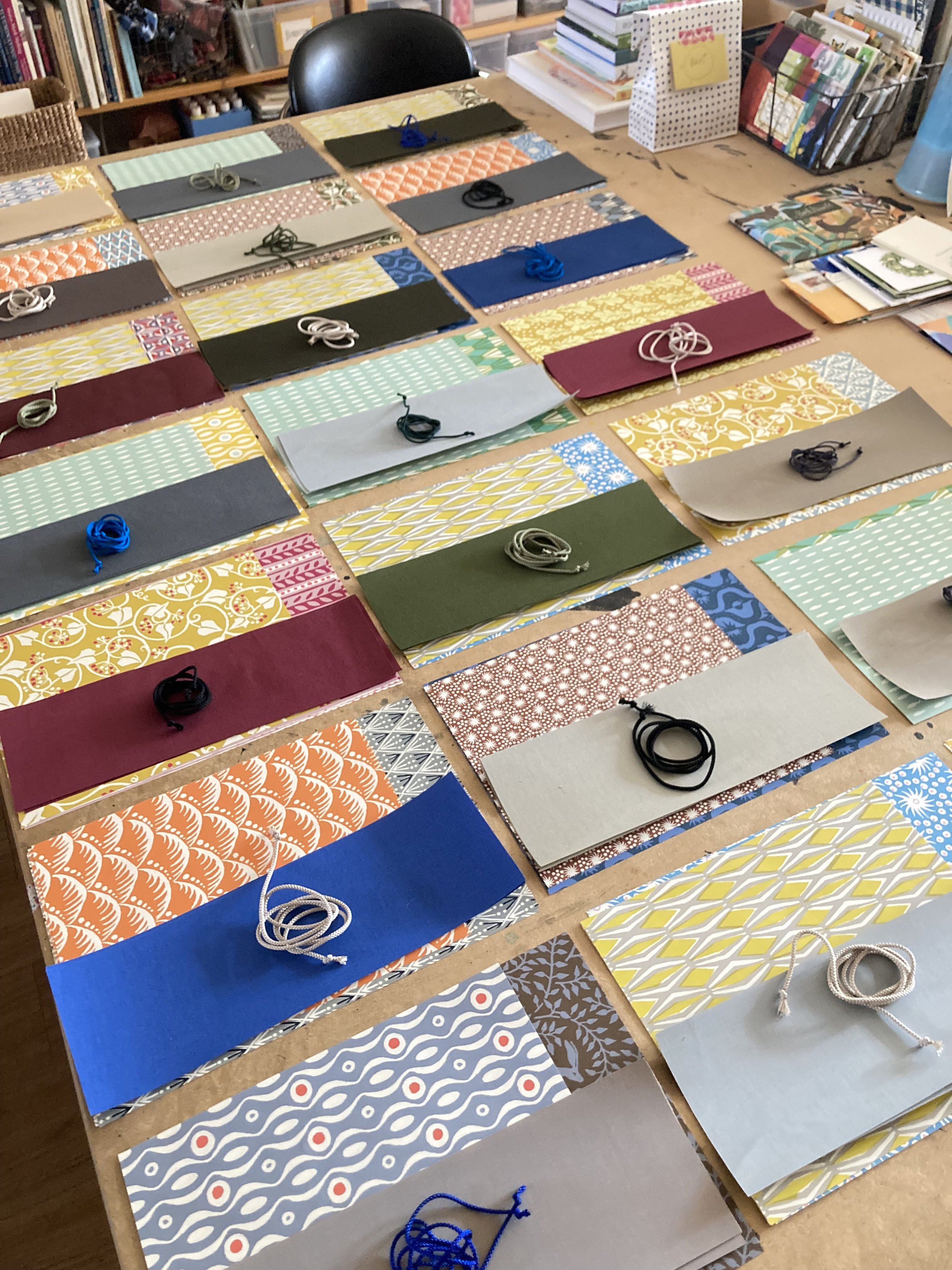
As I type, Ruby is mixing & matching Cambridge Imprint duos for each kit. I love that some students have requested their preferred patterns, and I love that other students have entrusted us to pair up the patterns for their portfolder! Very soon, all the kits will be wrapped & packed, and dispatched to their destinations—far, wide, and nearby. You can read more about the kit in colourful detail in the shop listing here!

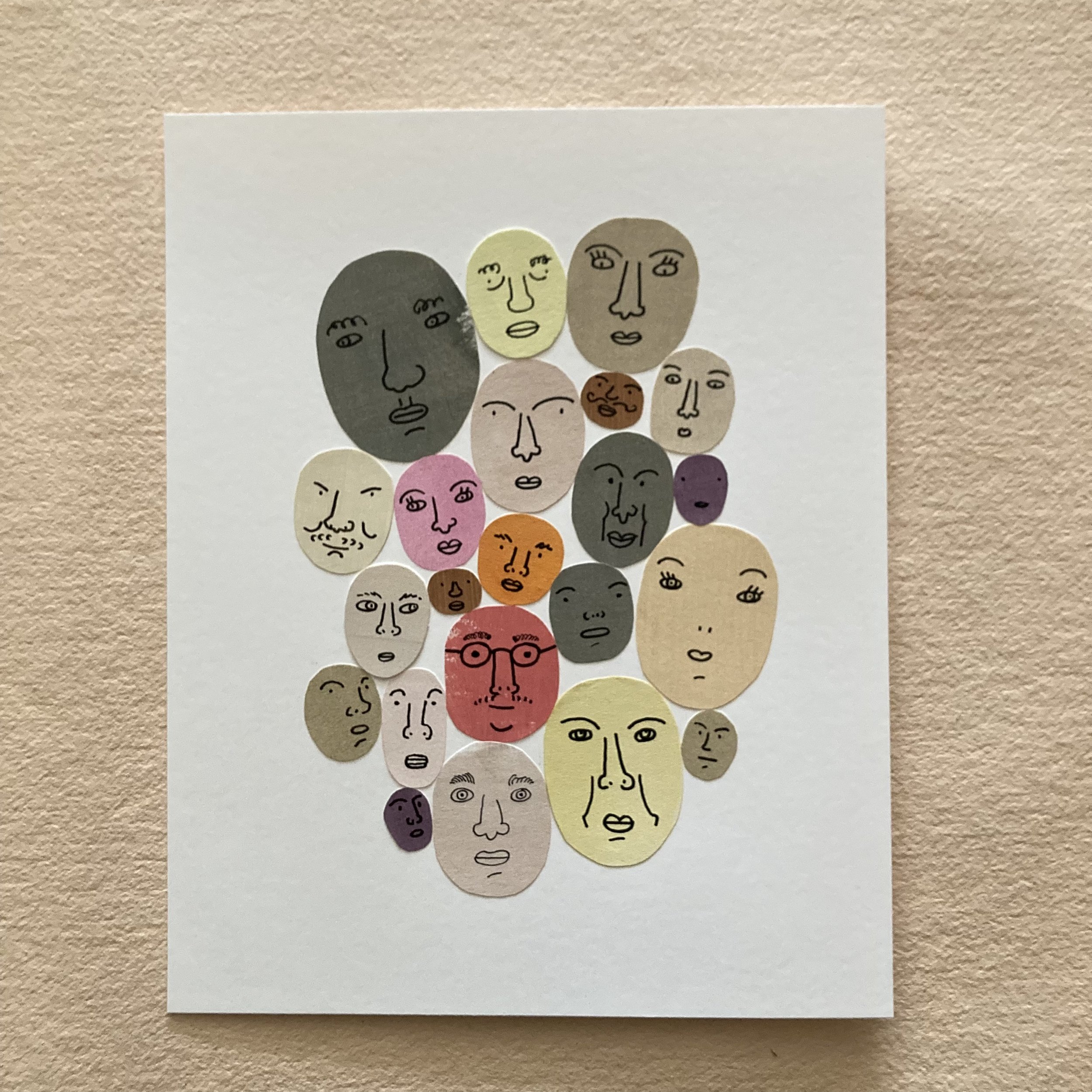
I’ve long been enamoured with Cat’s creative style, and her faces always bring a smile to mine from ear to ear. After several years of co-teaching, I am still fascinated by her creative process—and her natural ability to share her expertise and her positivity. I asked Cat how she developed her flair for drawing such fanciful faces, and she had this to say:
 
“When I was a kid, I loved drawing people. I’d use a photograph and try to render the person in pencil with realistic shading. I was so pleased when there was some resemblance and a little disappointed when my drawing was wonky. But very often I drew people simply from imagination. This was more cartoon-like and I could make the drawings funny. 

These two kinds of drawing come together as we learn to both capture what we see and invent a world. For me, accuracy doesn’t really matter as much as communicating a certain joy in life. Drawing people always reminds me that no matter our ethnicity or where we come from, we share a beautiful, common humanity. It brings us closer to each other, I think.”

We are delighted to report that the first Bookful workshop of 2024 has already attracted… 24 students—and counting! If you are considering joining us, we still have time to ship your kit(s). As always, Cat & I like to emphasize, especially if you are a Bookful newcomer, that absolutely no drawing, painting, collaging, or bookbinding experience is necessary. The pace and camaraderie are truly zen. (Plus you will have complete videos to watch and rewatch—all 12 hours-ful!)

Bookful of Fanciful Faces
 
As fancifully as ever, Bari

Ruby’s lyrical musings about Lyras and LePens

Hello Everyone, Ruby here!

I’ve been Bari’s shop assistant since August, and it has been so lovely to spend time in such a beautiful, serene, and creative space. I graduated in 2020 from the School of the Art Institute of Chicago with a Bachelors in Fine Art. After graduating I was eager to find a way to keep exercising my love for illustration, bookbinding, and crafting with my hands.

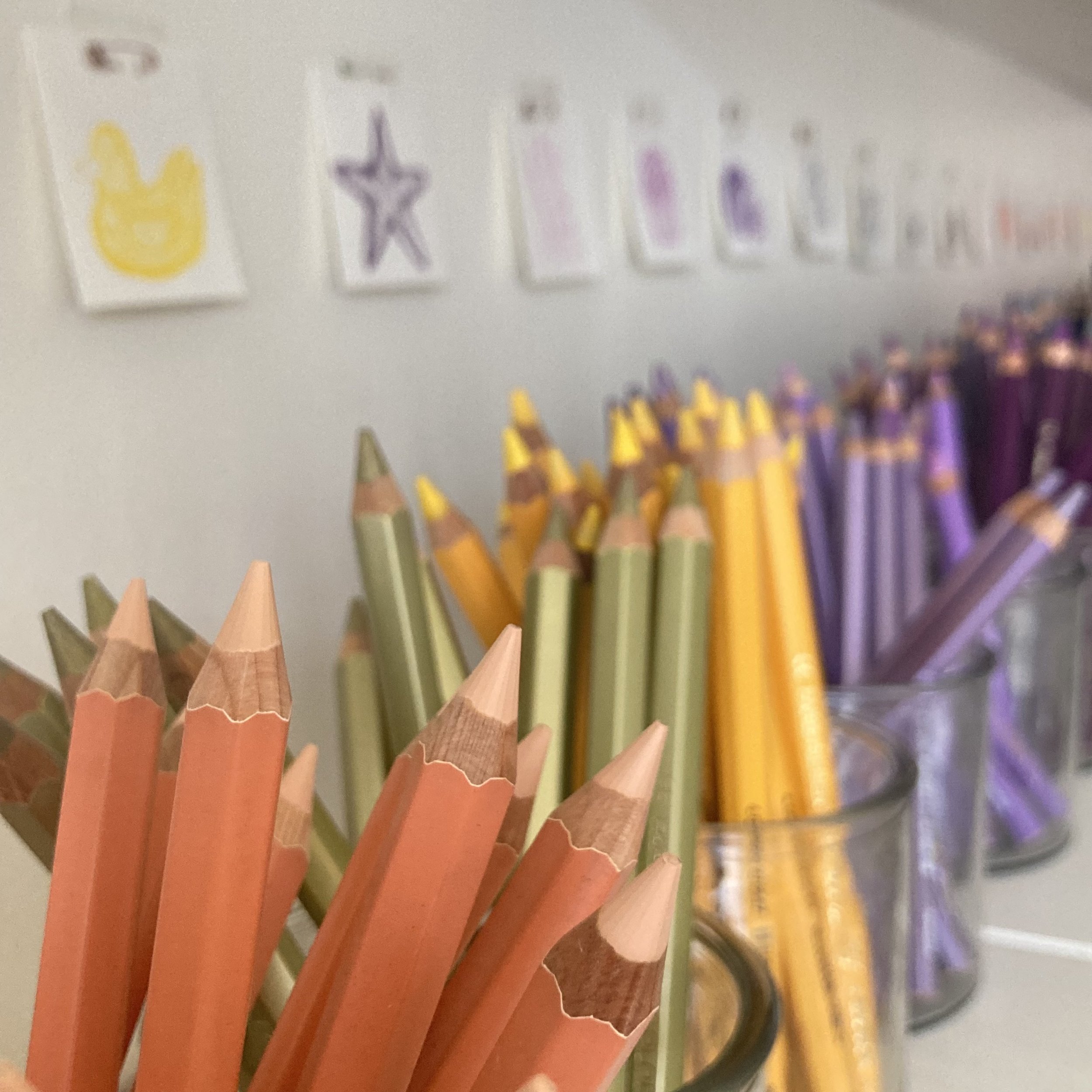
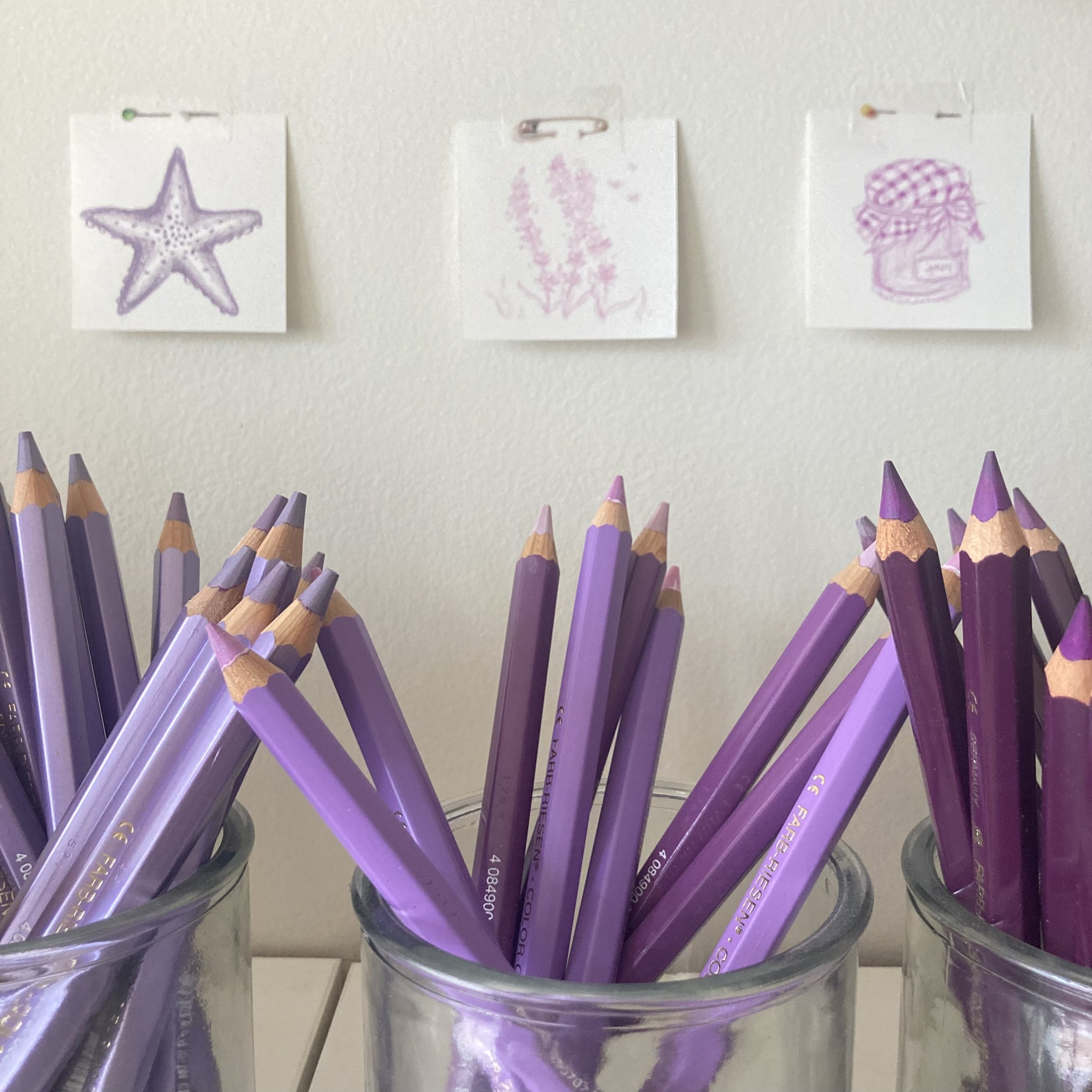
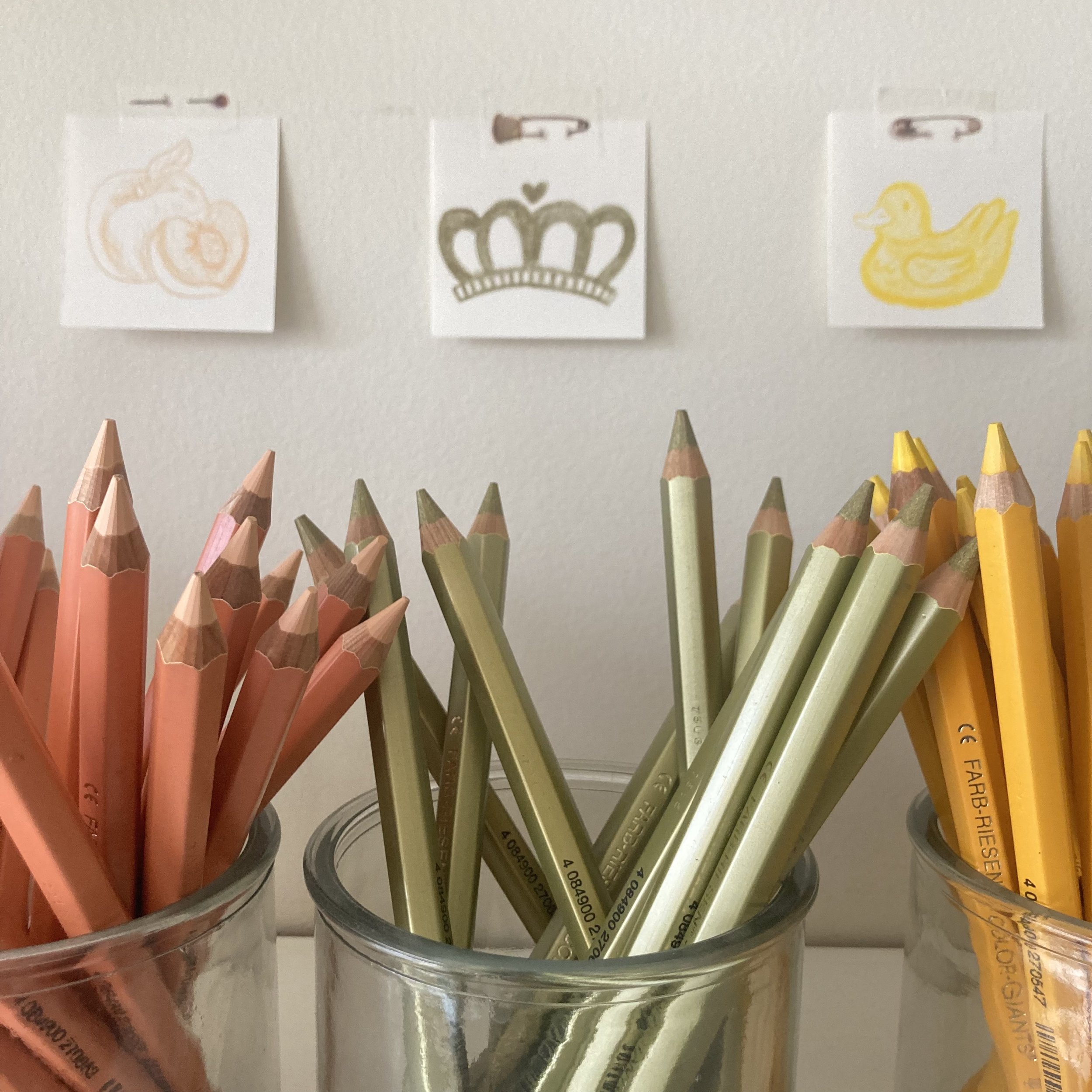
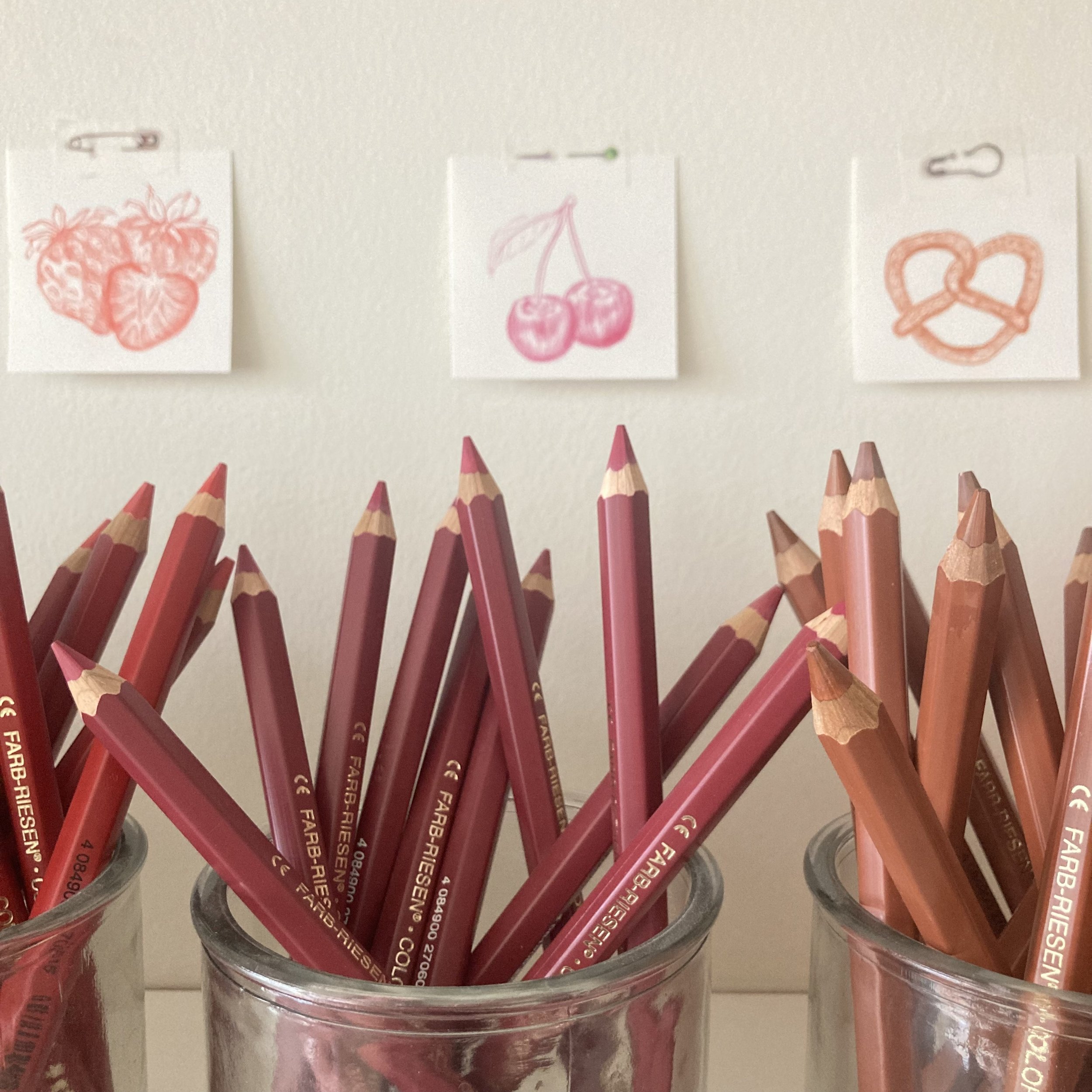
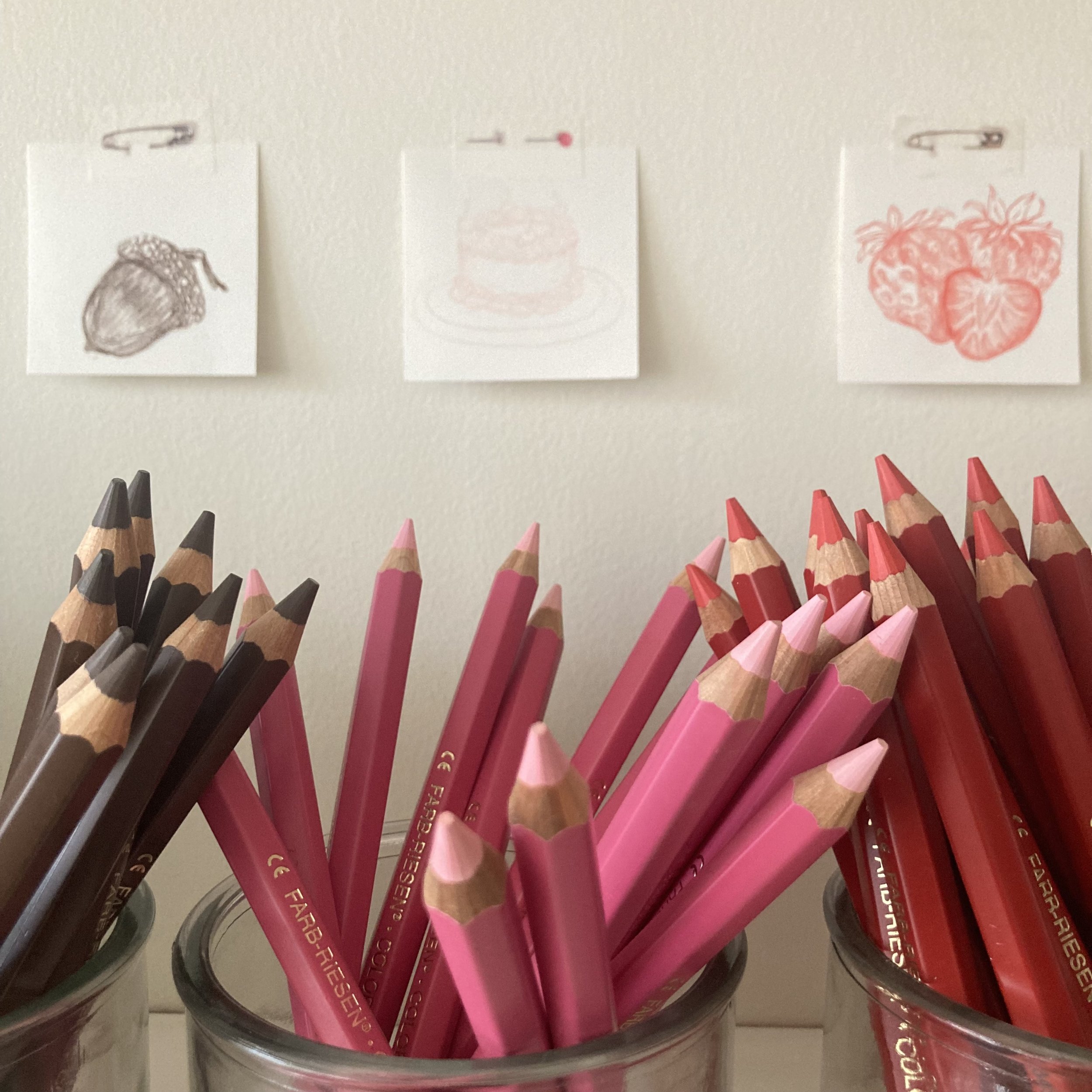
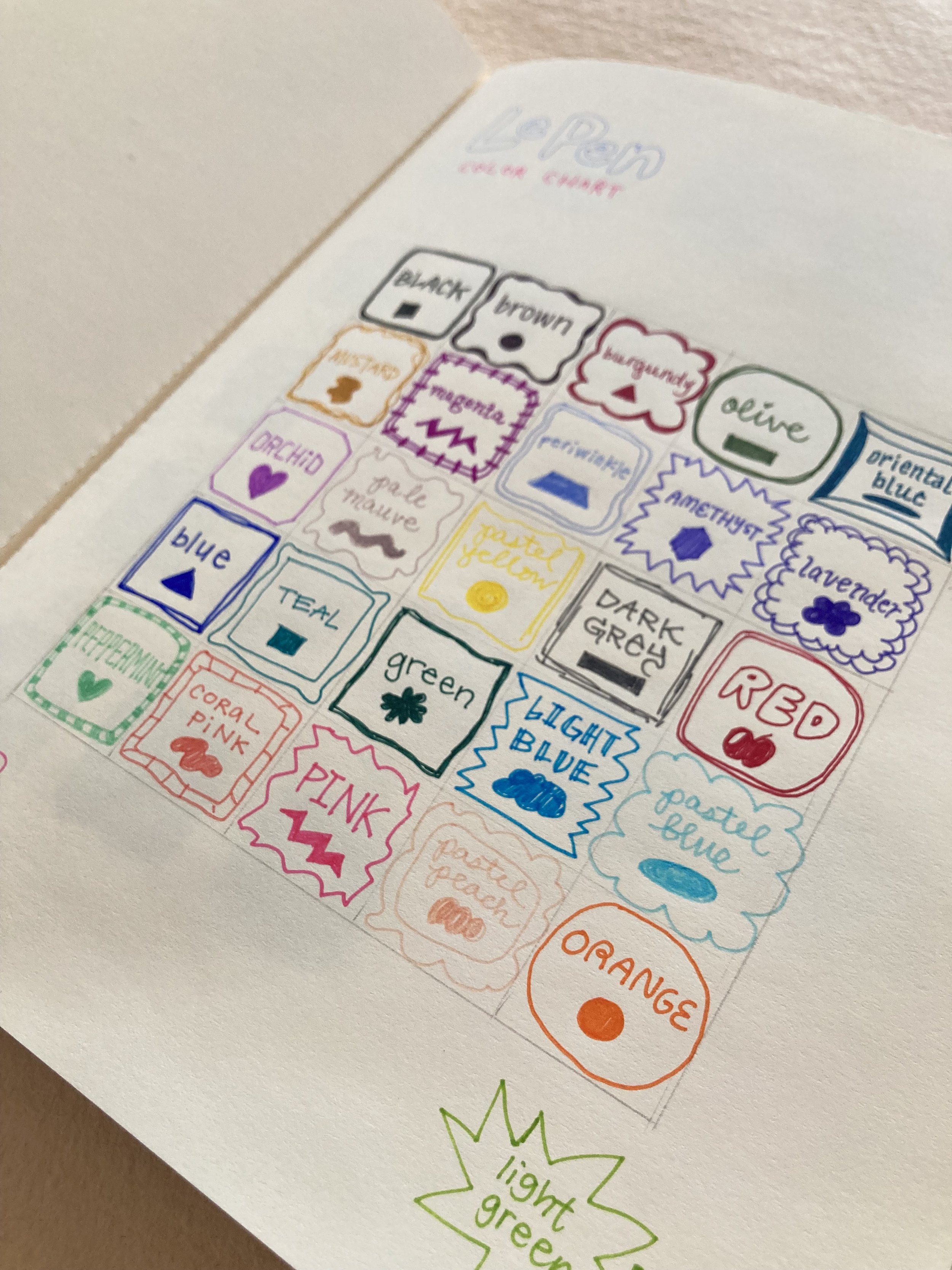
I tend to illustrate strange and intricate characters, anthropomorphic creatures, and mundane objects. A lot of my work addresses themes of childhood and nostalgia, which come through in the “cartoony” style I work in. I’ve really enjoyed the opportunity to contribute bits of my hand throughout the shop—drawing the various tools, hand-lettering price labels, wrapping pencils, and illustrating color swatches for the LePens and Lyra Colour Giant pencils.

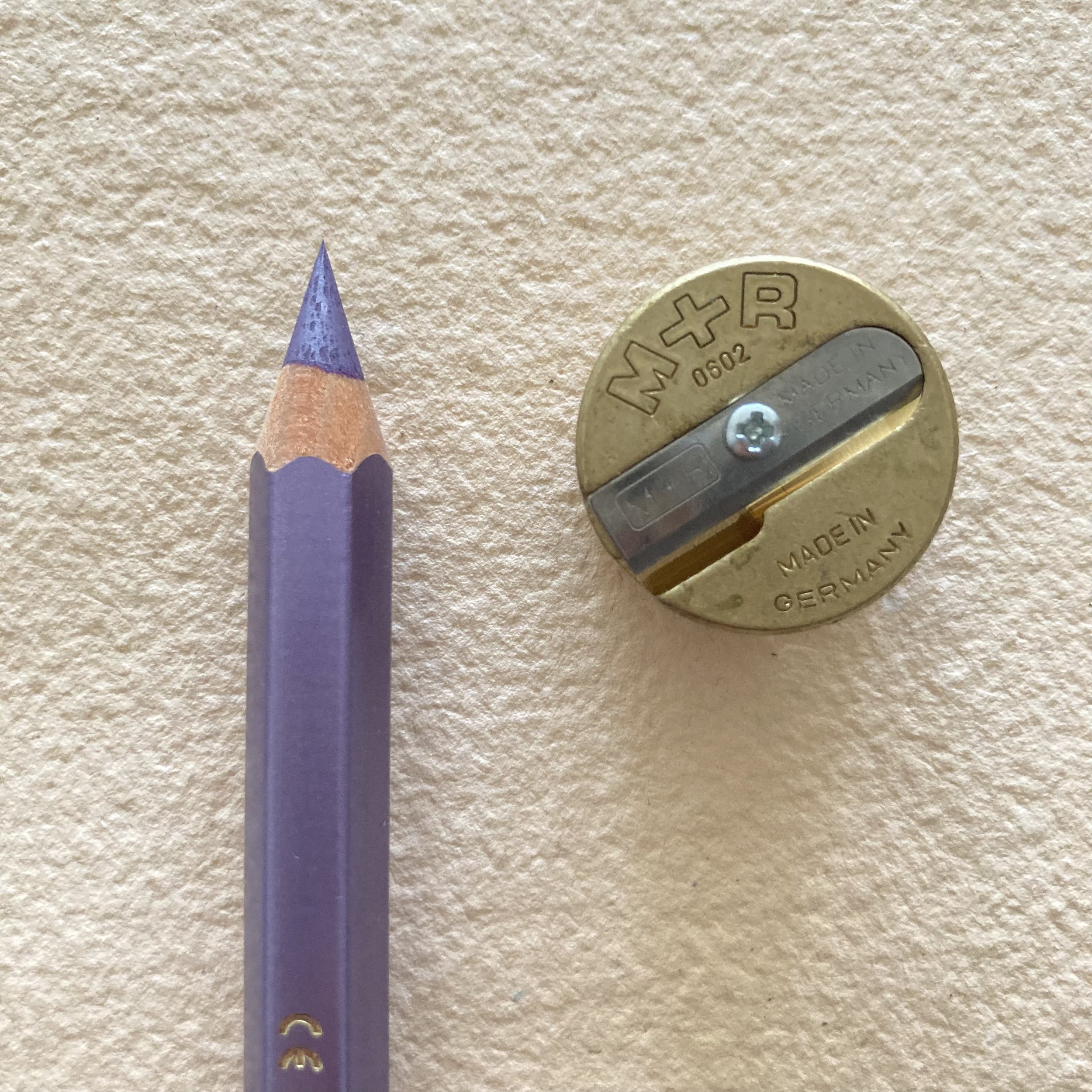
The LCGs are especially a pleasure to work with, and I find them exceptionally versatile. Their large size feels wonderfully accommodating, as they never slip out of my hand or feel uncomfortable. They are blendable as well as buildable, which is to say that they work quite well for linework and also provide an alluring aptitude for shading. They sharpen to an impressively fine point for capturing small details in a drawing, which I often want to do. I adore the different shades of purples and pinks, most notably the metallic purple! 

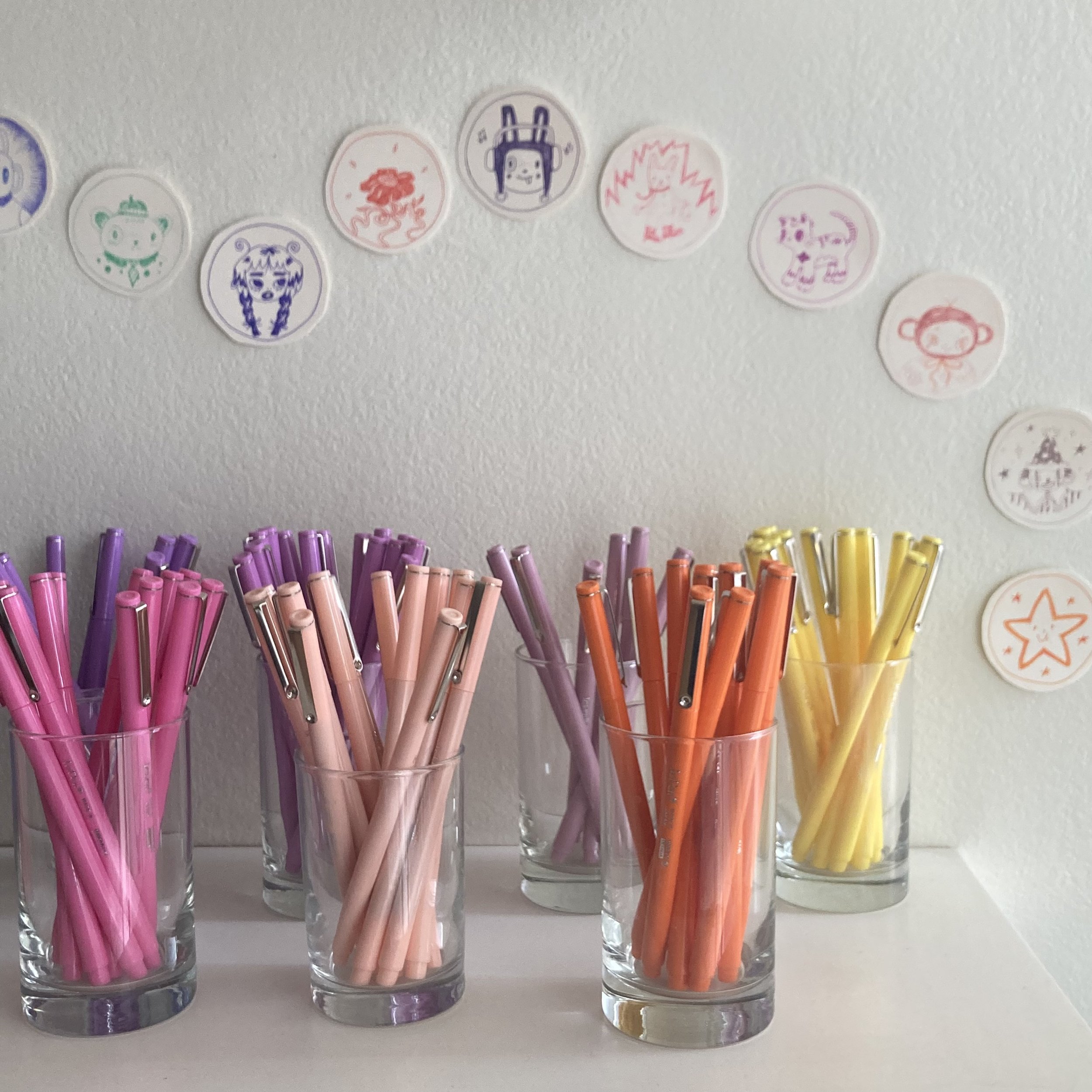
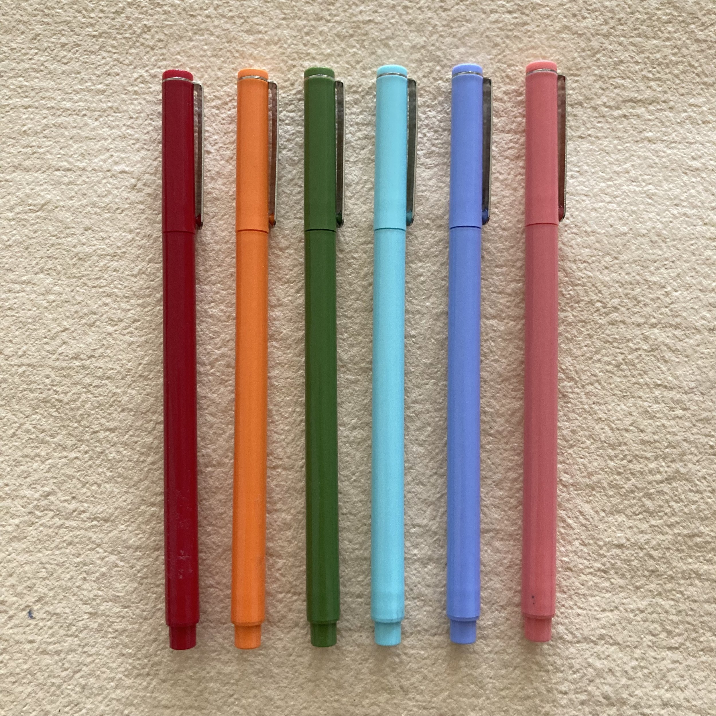
On the opposite side of the shop sit the LePens in their glass cups. They are petite in comparison but equally enjoyable to work with. They are perfect for linework, so I found it fitting to approach the drawings for the new colour swatches as I would my sketchbook. In this sense, I wanted to doodle things that first came to mind, being non-judgmental of my impulses. (I find this approach to drawing very freeing, and it allows me to get over some creative ruts I often find myself falling into.)

My style really came through in these illustrations—different people, flowers, unspecified creatures, and foods with faces. I drew the swatches on Stonehenge paper, and tried the LePens on the lush, toothy Velke Losiny as well. Both papers harmonize with the LePens to support the bold and bright shades. The purples in these pens really spoke to me the most. I definitely recommend LePens for linework and smaller drawings, or even journaling (perhaps in a Cambridge Imprint notebook, which is made of a hefty paper that allows for less feathering or show-through!)

 The LCGs and LePens make sweet stocking stuffers or gifts for someone that loves a pop of color in their life. I gifted a couple LePens to a friend before she went back to school, to provide some excitement in taking notes!

Six or more of the LCGs come in a hand folded (by me!) Cambridge Imprint paper bag. I’m a big fan of having a broad palette to work with, so if I were to choose my top six, they would be the Red, Orange, Olive, Pastel Blue, Periwinkle, and Pastel Pink! If you’re stumped on how to settle on six, I am cheerfully at the ready to provide recommendations fitted for any gifts you are giving. 

It makes me thrilled to incorporate my voice through this blog post in addition to showcasing my illustrations. It has been such a joy to write about the work I have done in the shop, and thank you for reading about it! 

Lyra Colour Giants
Le Pens
 
More than a shade of red, Ruby