
Dear Everyone ~

I’ve invited Alyson to share her reminiscences rekindled by our latest edition of fine papers from Carta Pura. Enjoy these musings from my Postal Muse, who also wrapped all the packages & hand-folded the envelopes for this post. Buon appetito!

“ Last month, Bari sent me photos of the new Carta Pura patterns, thinking I might like to help her name them. And then she sent me sample sheets, thinking I might like to experience them. And then she photo’d the sample boxy portfolio she’d made for her upcoming workshop, Hardcover Accordion Book in a Boxy Portfolio. And when I asked what ribbon she’d used for the closure… I had to share the story of Our Great Ribbon Caper in Oakland, Calif. almost 30 years ago!

I was living in San Francisco, working for Crane & Co., after a year at Paper Source’s flagship in Chicago. I had met Bari at the store, during the hottest summer in recorded history. We bonded in record time, and spent several magical afternoons at my apartment, hand-folding gorgeous envelopes from pages of the Martha Stewart Weddings issue, which was a hot commodity. Then, Bari went off to Italy with Zak to get married (and shop), and while they were gone, I was offered the job with Crane, whose corporate colors at the time were navy and kelly. Back in San Francisco, I read in the newspaper about Lacis, a store specializing in bridal fabrics and accoutrements, including beribbonments. I promptly went to investigate, returning with an entire spool (6" in diameter) of vintage navy-and-white stripe and ditto of kelly green-and-white stripe, for wrapping boxes of Crane samples… and more modest lengths of other colorways, including milk and dark chocolate.

Several months later, Bari was in Northern California, and Lacis was high on our papery itinerary. She swooned, she shopped… and she basically bought it all (after I had another turn). It’s true. And that’s how students in her workshop get to have this divine ribbon (while supplies last) to tie off their boxy portfolios.

Meanwhile, Bari had brought me back many wrapping & writing supplies from her honeymoon in Italy, including lengths of gorgeous passementerie that paired deluxely with decorative papers I’d brought home from Italy in the early ’70s, mostly classic Florentine florals, and a few little geometrics. Well, the Carta Pura patterns remind me (not surprisingly, as they are designed and printed in Italy) not only of my now 50-year-old papers from Florence but also of pitter-pattering around the Palazzo Pitti, in perfect papery proximity to venerable stationer Giulio Giannini. So, we felt bound to give each Carta Pura pattern an evocative Italianate name. Seen below are Piccolo Rosso & Piccolo Azzurro in envelope mode.


As for my vintage stash of Florentine papers: Eventually, I had no pieces large enough to wrap even a small gift. And then I had no pieces left with which to line even a little envelope. And then I had a bright idea: to commission Bari to cover butterfly clips in some of my scraps! And here they are, farfalle fiorentine that delight me every time I clip or unclip them—mostly in my kitchen cupboards. ”

Ruby has covered a flight of butterfly clips in Carta Pura papers. Students in my workshop will receive with each kit a glassine full of scraps for covering your own clips.


And note Farfalle Fantasia in the dropdown below: an entire constellation (1 parent sheet each) of the nine Carta Pura patterns plus a big butterfly clip covered for you. Hearts may flutter!

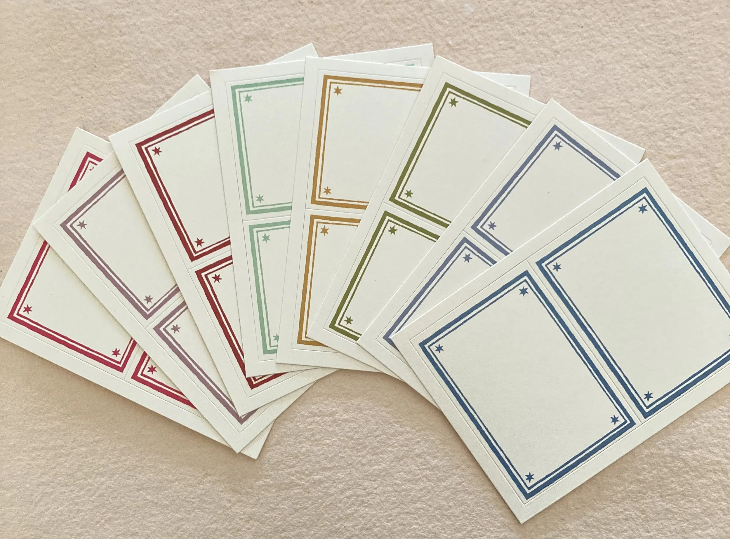
We are also doubly delighted to herald the arrival of Cambridge Imprint’s latest labels, which are simply stellar. They measure 2 x 2¾, with a writable area of 1½ x 2¼. Each packet includes 2 each of 8 lovely hues: cherry, lavender, marron, mermaid, mustard, olive, pewter, turq., presented in a glassine sleeve, sealed with a teeny YKW!


Carta Pura Papers from Italy
Stellar Cambridge Imprint Labels
Buona giornata, Bari