Rag & Pulp, Bookmarks & Gratitude

Dear Everyone ~

August was so august—and robust—at Bari Zaki Studio. The confluence of Stationery Store Day (SSD) & the publication of Rag & Pulp (R&P) made for a momentous month! I am hugely grateful for the lovely turnout for SSD, both in the shop and online. It was wonderful to see many familiar faces and a handful of new ones, and the day felt so festive! The shop was vibrating with love for stationery & all things paper, and that made my heart smile from ear to ear.

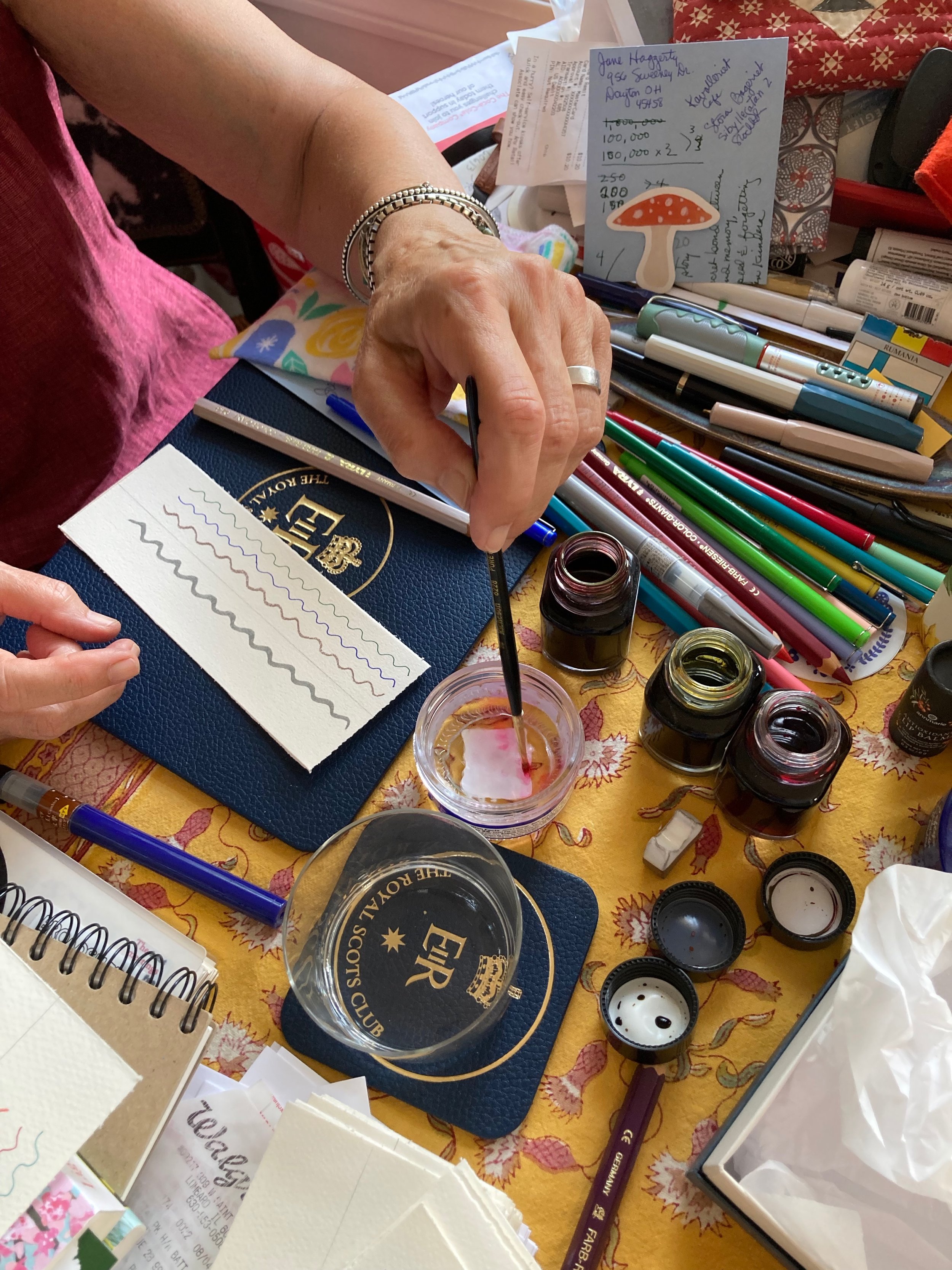
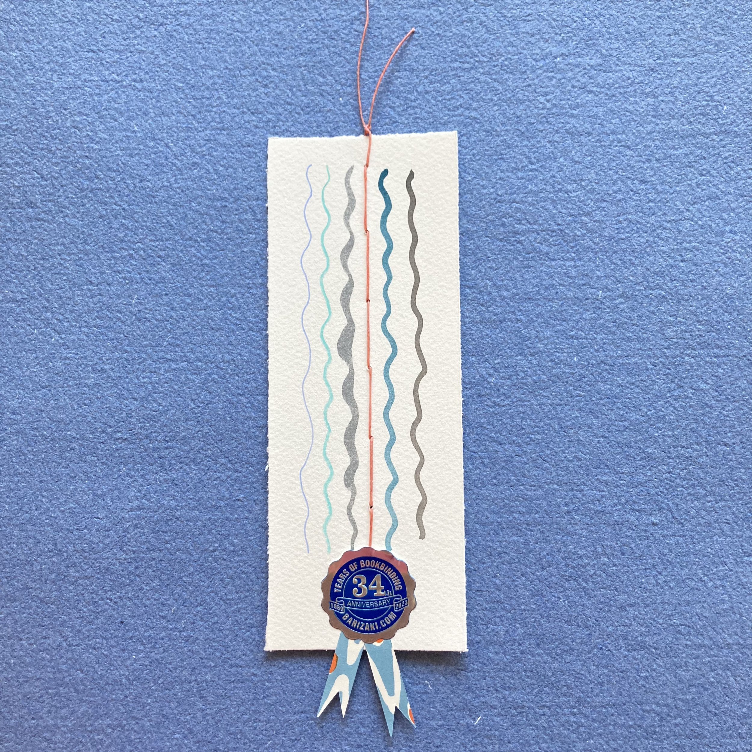
Leading up to SSD, bookmark-with-purchase production was in high gear. I am hugely grateful for my four extra hands: those of Janet Bouldin, dear friend and watercolourist, and Ruby, my new nimble shop assistant, who you will begin hearing & seeing much more of. Janet and Ruby’s creative camaraderie and beautiful handiwork imbued, infused, enthused the bookmarks with joie de papeterie.

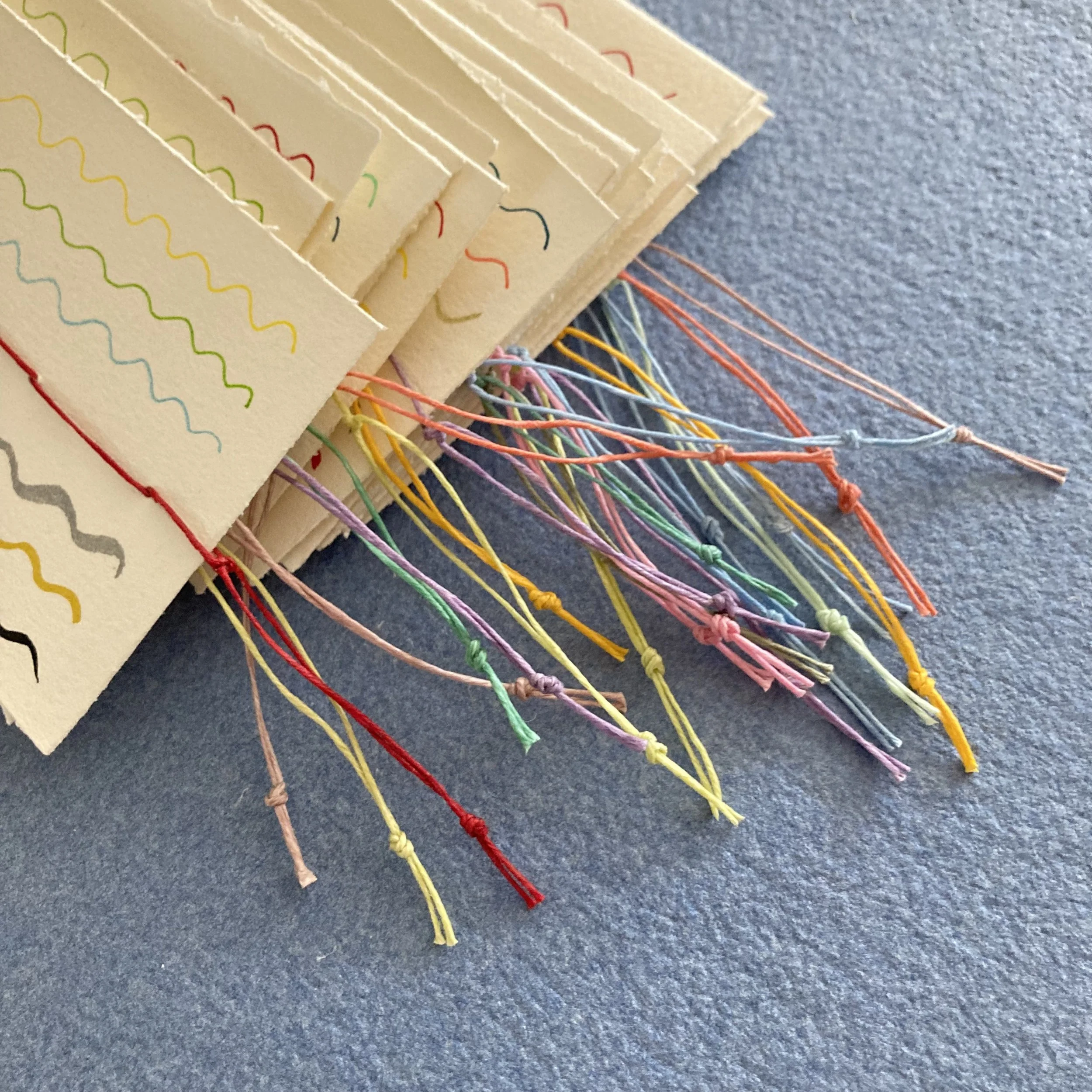
Here’s the bookmark backstory: My beloved bonefolder and I folded large sheets of Waterford Saunders watercolour paper down to size. My trusty shipping clerk’s knife deckled the edges. I delivered the stack, and a full set of Le Pens, to Janet’s studio-kitchen, for a delightful afternoon of painting and squiggling. She already had an excellent supply of the other supplies. The bookmark has six undulating “rows,” each featuring one of the assorted pens & inks I stock in the shop. The “equator” is a single row of waxed-linen thread, handstitched by Ruby. And for the seal of approval, Ruby affixed the BZS anniversary seal & Cambridge Imprint paper ribbons. Voilà-là-là!

It has been such a pleasure to inscribe, wrap & beribbon, and send off several dozen R&P! The lovely emails I’ve received from appreciative (and lyrical!) customers were a rereadable bonus! Below are a few endearing acknowledgments.
 
“ A belated note to let you know that your box of goodies arrived, proving that you can never be too old to squeal at mail. I immediately turned to page 76 [where the Bari Zaki Studio section begins], and then back again to page 7 [the first page of the table of contents], then 76, then 7... ad infinitem. Janine gave you a really nice write-up, and the pictures were oxygen, given how long it’s been since I’ve visited the store and you. Your fan, Martha ”
 
“ Received my beautiful Bari-treasure, I am peeling it like an onion, savoring every layer. You create the most amazing feasts for the eyes! Thank you, Mary ”
 
“ Rag & Pulp arrived today along with a lovely collection of Japanese papers from Chicagoland! I just finished reading your chapter and loved it! One day, I hope to visit you in your studio. Congratulations on a celebratory and inspiring story of your career!!! Now on to the chapter about Cambridge Imprint! Karen ”

Deborah e’d me twice. Her first subject line read: “Portrait of an order”, and she sent a photo of her order decanted (seen above). Her second message read: “ Got it!! Thanks for the wonderful surprises and for wrapping everything so beautifully. I’m trying not to drool in the box, and I feel a color coma coming on!!!”

Jill ordered a copy, wrapped in Grafiche Tassotti No. 3, which I shipped directly to a friend of hers. She requested this inscription: “ Happy Birthday Jodi! To a creative genius and wonderful friend. ” I loved writing that—and I also loved composing the inscriptions for customers who asked me to sign their own copies.
 
For me, the excitement around the launch of R&P is ongoing, as I can look over to see the stack of copies atop my Japanese teaboxes. I also have a browsing copy, with bookmark, at the front of the shop. Someone commented the other afternoon how hefty the book feels, and it’s true. The most papery paperweight imaginable!

Rag & Pulp
 
Singing into September, Bari
 
PS:
Speaking of Ruby and Kyo-no-oto inks. Last week two new dreamy ink colours arrived—No. 13 (Seiheki) & No. 14 (Yurushiiro)—which called for a refresh of swatches in the shop. Here is Ruby swooshing her swatches.

And here they are on display. Both colours have been added to the online shop.
Paging all bookbinders!

Dear Everyone ~

I’ve been percolating about new workshops to encourage students to rethink how you think about your pages: how they function, and how you can decide which binding style best accommodates them. I am delighted to announce that I have come up with not one, but two, workshops, which I will preview by saying: Pages are all the rage!

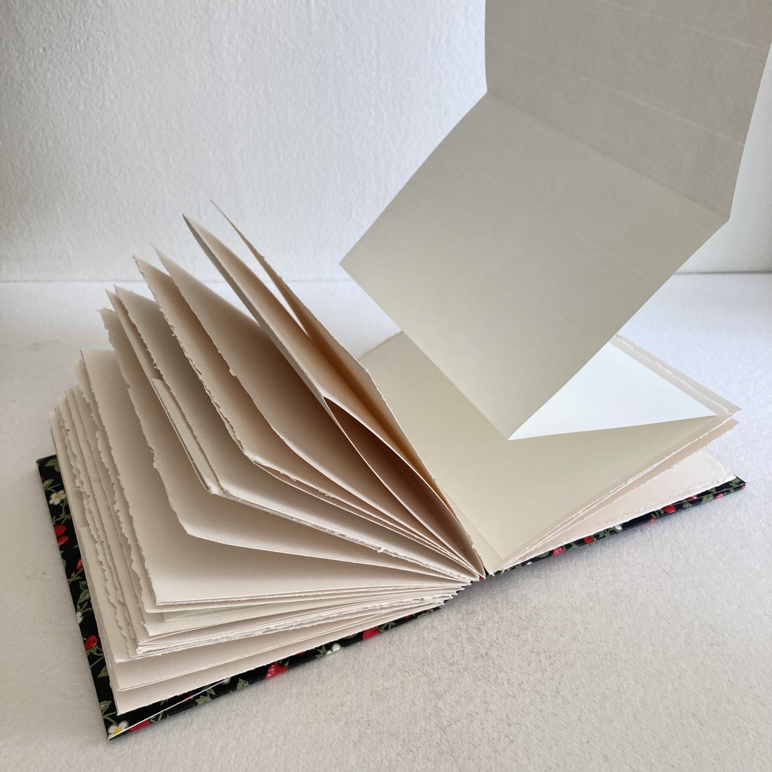
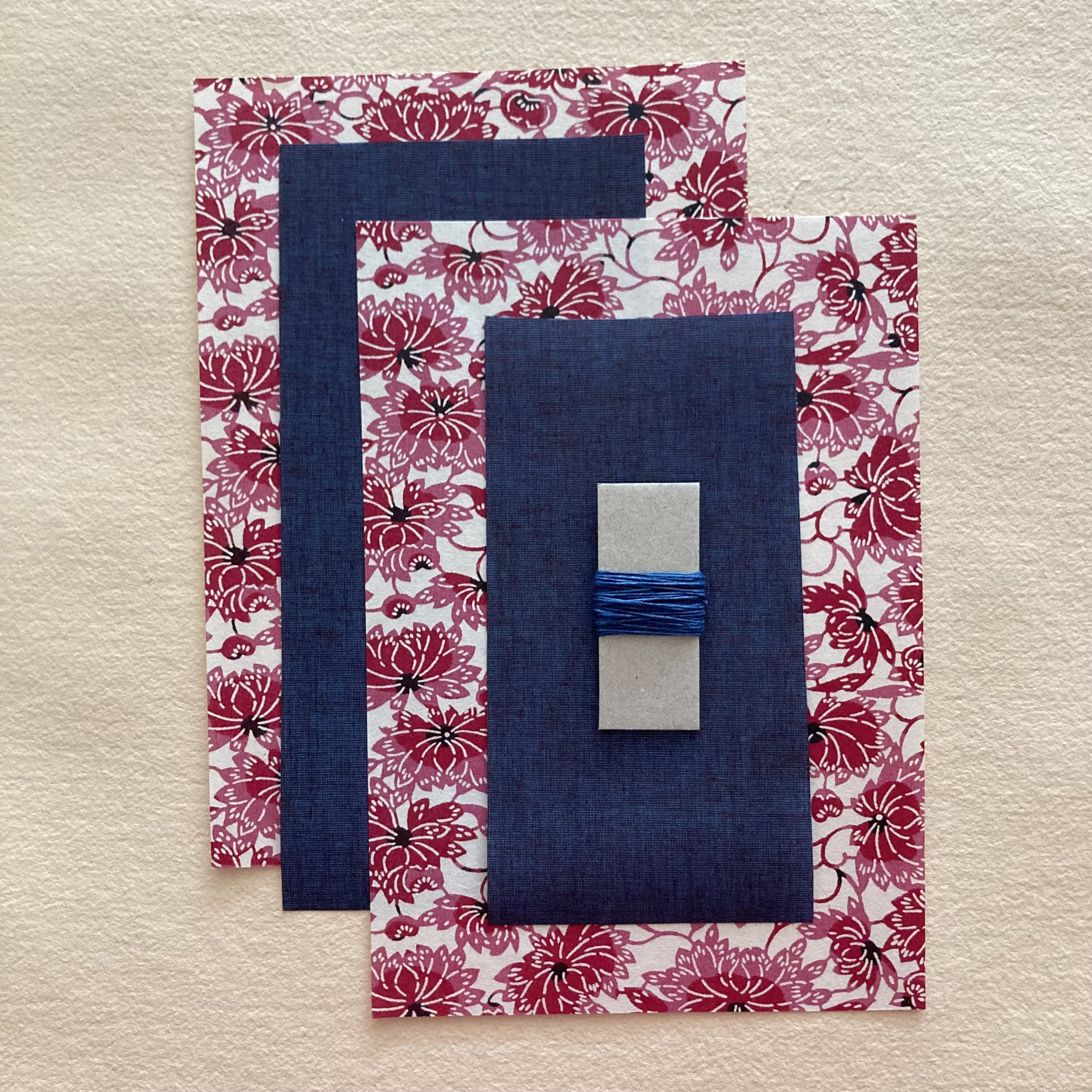
Book of Engaging Pages is a two-part workshop in which you will learn to make four different styles of page: a pocket-page, a 4-page signature; a 3-panel gate-folded page, and a “booklet-within-the-book” holding a 4-page concertina. You will bind your pages into a beautiful book measuring 6 x 7½ x 1½, using the Long-stitch technique. As the frosting on the binding, you will make envelope/pockets inside your front and back covers. 

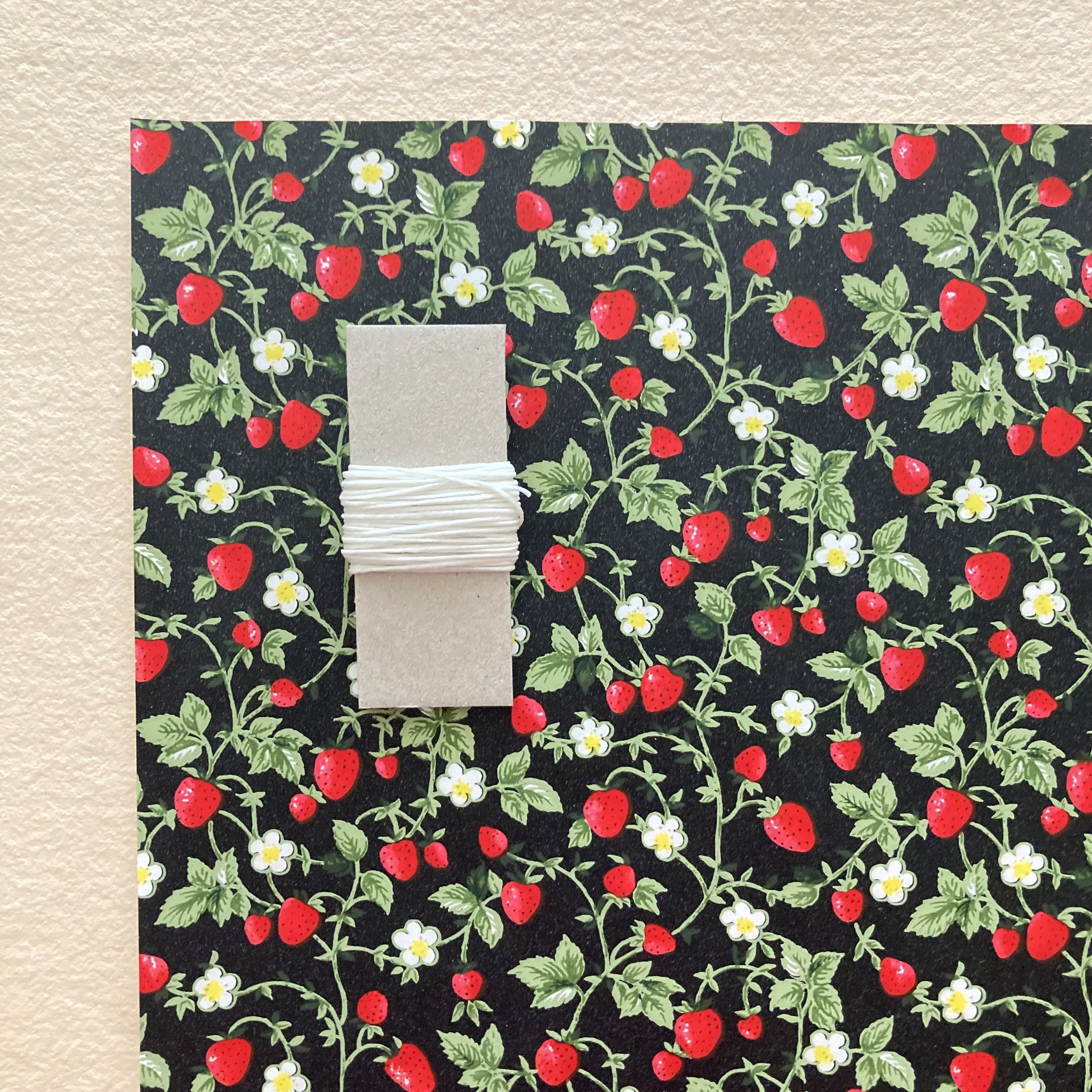
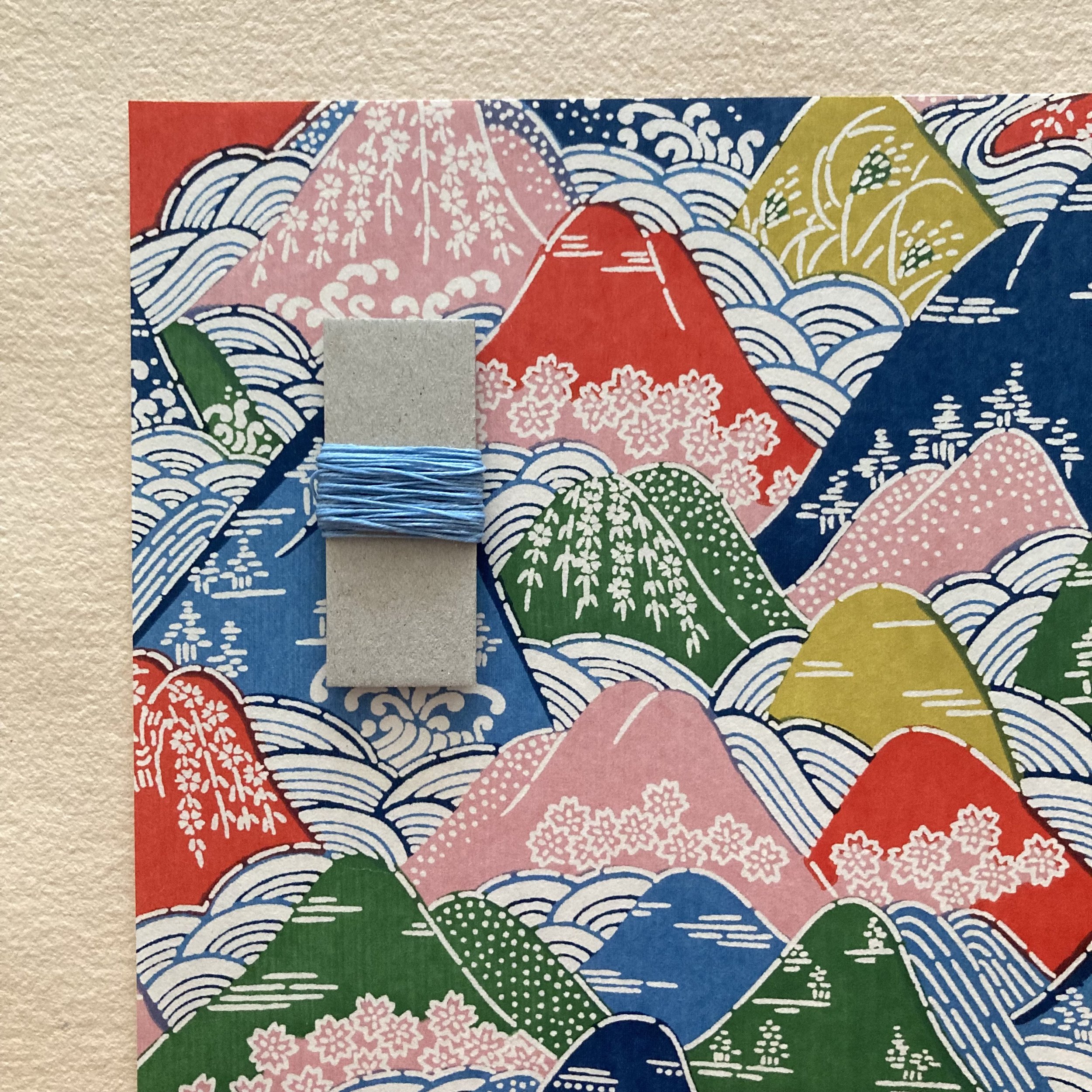
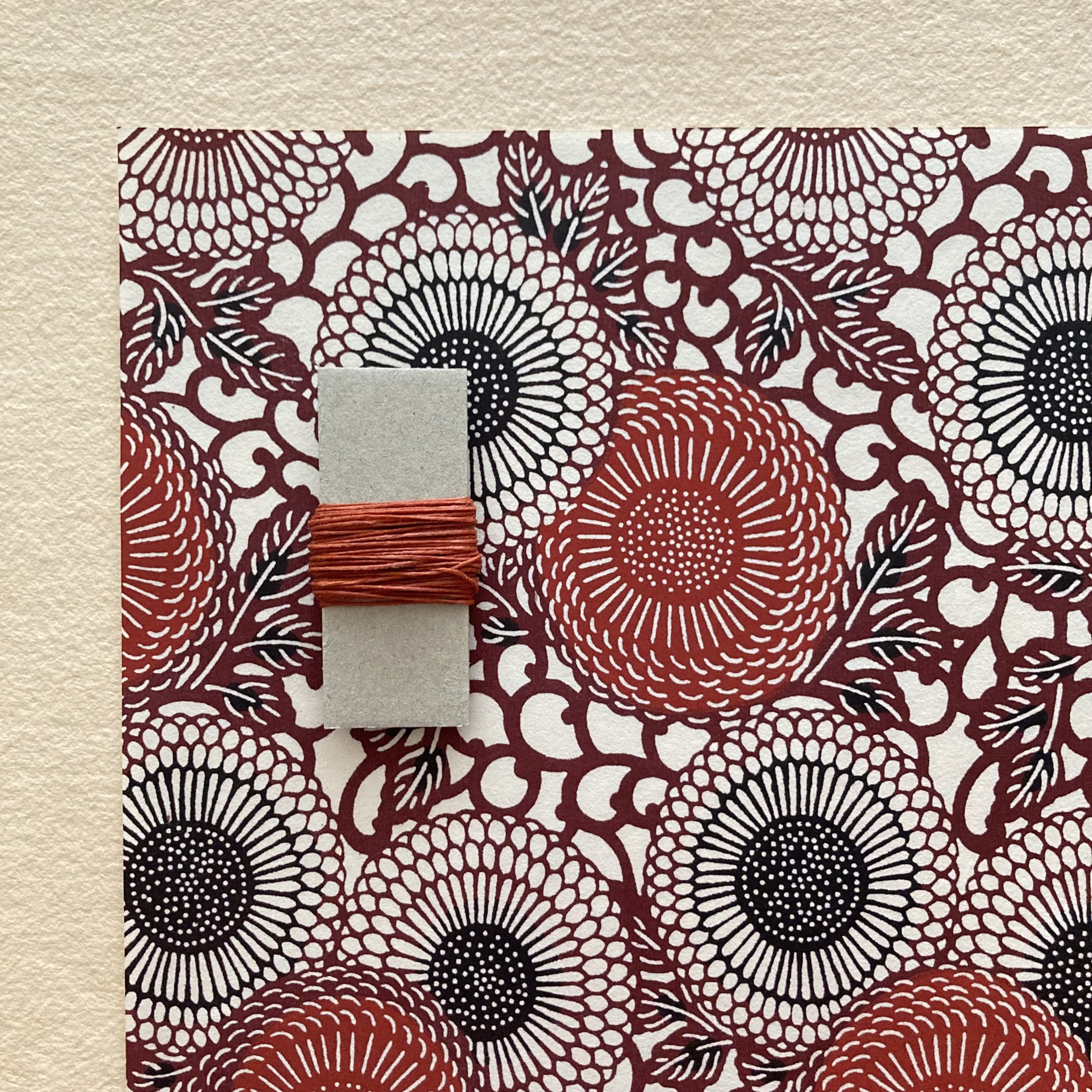
The materials I’ve selected for your Book of Engaging Pages are themselves engaging, of course. You have three options for your kit, from my current favourite Japanese Chiyogami & Katazome patterns: Wild Strawberries, Cloud Peaks, and Woven Mums, each with complementary waxed-linen thread.

In Pocket Book, you will learn to make a Japanese 4-hole binding with an articulated cover, measuring 7⅛ x 7¾ x ¾. Your book will have 12 pages: 5 hand-folded, hinged pocket pages, interleaved with 7 pages of Stonehenge drawing paper. Students will also learn how to make spine spacers, which increase the thickness of a spine and provide space between pages. Spacers are important when you’re making a book to hold photographs, swatches, or ephemera, or, in this instance, pockets that need room to hold things.

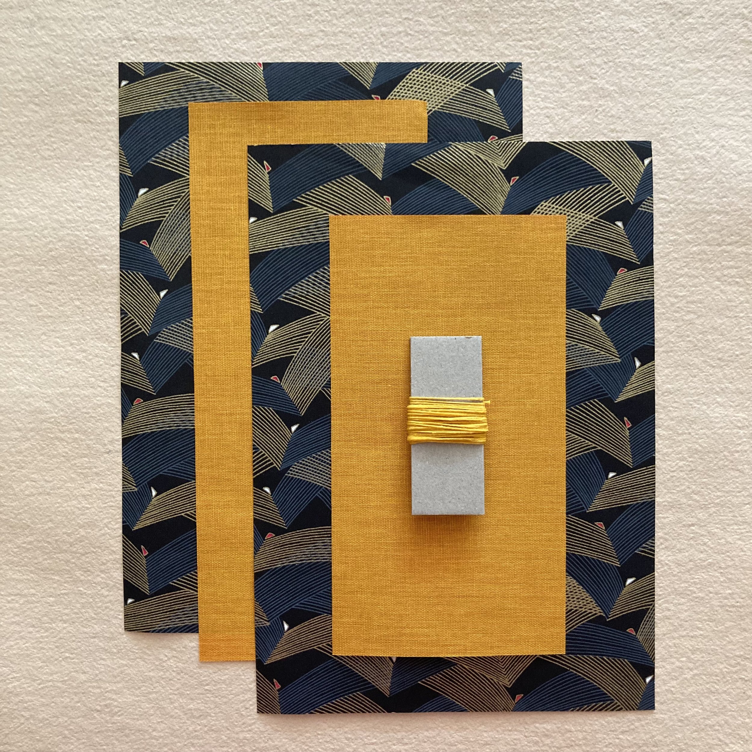
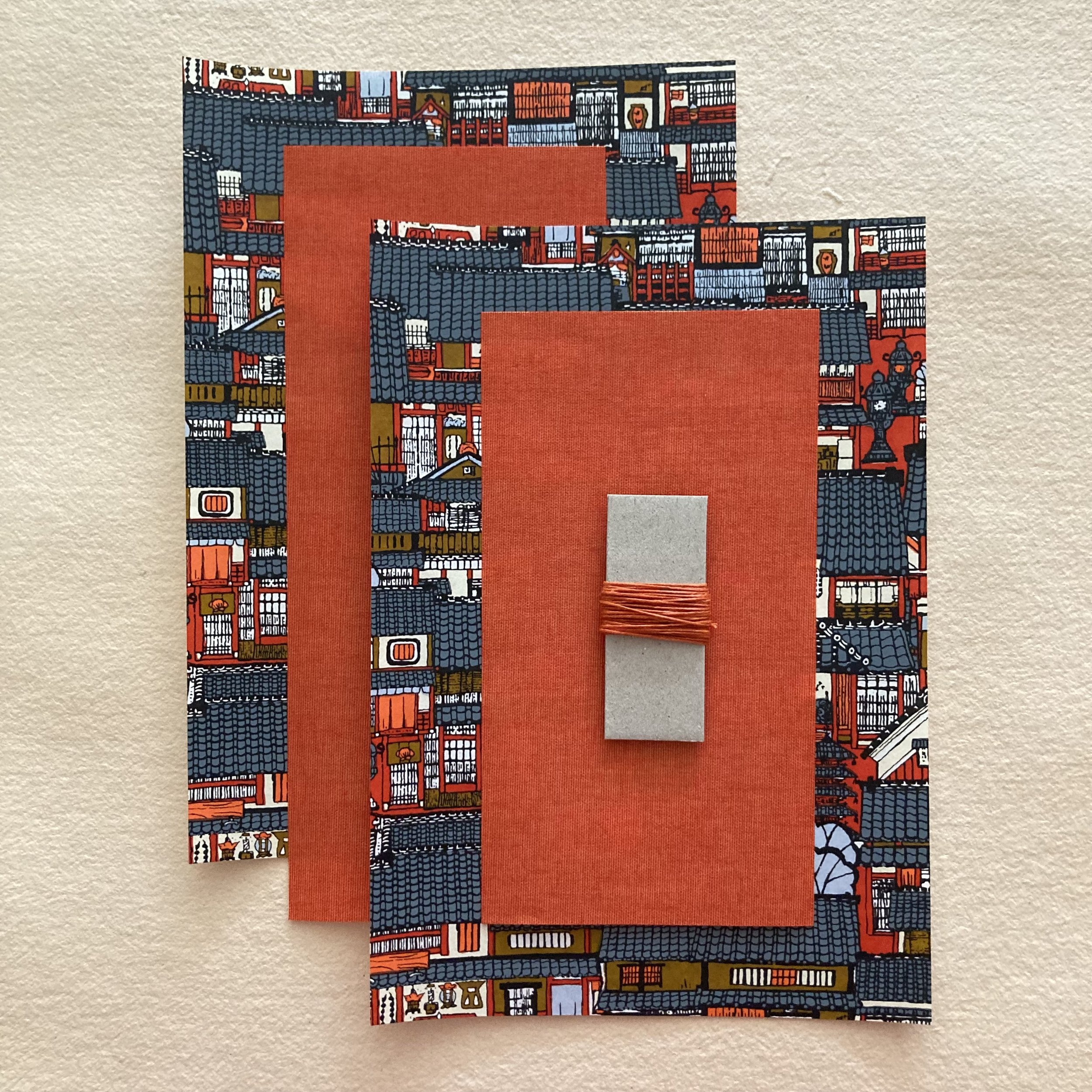
The materials I’ve selected for this kit are also three of my favourite Japanese Chiyogami & Katazome papers: Celebration, Village, and Classic Mums—paired with complementary bookcloths & waxed-linen thread.

 No previous bookbinding experience is necessary to have your book(s) be a paging success!  For Pocket Book, a bit of glueing experience is a plus but not a must. You will have ample time during each step to ask questions while we work. As always, I will live record all workshop sessions, and these will be available to you later the same afternoon to watch and rewatch at your leisure.If you have any questions now, please feel free to call or e me to discuss!

Book of Engaging Pages
Pocket Book
 
Flipping excited, Bari

Announcing Bookful of Art Inspirations

Dear Everyone ~

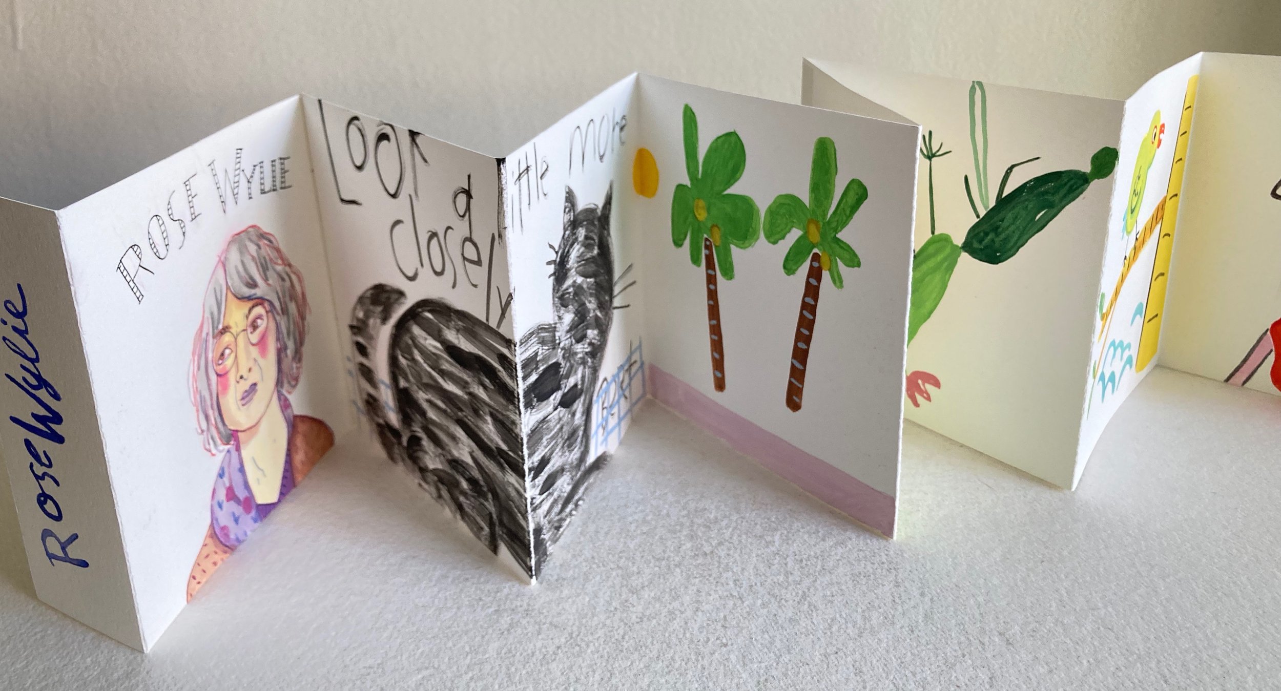
Bookful of Art Inspirations is my eleventh Bookful collaboration with artist, author & dear friend Cat Bennett. Our four-session workshop via Zoom will begin on Saturday, September 16, a scant week before the autumnal equinox.

In this series, we will explore the themes & styles of three wonderful women artists: Vanessa Bell (1879–1961), sister of Virginia Woolf; Sonia Delaunay (1885–1979), who lived and worked in Paris; and Rose Wylie (b. 1934), who is still  painting huge canvases in Kent, England and achieved artistic recognition at the age of 80! 

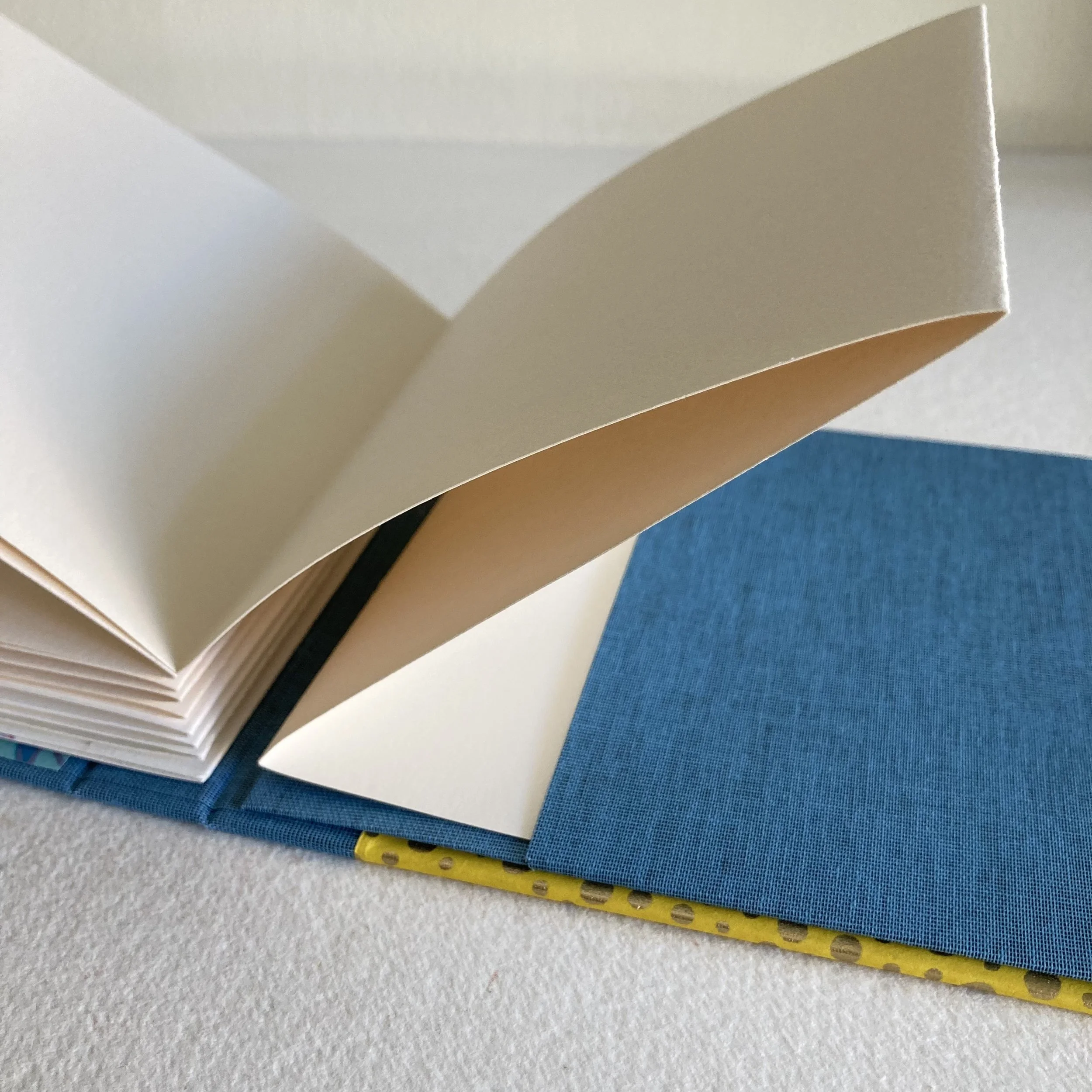
The structure you will learn to make in this series is a drop-spine accordion book measuring 5½ x 5½ x ¾, with hard covers. Your accordion panels, each measuring 5 x 5, will open to 5" x 8-plus ft. when fully extended. Displayed upright on a ledge, mantel, or shelf, your panels will look lovely opened to 4 or 5 or 6 ft.

The back cover has a cloth-covered vertical pocket that secures your accordion-block in place and also allows you to easily remove & replace it with a fresh accordion-block. We love the idea that you can refresh the contents of your book whenever, or even share or exchange them with another person—that would be lovely! You can create a series, or seasonal swap, of accordions over time.

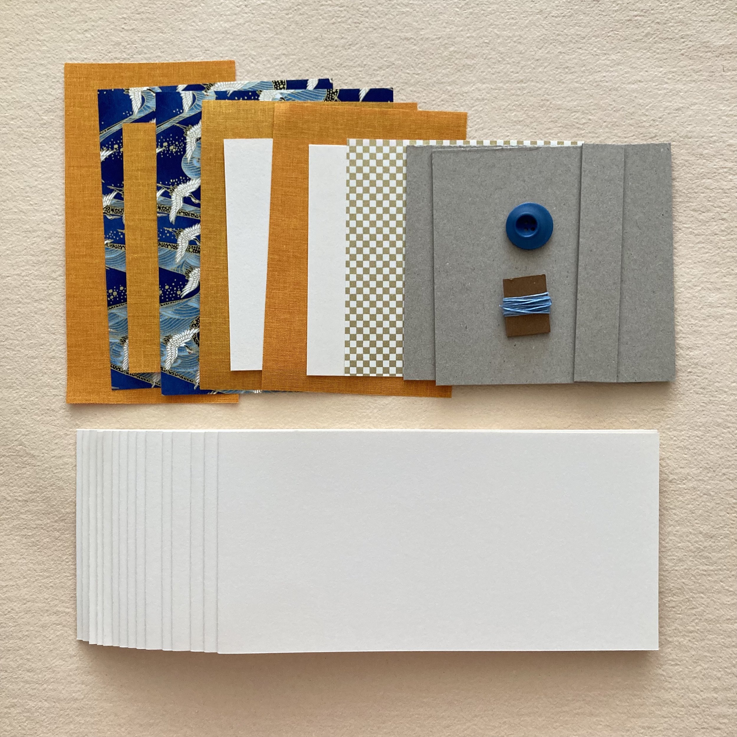
The kitful of materials I’ve selected for this Bookful includes a particularly yummy selection of Japanese decorative papers & bookcloths from my reserves. As you know, I delight in mixing & matching colours and patterns. If there’s a particular palette or combination that strikes your fancy, please feel free to e me and I will do my best to accommodate your request.

In weeks #2, #3, & #4, Cat will begin the workshop session with a curated slideshow. She will then lead the class in painting & drawing exercises using a variety of mediums, including coloured pencils + watercolour, pen & ink, and collage. We’ll also explore painting with gouache, which is opaque, and wondrous for the layering of colours. 

Cat & I want to assure you, especially if you are a Bookful newcomer, that truly no drawing or bookbinding experience is necessary—all levels of artistic skill & interest are welcome. Our pace is relaxed & supportive, and the camaraderie is delightful. Plus, you will have four complete workshop videos (recorded in real time) to watch and rewatch at your leisure. We look forward to seeing you soonish via Zoom!

Bookful of Art Inspirations

Zooming, Bari

PS:
Stationery Store Day was the least stationary day ever at Bari Zaki Studio, both in person and online. It made my heart smile from ear to ear to see so many familiar faces and several new faces waltzing in the shop, all basking in papery pleasures. It was a particularly grand day for sales of “Rag & Pulp.” The very elaborate multi-medium bookmarks-with-purchase were ready in record time, thanks hugely to my two nimble collaboratrices: Janet Bouldin and my new shop assistant Ruby! Next week I will showcase the assembly process in squiggly, stitchy, seal-of-approval detail!

Glimpses & Deliria of “Rag & Pulp”

Dear Everyone ~

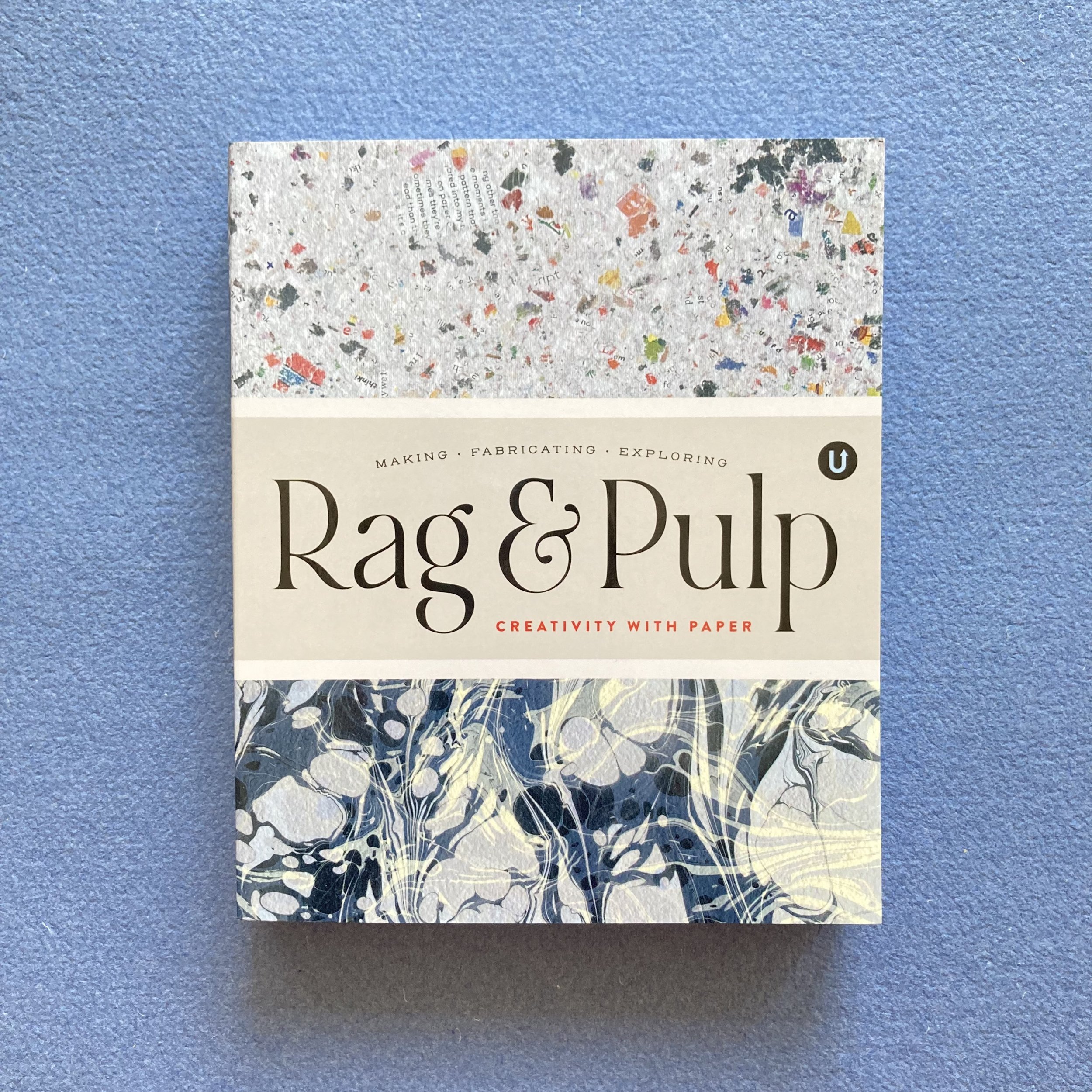
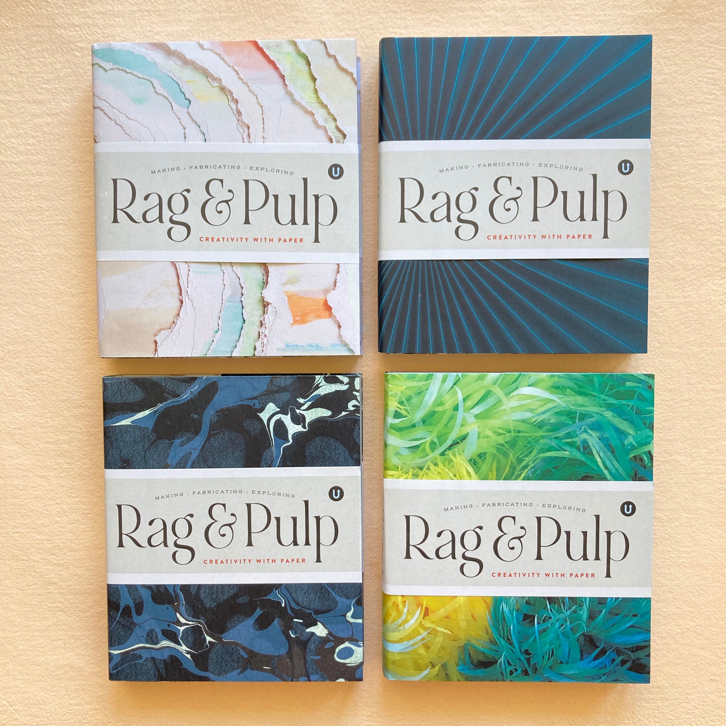
I am over-the-moon delighted to announce that Volume R for Rag & Pulp (R&P), in the Uppercase Encyclopedia of Inspiration has just arrived at Bari Zaki Studio. We are honoured, chuffed, and thrilled to be included in this international assemblage of people who make their living (and their lives!) using paper. BZS is doubly happy that Janine Vangool, designer and publisher extraordinaire, chose a photo of one of my books (Coptic-stitch binding) to grace the spine of R&P. 

I mused with Alyson Kuhn—my postal and everything-paper muse—about ways to personalize copies of Rag & Pulp for customers. We entertained several embellishments, and settled on a multi-medium BZS bookmark on Saunders Waterford watercolour paper: gentle undulations (bordering on squiggles) of the various writing implements stocked in the shop—Lyra Colour Giant, Kuretake brush pen, Kyo-no-oto fountain pen ink, Le Pen, and sumi-e ink. For good measure, a row of hand-stitching with waxed-linen thread. As a footnote, my anniversary seal-of-approval with Cambridge Imprint chevroned paper ribbons.

If you’ve e’d me to request your copy of R&P, I have set it aside and will e you a direct payment link. If you fancy having your book personalized, please e me what you’d like me to write, whether you are acquiring a copy for yourself or for a friend. And if you had already pre-ordered or purchased your R&P through Uppercase, but would enjoy receiving a bookmark, please e me for details.

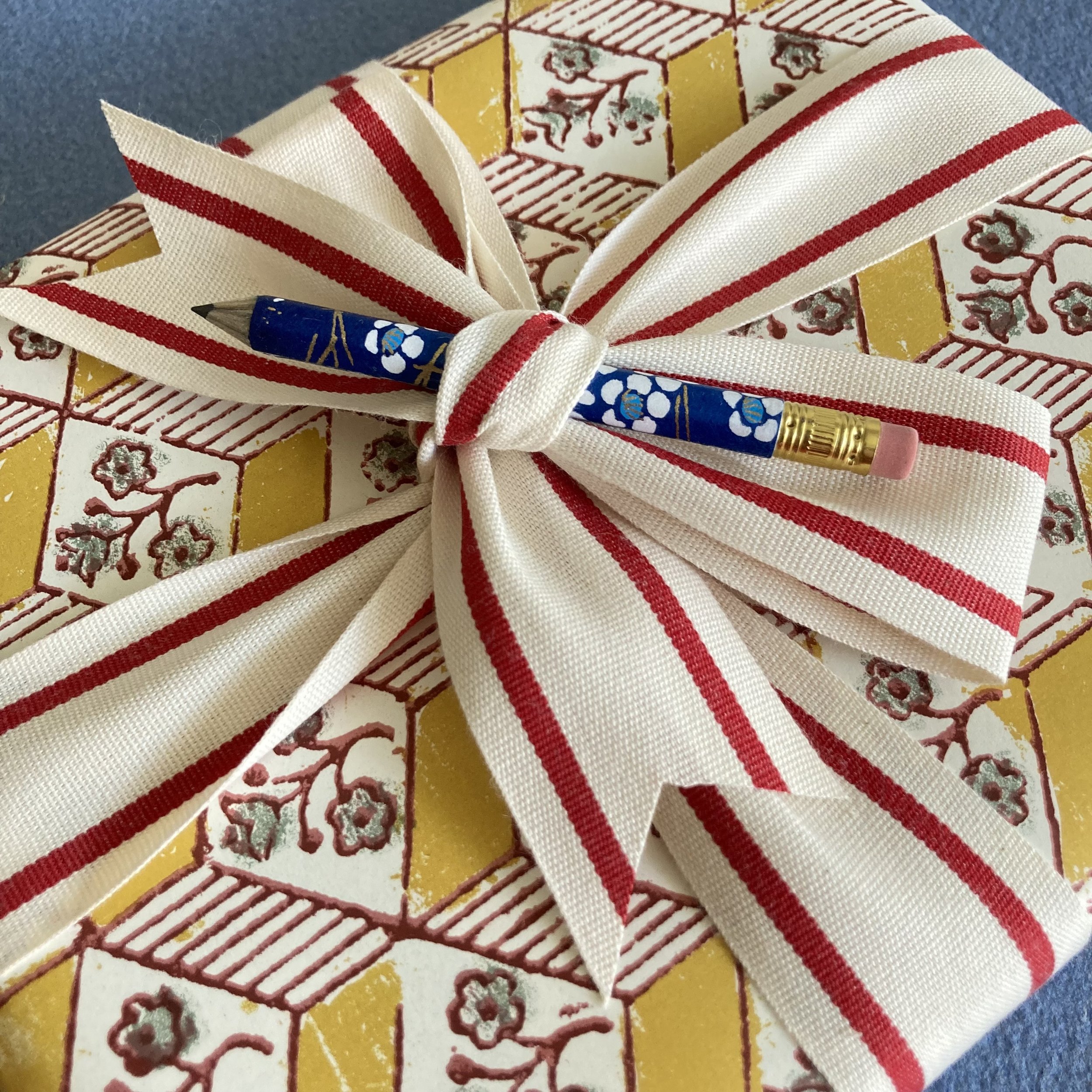
 As you might imagine, I’m also offering dressy gift-wrapping. We’ve chosen the Genius Geometric palette by Grafiche Tassotti, beribboned with a 2-inch double stripe ribbon by Studio Carta, with a tiny pencil we've covered in Japanese paper tucked into the bow. 

Correy Baldwin, the writer extraordinaire of Rag & Pulp, included several of my direct quotes in my—count them!—five spreads, one of which I’d like to wrap up with here, because it distills the essence of why I love books and why my collaborations with customers and students alike are so meaningful to me.

“ I think of a book or box I’ve made as being at the beginning of its functional life. My part is finished, but it's the customer or ultimate recipient who determines what it will become and what its future will hold. Once you begin using the book, it actually gets more beautiful! Yes, the book itself is a lovely object, but it is what’s inside that makes it engaging to flip through, and therefore memorable. ”
 
Volume R for Rag & Pulp

Book bliss, Bari

Stationery Store Day encore galore!

Dear Everyone ~

Hark & Huzzah! This Saturday, August 5, is the second annual international Stationery Store Day (SSD). Last year, BZS and A. Favorite Design were the first two Chicago stationers to hop on the Stationeryland bandwagon. This year, the Chicago metro area has eleven participating stationery shops! There are hundreds of shops across the U.S. and abroad, from Amsterdam to Zealand, New—all celebrating the joys of written communication and the love of all things paper &tc. Bari Zaki Studio is beyond delighted to be part of the festivities!

This year's swagalicious SSD loot is illustrated by Providence-based artist Eloise Narrigan: posters, postcards, stickers, and of course a tote bag! Seen here is the poster in my shop’s front window. 

Here is a preview of the BZS gift-with-purch ($50 pre-tax) merch: a ½ sheaflet of 3 x 5 drawing paper held together with a madam butterfly-clip covered in Japanese paper, and a mini-pencil covered in ditto. The ensemble is ensconced in a glassine sleeve sealed with my anniversary seal. We will include an SSD postcard or sticker (while supplies last). With a purchase of $100 (pre-tax), you will also receive an SSD cotton tote bag in which to transport (and perhaps flaunt!) your new supplies.

Speaking of mini-pencils, may we draw your attention for a mini-moment to the charmola Tinyconderoga that Eloise has installed on the mezzanine of this stationeryscape? Our mini is a non-Tinycon, that you can both  jot with, and also use on a package or as a hair ornament.

BWTW! Behold the official SSD washi tape! We will of course use this to wrap and embellish all purchases. And we will share the washi love for your own wrapping, sealing, and journaling re-use. Our gift-with-purch includes a wide washi bookmark: three 5" strips of official SSD washi on a piece of cardstock. It peels off easily and borders on genius!

We will be OPEN for business and giddiness from noon to 5pm, no appointment needed! Because we are ardent equal-opportunity shopkeepers, online shoppers may place their Stationery Store Day orders beginning at noon (Chicago time) on the 5th to receive the BZSSSD giftie (while supplies last). 
 
Looking forward to seeing you very soonish, Bari

Midsummer refreshment(s) in the shop

Dear Everyone ~

I’m delighted to showcase several of my handmade books that have just been listed in the online shop: six Buttonhole-stitch books, two Long-stitch-link-stitch with hand-folded envelopes, and one Case-binding. I’m also pleased to announce that various customer favourites—awl you needle for stitching and punching and so forth—have been restocked, re-upped, and re-adied for you.

Buttonhole-stitch binding happens to be one of my favourite styles, and I recently experimented with miniaturizing it. I’ve made a quartet of these amuse-books, covered in the Grafiche Tassotti Sprigs & Twigs palette.

 The two Long-stitch-link-stitch books with stitched in hand-folded envelopes feature Cambridge Imprint Peggy Angus-from-all-angles. These books are wonderful for an ephemera album or travel diary, as the pair of envelopes with string & button closures are perfect for filing this & that & what-have-you!

This Case-bound book is my very most recent book, made alongside two students via Zoom this past week. The Hahnemühle Bugra signatures alternate Light Grey & Marble Grey. Covered in Japanese Chiyogami, it measures a charming 5½ x 6 x 1.

Speaking of bookbinding, let’s! We have two new bookbinding needles in stock, one straight and one curved. I find that, depending on the book and the day, I might prefer a smaller or larger…and it’s nice to have a choice.

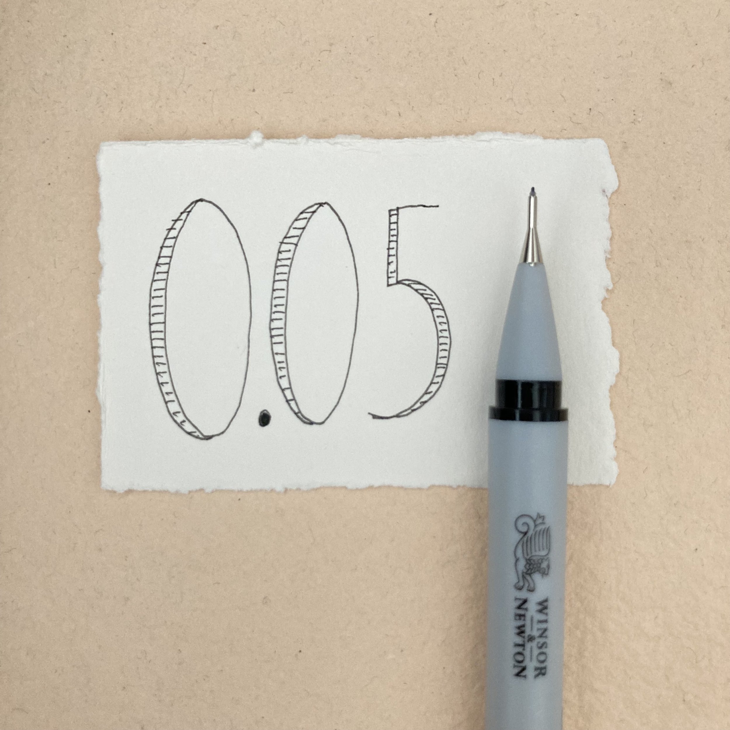
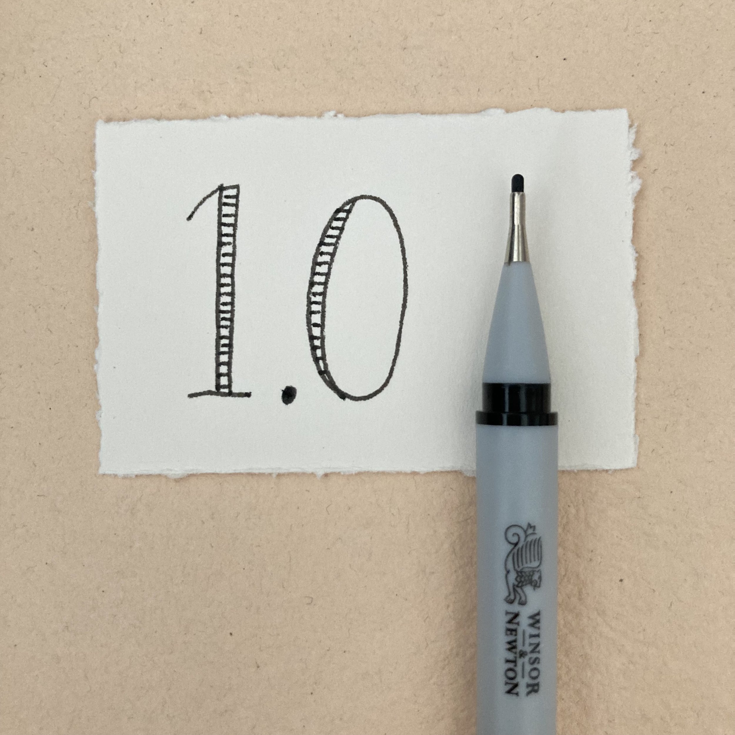
 Our Winsor & Newton pen point selection has grown by two. We now stock the 0.05 (divinely fine line), and the 1.0 (thoroughly thick line). 

Season Paper notebooks have been replenished in eight new designs. 

Coccoina glue-sticks in the extra-grande 40g size are back in stock. If you haven’t tried this size before, we recommend it for sealing bigger envelope flaps, larger works of art, and collaging. It spreads evenly and allows for movability before it dries. And the best bit is that it smells like maraschino cherries! 

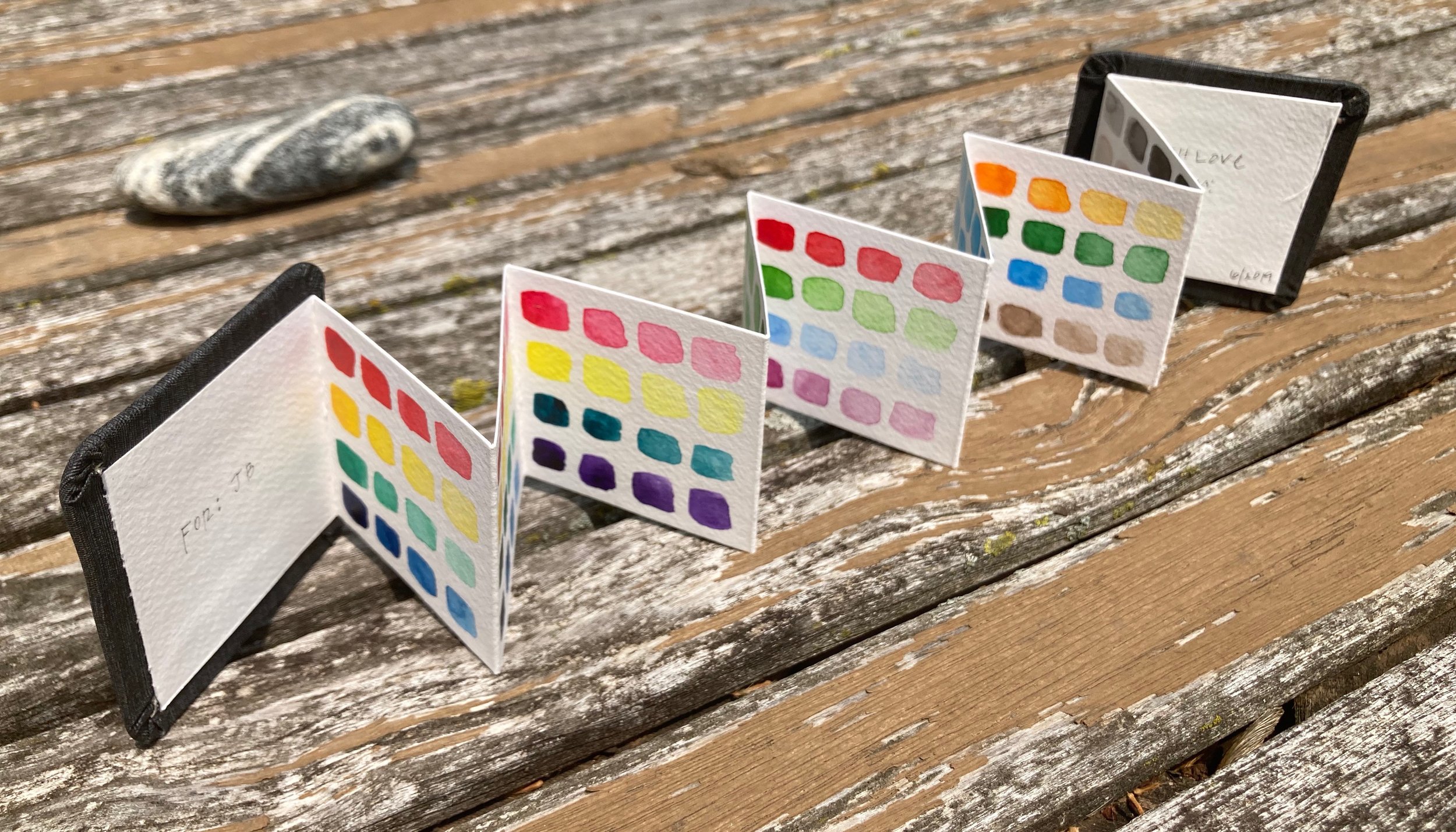
Also back in stock are the tiny & charmola 2 x 2 (and 2 x 16-ish when open fully) concertina books from Hahnemühle. Perfect for watercolouring, swatching, collaging and … whatever-do-you.

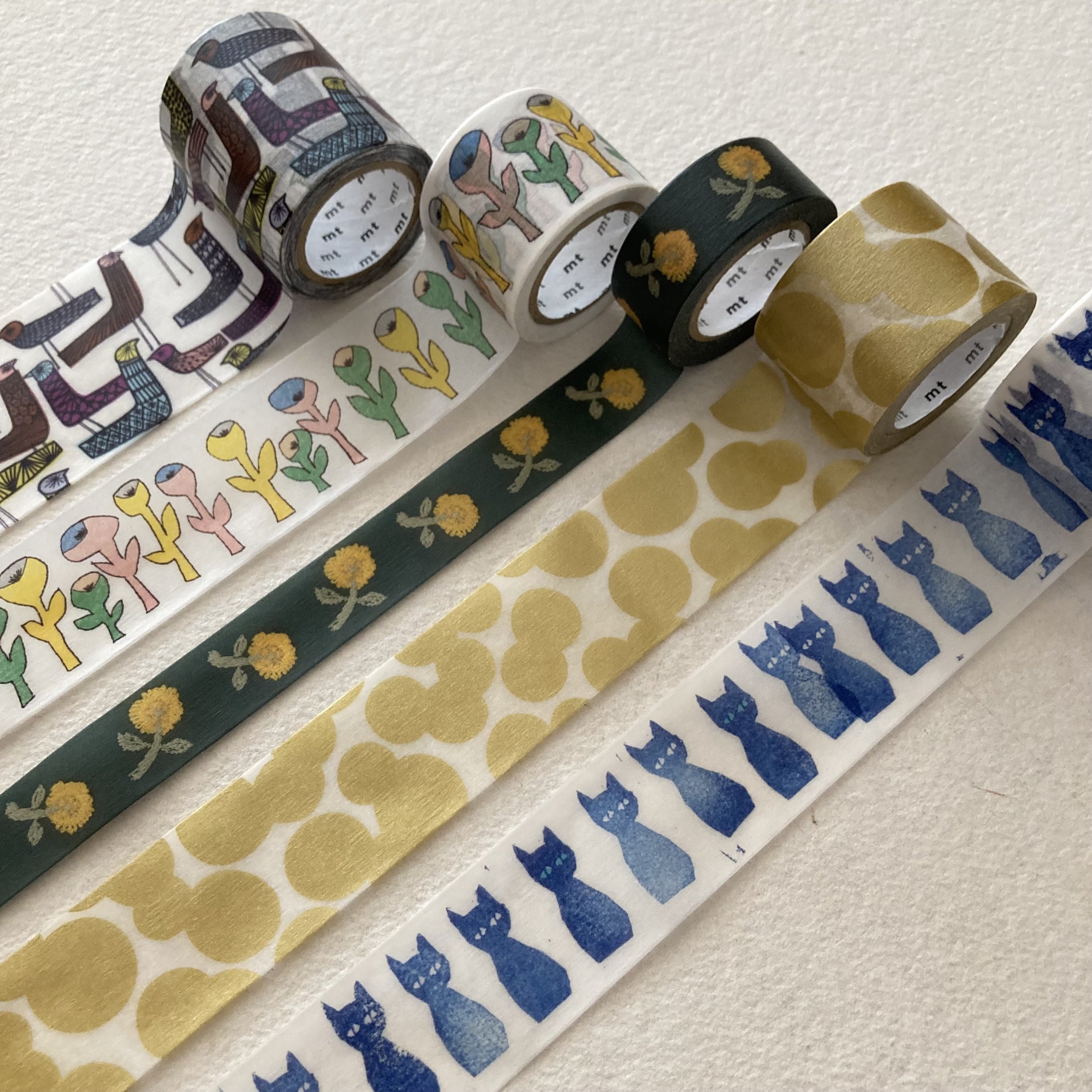
Washi of the Season is now in full bloom, presenting an assortment of summery patterns & colours from Rainbow Plaid and Strawberry Fields, to Pale Pink Sakura and Colour Pencil Stripes. 

 I’ve also added a new Minä Perhonen washi pattern by Japanese textile designer Akira Minagawa: Keru neko—it’s the cat’s pyjamas!

We love these letterpress printed, pinhole-perforated red-bordered labels from Portland Stamp Co. They are included in our MORE Art of the Hand-folded Envelope kit, and we are now delighted to be offering them on their own. Ten labels of assorted sizes per sheet (5½ x 8½) available with square-corner borders or round-corner borders—and a sweet discount if you buy a sheet of each. The stock is not sticky-backed—all the better to deploy your maraschino glue-stick!

Almost SSD @ BZS, Bari

My idyllic interlude at Cambridge Imprint

Dear Everyone ~

Back in May, Zak & I were visiting family & friends in the U.K. Some of our travels took us to the Suffolk coast, which is close-ish (a verdant, rural two-hour drive, unmarred by billboards) to Cambridge. As soon as our plans were set, I sent word to Susie at Cambridge Imprint—who I’ve been e-communing with for over four years—to arrange a visit to their new studio space at Chesterton Mill, an urban renovation project on the outskirts of Cambridge. They had moved in a couple of months prior, and I was hugely excited to meet them in their new atelier! It just so happened that there was just a single day in all our schedules that meshed perfectly for my visit—a gorgeous & sunny day in so many ways!

I walked s-l-o-w-l-y up the inside stairs to their space, taking in the moment entirely. Cambridge Imprint occupies two stories, the upper of which is very loftlike. I was mesmerized with just about every corner, table space & shelves in their studio—colour, pattern, p-a-p-e-r! We drank tea from mugs with Cambridge Imprint patterns (not currently available for purchase, alas), and chatted about this & that & these & those.

My favourite scarf (knitted by my merchandising angel, Jamie) is my constant companion when the weather is chilly). It looked right at home at Cambridge Imprint, next to Claerwen, then Susie, then Jane. Perhaps they favour wardrobe solids so as not to compete with their patterns. There is no mistaking that mixing & matching is the name of the Cambridge Imprint game. The more you have, the more you see! I asked the Cambridge crew about their favourite combos: 

Claerwen: “My current preferred mix would include the Charleston border, Dancing Hares in violet and Peggy Angus tile prints together. It isn't very summery, but I love the combination of brown shades, for example Animalcules in cocoa and the Dancing Hares in bronze”.

Ali: “Brown horses and Wave indigo and Persephone grey & crimson.  
I also love the Smocking and Threadwork patterns we did for the Whitworth—we’re planning some new colourways of Threadwork.”

Jane: “Quercus sap, Wave orange and Charleston ripple”

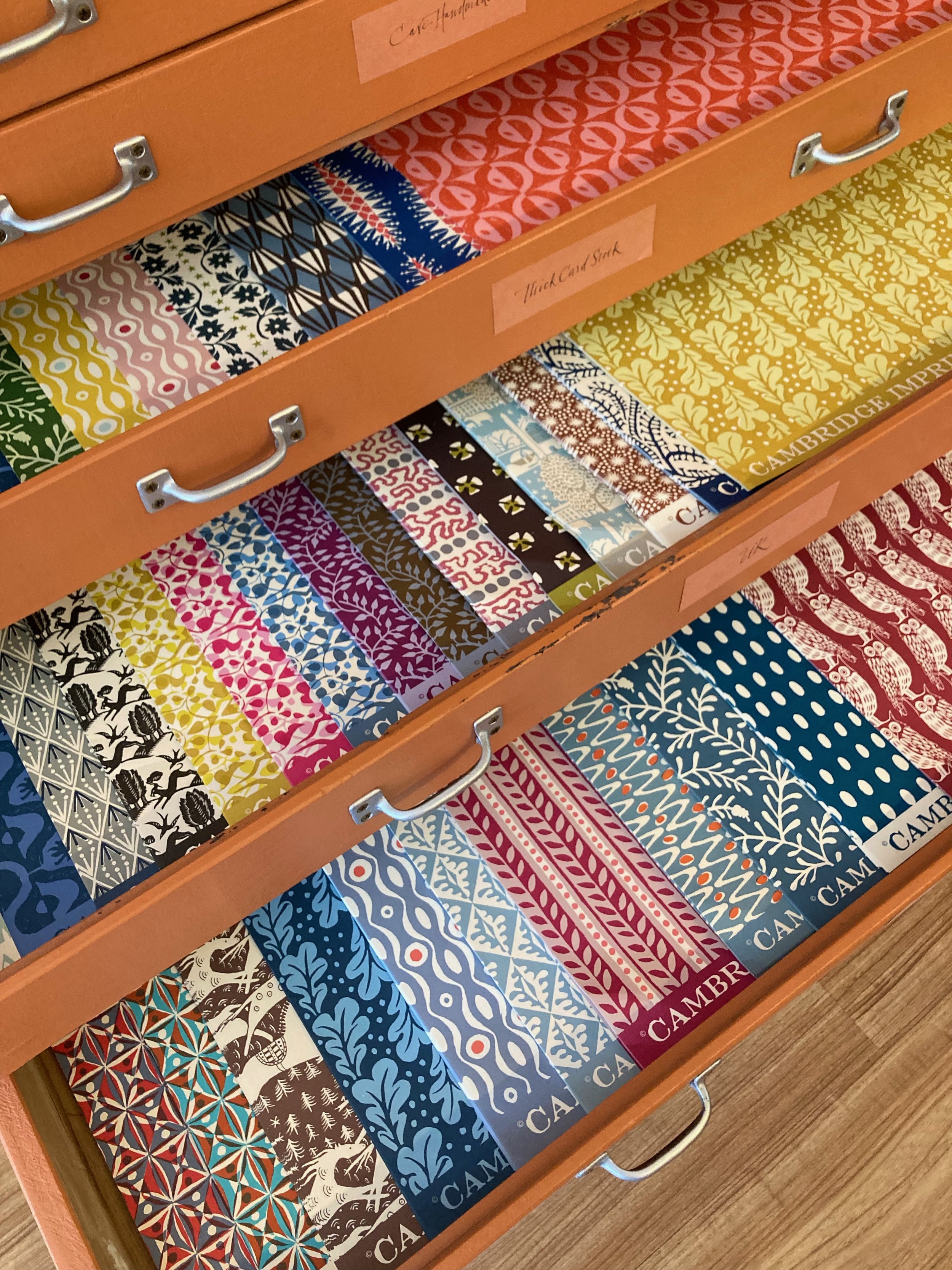
Inspired by my private tour, I have brought in several new Cambridge Imprint papery provisions. I’ve increased my inventory of parent sheets with 21 new patterns, bringing the total to 40. I’ve created a new assortment of six patterned envelopes, paired with six leafy-bordered postcards. (A few sets of my original envelope assortment remain; ditto the original postcard sets.)

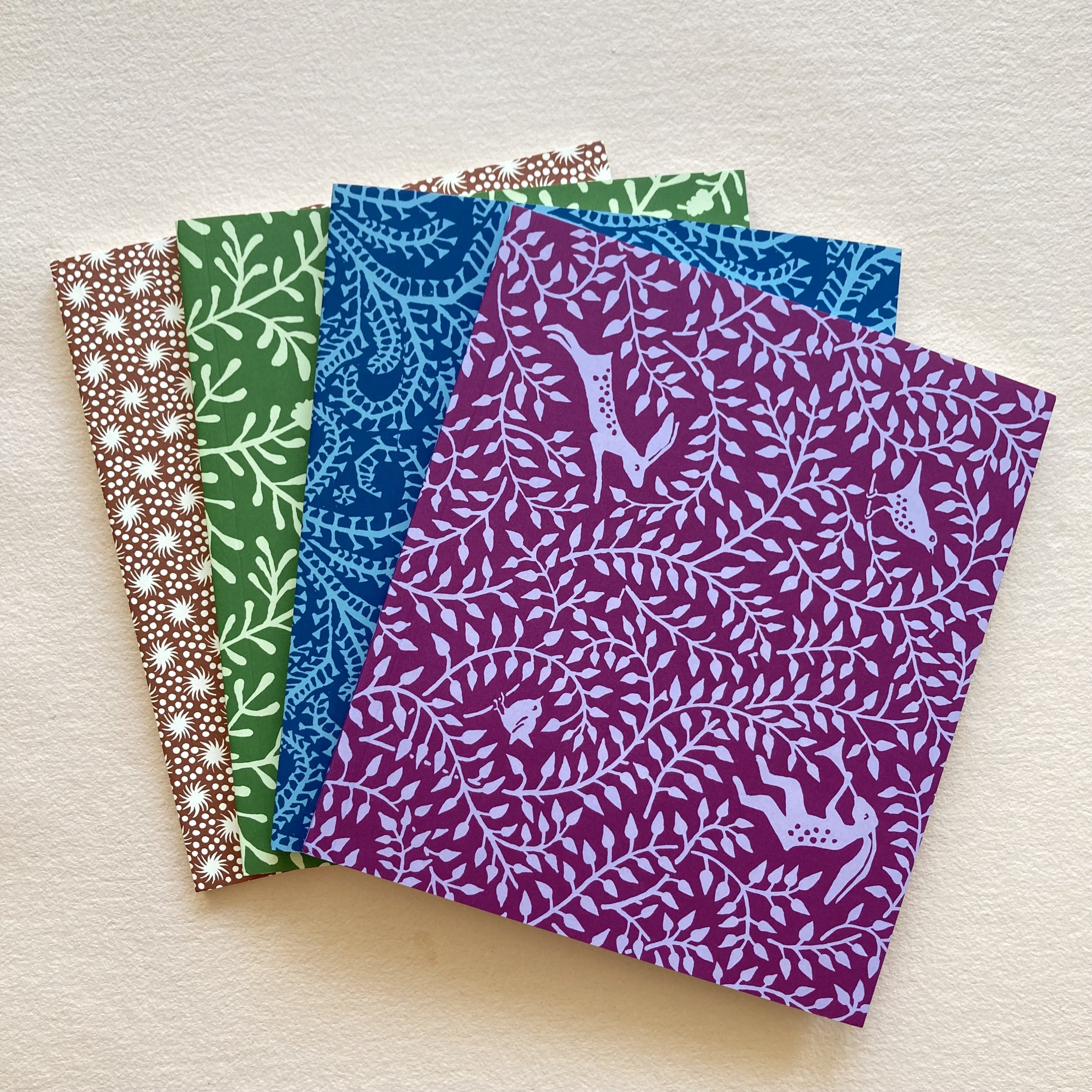
 The new Tall Softback Sketchbook is available in four patterns (seen above), and a Trio of Tri-fold Document Portfolios is available in two colourways (seen below).

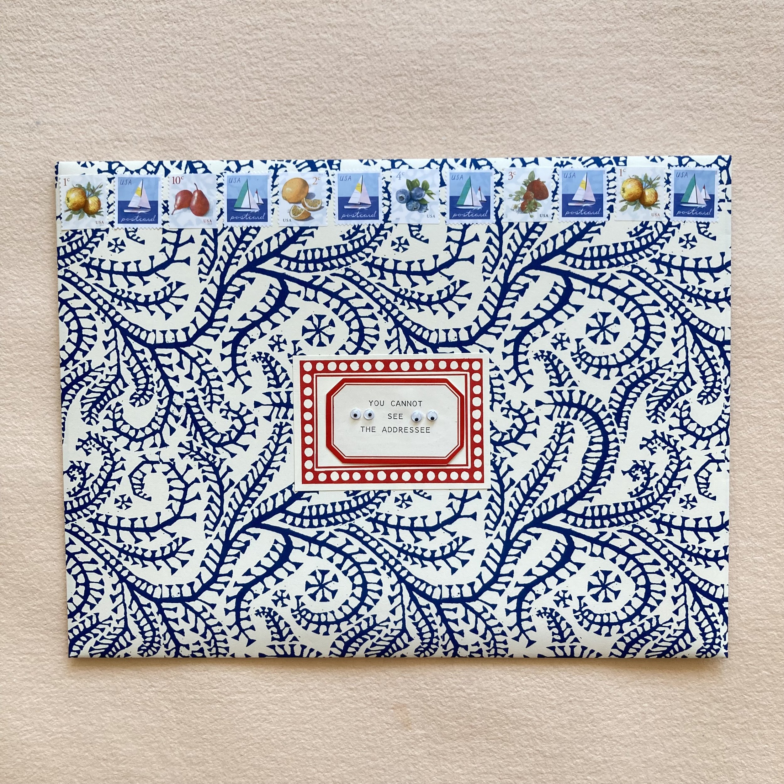
It has just occurred to me that a parent sheet can make a 9 x 12 or 9½ x 12½ envelope to hold a document portfolio (or two). Like a sweater set! Here is my freshly folded Seaweed Paisley Prussian Blue 9 x 12¼,  
lined with Kaleidoscope Red and Blue.

And here is the sweater set, all dressed up and ready to go!

Cambridge Imprint parent sheets
Trio of tri-fold document portfolios
Tall softback sketchbook 
Patterned envelopes & postcards
 
Mixing & matching & delight & delirium, Bari
 
PS:
Speaking of delirium, Volume R, for Rag & Pulp, in the Encyclopedia of Inspiration, created & published by Uppercase, is, to quote the promo card, “freshly printed.” Bari Zaki Studio is honoured to be included in this international extravaganza of people who make their living (and their lives!) using paper. I will be selling Volume R online and in the shop. As you might expect, I will be adding custom embellishments. Whether you are acquiring a copy for yourself or for a friend, I will also be happy to personalize. And, inevitably, gift-wrapping will be offered in several papers for a nominal fee. I anticipate receiving my order early in August and will keep Everyone posted. 

Glimpsing the whimsies of my mail!

Dear Everyone ~

Today, June 26, I am celebrating my 8-year anniversary as a shopkeeper on Lincoln Avenue! As I sit and type at my center table—where I also taught many bookbinding & boxmaking workshops in pre-pandemic days—my heart is smiling from ear to ear. It is here, in my expanded studio space, that I’ve connected with so many incredibly creative kindred spirits, in person, via Zoom, and lovingly through the mail!

This year, my BZS shop postcard, part of my Glimpses & Whimsies of Bari Zaki Studio, has gained a lot of attention and embellishment. I thought it apropos to showcase several creative shopfront illustrations, beginning with Emery Kennett’s (my nimble shop assistant) original, leading up to the most recent I received in the mail, and every lovely work of creativity in between.

Back in 2017, I had commissioned Emery to illustrate the entire row of charming shops (seen at top) for the neighbours page on my website. Her original pen-&-ink and gouache is now framed and hangs in the shop (seen here).

In 2019, inspired by my dear friend Janet Bouldin’s whimsical pen & ink drawings, I commissioned her to draw a few of her favourite things around the shop. My only art direction was, There is no art direction! I left it up to Janet to select what she enjoyed looking at, touching, and drawing. Here is her original 6" x 8" illustration.

Last August—Saturday the 5th, to be exact—was the inaugural Stationery Store Day. BZS was excited to participate, spreading the word, the joy, the swag. Kristen Hermanny—artist, calligrapher, penpal, and shop-by-colour customer, which you can read about here—came to visit that day, bearing a poofy envelope that she hand-folded. I could never have guessed what was inside, and was speechless beyond delight when I had decanted it to reveal a three-dimensional pop-up studio that she had furnished in a multitude of mediums. It sits prominently atop a shelf in the shop.

To celebrate the launch of the Glimpses & Whimsies postcard set, Alyson, my postal muse, and author of the cards’ enchanting captions, sent me a backless envelope she had made from a slightly enlarged B&W photocopy. Before posting the envelope, she subtly coloured just a couple of the shop fixtures and typed an address label as the welcome mat.

In April of this year, I received an unassuming hand-folded envelope in the mail from Deborah Rantz, a newish customer. I showcased her postcard in a recent blog post, April showers brought a bouquet of mail, which you can enjoy here. I describe Deborah’s work of postcard art as a “triple-tiered letter cake”. 

In May, Carla Jacobs popped into my inbox with this virtual surprise. Her caption: Does she sell coffee too? I want everything inside! melted my heart. When I replied to thank her, she said and I quote, “Today I discovered a stash of postcards from you so I expect I will continue to play with collage images of your storefront! She has since e’d me two more images, reporting that she has decided to make a concertina book with her continued inspirations. 

Carla previewed her second collage as Neighborhood watch...

... and her third as I brought a truck for everything I want to purchase! (Hilariously, Cheeky Spellcheck wants me to change “brought” to “bought”!)

Also in May, Shirley Coppi, colour pencil aficionado, longtime student, customer & friend surprised me with this cheerful greeting. Her caption was Fill in the Blanks. Her colour choices are light & bright, and I spy a couple of Luminous Lyra Colour Giant hues. I first met Shirley during a colour pencil botanical drawing class at The Botanic Gardens back in 2012. My mom was also in that class, and I love that Shirley and I have this connection.

When I first began teaching here on Lincoln Avenue, I was able to comfortably host a maximum of three students per workshop, so each of us had our own “side”, two yards worth of space for folding large sheets into signatures and enough elbow room for expansive glueing. Occasionally, I squeezed in a fifth, or even a sixth, person. Since going Zoom, I have had the pleasure of teaching as many as 40-ish students simultaneously, and have shipped kits to the north, the south, east & west coasts, and around the world.
 
I admit that one of my favourite things about teaching is creating and assembling the kits for each workshop. In recent years, these have become quite elaborate, with an increasing number of pieces. As a result my Extremely Exquisite Scraps (XXS), a long-time customer favourite, now includes Cambridge Imprint,  Grafiche Tassotti and Wanderlust papers—in addition to the original mix of Japanese Chiyogami and Katazome (new & vintage) and hand-marbled papers from a range of artists. Some of the tinier scraps in the XXS sets are edges or corners from my own bookbinding and boxmaking projects. My dear husband Zak expertly assembled the freshest batch of XXS. XOX to him!

To celebrate my 8-year anniversary (and 34 years in bookbinding), I am offering a gift-with-purchase starting today until Saturday, July 8. The anniversarial bonbon is a glassine sleeve-ful of XXS shipped with every order of $88 or more (excluding shipping, natch).

I could go on, and on and on, about scraps, and no doubt I will be writing about them again soon. For now, my deepest and heartfelt appreciation to Everyone for your continued enthusiasm, creativity & inspiration—each piece of paper, snippet, or scrap, no matter its shape or size, gets to go to a new home and be creatively repurposed. 

From the bottom of my ❤️, Bari

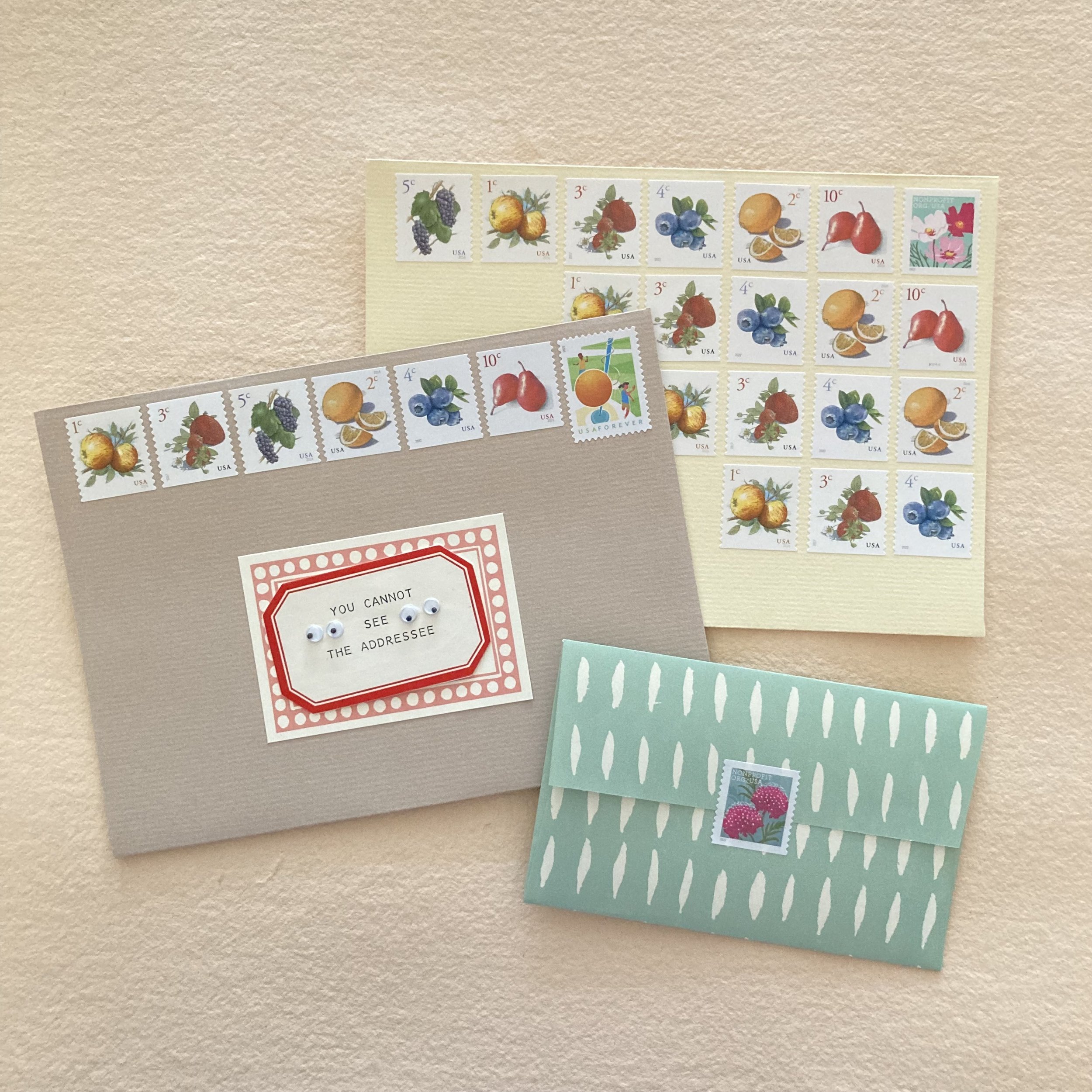
Envelop your mail in summer fruits

Dear Everyone ~

Today is the summer solstice, the official start of summer. Farmer’s markets are in full swing, brimming with seasonal fruits, vegetables, and beautiful bouquets of flowers. In honour of the season, we have refreshed our Summer Fruit Sampler. We added a row of the 10¢ pears by John Burgoyne—making our suite of fruit complete. And two rows (!) of Rigel Stuhmiller’s Butterfly Garden Flowers. Though Rigel’s stamps are officially for non-profit use, they definitely add a dash of panache and cheer to your envelope flaps, gift wraps, jam labels, picnic tables, &c.

For an artist, having your work on a US postage stamp is quite the plum! John Burgoyne’s series of low-denomination, high-charm fruit stamps now includes 1¢ apples, 2¢ Meyer lemons, 3¢ strawberries, 4¢ blueberries, 5¢ grapes, and 10¢ pears (a pair of pears, in fact). We love Rigel Stuhmiller’s Butterfly Garden Flowers, even though we cannot use them as postage ourselves.

We had an e-xchange with Rigel about her stamps—which we hope she will soon be able to refer to as her first stamps for the USPS. Here are some highlights:

“I handcarved the original images into linoleum blocks many times the size of the final stamps, about 6" across. I scanned them into the computer and reduced them for testing at stamp size.” 
 
“I’ve received so many letters with the stamps on them, and friends have collected their nonprofit envelopes and sent me photos. The stamps are only for official use by nonprofits, so all the letters received have been from various organizations. I’m really happy to see my artwork on the letters of nonprofits I know—and even one or two I’ve worked with—and also to see that all kinds of organizations have used them.” 

“Every organization can use these stamps, everyone can receive them… isn’t that cool? I know that every single stamp works this way, but I’ve never thought about the equality of stamps before this project. In a very (very!) (very!) small way, it makes the country seem a little more like a community.” 
 
“I had a great time working on this project. (I’m about to use a lot of loves but the sentiment is honest.) As a kid I used to dream about making stamps and so this opportunity was incredible. I love the postal service, I love our mailman, I love getting letters, and I’ve always loved the idea that everyone who mails a stamped letter is by default required to send someone a piece of artwork. I very much loved the process of working with Antonio [Alcalá]. I’ve worked with a number of art directors but he stands out as my favorite.” 

Alyson, a.k.a. my postal muse, has corresponded for years with Antonio Alcalá, who is an art director for the USPS stamp design program. (He has also designed many US stamps, which Alyson likes to use on her mail to him. We showcased several of those envelopes here.)  We were able to ask him what about Rigel’s style led him to commission her beautiful blooms, and to ask him about nonprofit stamps as a category. He replied:
 
 “I think I first saw Rigel’s work back in 2012 on an artist’s rep website. I liked the ‘less-polished,’ more natural tone to her artwork, and I was attracted to the grace and simplicity of her flower images. The two she created for these stamps complement one another.” 
 
“Nonprofit Org can be a challenging category to design for because the mailers cover such a wide spectrum. They want to have stamps with appeal to the broadest market segment possible. Flowers can be a good solution, because they generate an optimistic and positive impression on the envelope.”

Speaking of sending mail, we’ve added a baker’s dozen of Hahnemühle Bugra (HB) A7 envelopes to the Summer Fruit Sampler. They are assorted in four delicious shades: iced coffee, French vanilla, crème brûlée, and fresh toast. These envelopes are a very limited edition, freshly converted from parent sheets of HB by my dear paper-purveyor pal Pavel. If you have any other Hahnemühle items on hand (such as HB Ultimate Palette Housemade Pad or the HB envelopes & notesheets), you know that the paper’s texture is part of its distinctive charm.

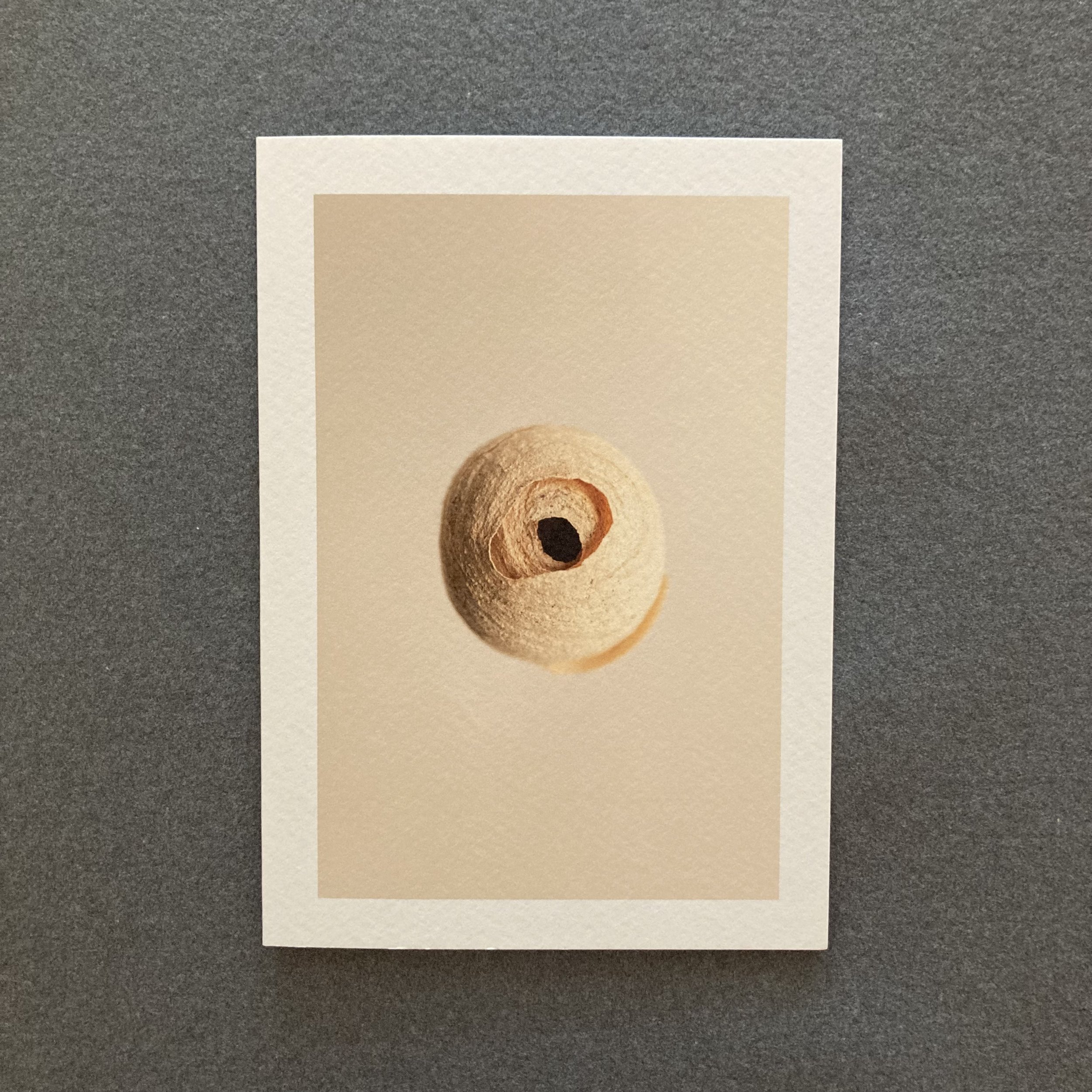
Newest nature inspired notecards by James Winrow

Dear Everyone ~

I am delighted to herald the arrival of a series of photographic notecards by artist (and photographer!) James Winrow. His newest edition of nature-inspired cards presents incredible close-ups of nests. They are mostly avian, but there are also two mouse nests, one wasp’s nest, and one emperor moth cocoon. All fairly fascinating and a bit mesmerizing.

Since I began stocking James's cards, I’ve had the pleasure of speaking with him via Zoom on a couple of occasions. It’s always a delight to commune with him about his drawings and collections, and our shared love of nature. 
 
James had sent me his nest images via email, before they were printed, and I was aswoon. Seeing them “in person” on paper revealed James’s lovely & lyrical description on the back of each card. In the shop listing, you can savour his full description for the Goldfinch.

I e’d James a few questions,  to which he has graciously replied.
 
Where & when—perhaps I mean how—do you find these nests?
 
It varies considerably. First up, timing. I won’t deal with nests in nesting season. I will often find nests when I’m out and about walking and spending time in nature—in woods, fields and hedgerows mainly. It’s actually a marvellous challenge to set yourself if you’re interested in connecting with nature more and having your eyes opened—albeit one that must be done with respect and care not to disturb the nest or birds.

Do you have a designated space in your studio for displaying them?
 
Do you know, I don’t… I’ve garnered quite a collection now, so I should really have a shelf set up for them. Perhaps that can be a project for the studio.

Do you have a specific way to document them?
 
Yes. I will set up a small photographic studio with a plain backdrop and then photograph them in natural light and with studio lights, depending on the nest and what quality to the image I’m after. Photography forms a large part of my artistic practice. It’s a useful tool for documenting and creating reference material to work from later.

Do the nests change over time, even though they’re indoors?
 
Yes, they do. They’re made of natural materials and will fade and go rusty in colour, or a washed-out brown. A bright, vivid green wren’s nest made from moss will turn to a ball of russet, grey and washed-out brown in a few months, which has a charm of its own, but I like to capture the colour and form when they’re as fresh as possible, which is what the camera is so good for. 

The nests seem quite varied. Have you found them all in your immediate vicinity?
 
Most of these nests have been found within about a half mile radius. Exceptions are one of the mouse nests, the moth cocoon, and the fragment of the long-tailed tit nest.

Do you have a favourite foot path? 
 
I actually don’t! There are some animal trails on the land here that I like to follow. I’m terrible on a walk. I can’t do the A-to-B route march. I could spend a whole day walking a 500-yd stretch of path. I meander and wander, following any little sign or track. I will often want to stop and see and look for a while. That’s where the magic happens. 

Also new from James is a portfolio envelope with string-and-button closure that holds his set of four nature inspired postcards. And when you’ve sent, shared, or framed the postcards, you can adapt your portfolio for stamps, other cards, or little treasures. If you’ve already purchased a set of James’s postcards and would like a portfolio envelope, please just e me, as James has been generous with extras.